Overview
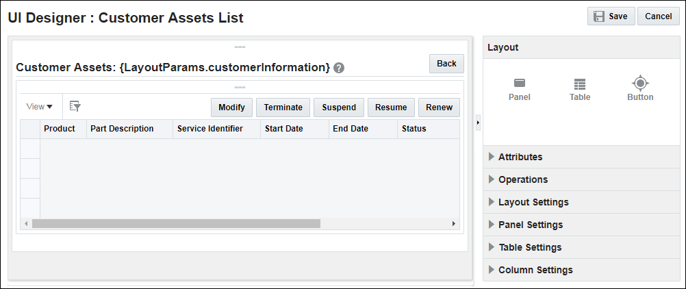
UI Designer contains a drag−and−drop interface that allows administrators to easily customize layouts. The following image shows the UI Designer layout screen for Customer Assets.
Administration
Complete the following steps to access the UI Designer.
- Click Admin to go to the Admin Home Page.
-
Click UI Designer under General.
This opens the UI Designer List page.
-
Click the name of a pre−generated layout.
This opens the layout in UI Designer.
The Layout panel contains basic components that are used to create the layout. Drag and drop the desired components onto the content area to place the component in the layout.
Use Layout Settings to customize the Name, Description, Parameters, and Category associated with a layout. Instructions for each of the Layout Settings are provided below and are also available as Tooltips by hovering over the settings with your mouse.
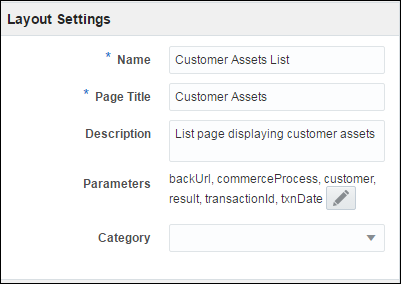
- Name: Enter a name for this UI layout. The Name is seen on the Layouts List page.
- Page Title: Enter a title to display in the browser tab or header.
- Description: Enter a description of the content or purpose of the layout. The description entered displays on the Layouts List page.
-
Parameters: Use the Layout Parameters dialog to add, modify, or delete the parameters associated with a layout. The Layout Parameters dialog can contain default values that are already defined but are primarily defined through parameters that are passed through a URL.
 View Layout Parameters
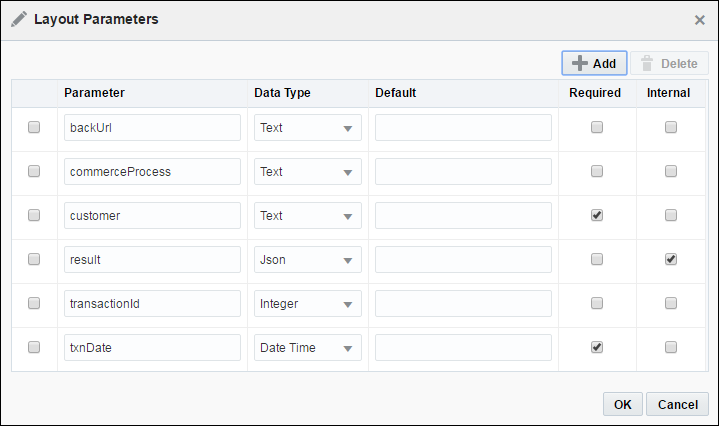
- Category: Select a category or create a new category for organizing the layout on the Layouts List page.
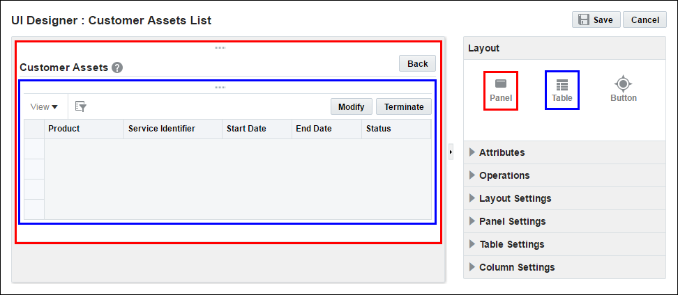
Use Panel Settings to customize the Title, Help Text, Help URL, Tooltip, or Icon Set associated with a panel. A sample panel is outlined in red and shown below.
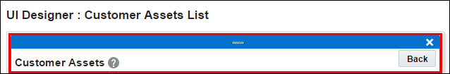
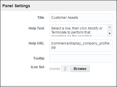
- Title: The title displayed in the upper−left of the panel. In the Sample Panel figure, Customer Assets is the title.
- Help Text: The instructional text that displays upon hovering over the Help icon with your mouse.
-
Help URL: The URL of the page that opens upon clicking the Help icon.
If no content is entered in the Help Text or Help URL fields, a Help icon does not display on the panel.
- Tooltip: The short message that displays upon hovering over any part of the panel.
- Icon Set: The icon that displays in the upper−left of the panel next to the title. An icon set on a panel only displays in the Enabled state. The behavior of an icon set on a panel is static in comparison to how an icon set functions on a button.
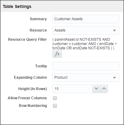
The Customer Assets List layout and the Performance Logs List layout are both displayed in a table format. Use Table Settings to make permanent customizations to these tables, including enabling the freeze column feature on the table, adding row numbering, and changing the default column width.
Descriptions of each of the Table Settings are provided below.
- Summary: Enter a summary of the contents of the table. This is an important step for creating accessible layouts.
-
Resource: Select the object to use for defining the contents of the table. The available options include Assets and Performance Logs.
For additional information, refer to the following topics: Asset-Based Ordering, Performance Logs, and Eligibility Rules.
-
Resource Query Filter: Select
 to define a filter to apply to the selected object.View Resource Query Filter
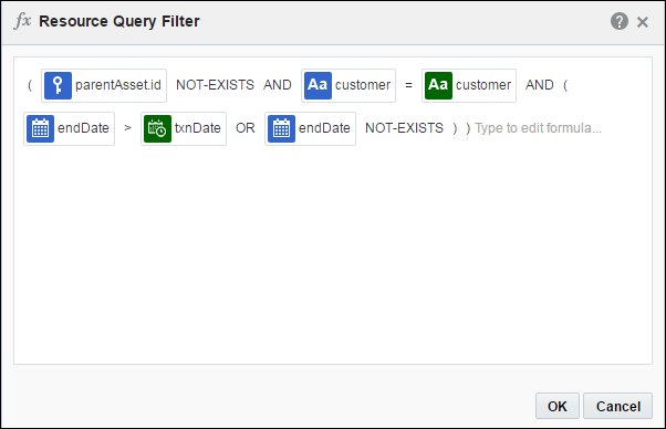
- Tooltip: Enter a short message to display upon hovering over the table.
- Expanding Column: Select a column to fill extra space in the table.
- Height (In Rows): Specify the number of rows to display in the table for the height. As the user scrolls down, additional rows will display.
- Allow Freeze Columns check box: Check the Allow Freeze Columns check box to display a Freeze button in the table’s toolbar, so users can freeze or un-freeze columns. Selecting and freezing a column creates a horizontal scroll bar to the right of the frozen column.
- Row Numbering check box: Check the Row Numbering check box to display row numbering for each row in the table. As the user scrolls, additional rows become available.
Oracle CPQ Release 18D does not support the following:
- The UI Designer "Freeze Columns" option, which allowed users to select and freeze table columns.
- The UI Designer "Expanding Columns" option, which allowed administrators to select a column to fill extra space in the table.
-
Rearranging table columns on Customer Assets, Performance Logs, and Eligibility Rules List pages.
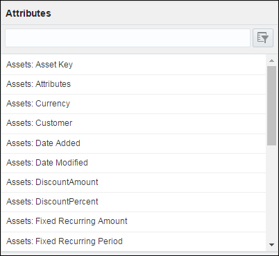
The Attribute panel contains a list of object attributes that are available to add into the selection in the content area. Drag and drop an attribute onto the table to add it as a column.
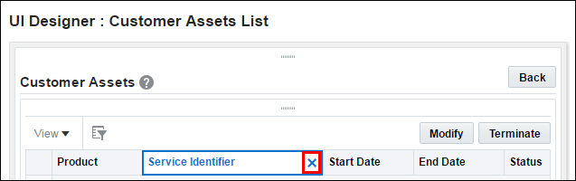
To remove a column, select the column to remove and click the remove icon, which is located to the immediate right of the icon. In the following figure the remove icon is outlined in red.
Use Button Settings to specify a Label, Navigation option, Operation, Tooltip, and Icon Set for a button.
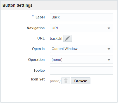
Descriptions of each of the Button Settings are provided below.
- Label: Enter a label to display on the button.
- Navigation: Select a URL to associate with a button. When the button is clicked, the specified URL opens.
- Operation: Select an operation to assign to the button.
- Tooltip: Enter a short message to display upon hovering over the button.
- Icon Set: Associate a button with an icon set. Each icon set has an Enabled, Disabled, and a Hover state as well as an Active state for when the button associated with the icon set is clicked.
-
Hide Label: Hides the text label assigned to a button and renders the button as icon-only.
When an icon set is assigned to a button, the “Hide Label” option is available on the Button Settings panel.
Notes
- Only one panel per layout is currently supported. When an administrator attempts to drag−and−drop an additional panel onto a layout, the layout is not updated with the additional panel.
- When defining a Help URL or Navigation URL, use http:// or https:// at the beginning of external links. Otherwise, the path is assumed internal within the Oracle CPQ page. If only an end-point such as /commerce/display_company_profile.jsp is entered, the Oracle CPQ domain is automatically added to make the entire URL [site].bigmachines.com/commerce/display_company_profile.jsp.
- As a recommended good practice, make the layout parameters used in a Resource Query Filter mandatory, especially if the parameter type is not text. Otherwise, the Resource Query Filter evaluation may fail, resulting in a runtime error when attempting to load the page.
- Icon sizes on buttons are constrained to 16 x 16 pixels. While it may appear that the icon size is constrained on panels as well, the images will display to the end user in the icon’s unrestricted size. When defining an image for an icon set, make sure the image size is correct in File Manager.
- Not all of the attribute types available on the Customer Assets List layout or the Performance Logs List layout are supported. For example: An administrator can add Currency and Currency Code attributes to the Customer Assets List layout, but the attributes do not display values for the end user.


