Stylesheet Manager
Overview
The Stylesheet Manager enables you to customize and modify the Oracle CPQ system's font, colors, and images so that they closely match your company's colors and style. A CSS file is used to generate the uniform look and feel of the web site. A default CSS file is provided with the system.
These changes only affect the user pages, not admin pages.
The UI provides an easy way to change the colors and fonts used.
For advanced customization, you can download the default CSS file provided, make changes and then upload it as an alternate CSS file.
Stylesheet Manager Description
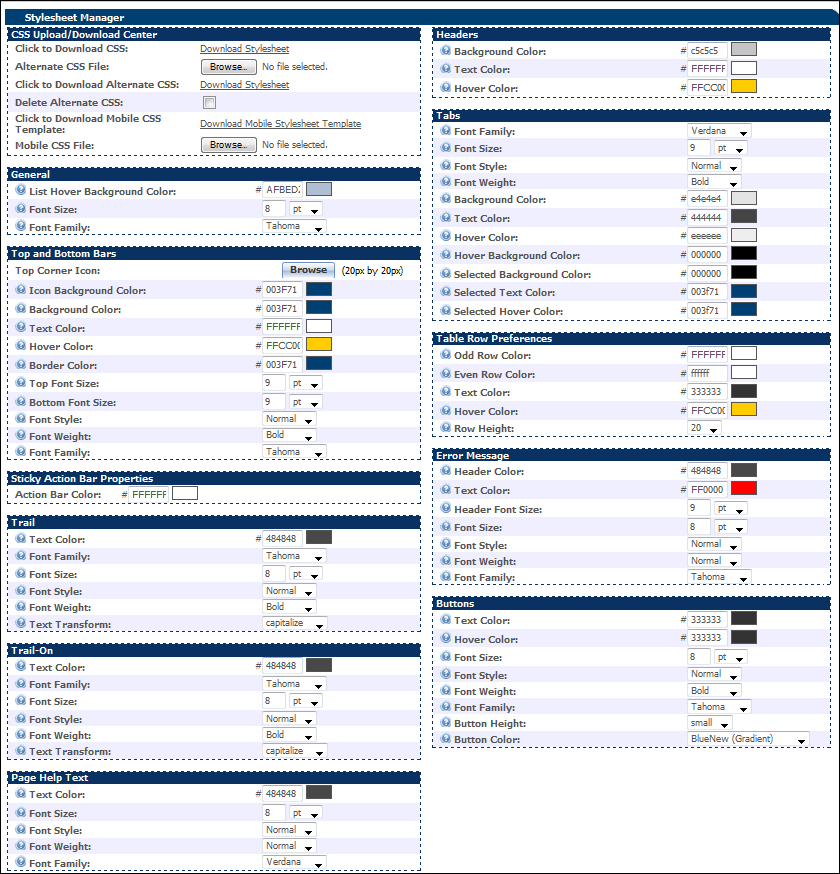
 Top & Bottom Bars
Top and bottom bars frame page content. Typically, each page has a single top bar and a single bottom bar. On the Branding page, Stylesheet Manager displays in the top bar and Back to Top displays in the bottom bar.
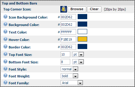
| Icon Background Color |
Specify here the background color of the icon. You can see a preview of the color for the value entered. |
| Background Color |
Specify here the background color of the bars. You can see a preview of the color for the value entered. |
| Text Color |
Specify here the color of the text that will be displayed on the bars. You can see a preview of the color for the value entered. |
| Hover Color |
Specify here the hover color. This is the color in which the text is displayed when you bring your mouse pointer over it. You can see a preview of the color for the value entered. |
| Border Color |
Specify here the border color of the bars. You can see a preview of the color for the value entered. |
| Top Font Size |
Using the drop-down provided, select the font size of the text that will be displayed on the top bar. |
| Bottom Font Size |
Using the drop-down provided, select the font size of the text that will be displayed on the bottom bar. |
| Font Style |
Using the drop-down provided, select the font style of the text that will be displayed on the bars. |
| Font Weight |
Using the drop-down provided, select the font weight of the text (normal, bold, and so on) that will be displayed on the bars. |
| Font Family |
Using the drop-down provided, select the font family of the text that will be displayed on the bars. The default font is Tahoma. |
Trail & Trail-On
Trail provides a path at the top of the page to indicate the current position of the user in the site structure. Trail-On is the portion of the trail where the user is currently at.
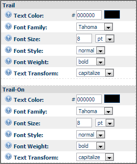
| Text Color |
Specify here the color of the text that will be displayed. You can see a preview of the color for the value entered. |
| Font Family |
Using the drop-down provided, select the font family of the text that will be displayed. The default font is Tahoma. |
| Font Size |
Using the drop-down provided, select the font size of the text that will be displayed. |
| Font Style |
Using the drop-down provided, select the font style of the text that will be displayed. |
| Font Weight |
Using the drop-down provided, select the font weight of the text (normal, bold, and so on) that will be displayed. |
| Text Transform |
Using the drop-down provided, select whether the text would be capitalized, upper case, lower case, or none. |
Page Help Text
Using this section you can customize the look and feel of the help text.
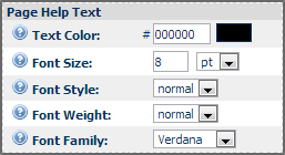
| Text Color |
Specify here the color of the text that will be displayed. You can see a preview of the color for the value entered. |
| Font Family |
Using the drop-down provided, select the font family of the text that will be displayed. The default font is Tahoma. |
| Font Size |
Using the drop-down provided, select the font size of the text that will be displayed. |
| Font Style |
Using the drop-down provided, select the font style of the text that will be displayed. |
| Font Weight |
Using the drop-down provided, select the font weight of the text (normal, bold, and so on) that will be displayed. |
General
Using this section, you can customize the general look and feel of the website.
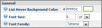
| List Hover Background Color |
Specify here the hover color - that is the color in which the text is displayed when you bring your mouse pointer over it. You can see a preview of the color for the value entered. |
| Font Size |
Using the drop-down provided, select the font size of the text that will be displayed. |
| Font Family |
Using the drop-down provided, select the font family of the text that will be displayed. The default font is Tahoma. |
Headers
Commerce pages typically have multiple sections. Headers mark the start of a section. Example: on the Branding page, a few headers are: Top and Bottom Bars, Headers, Table Row Preferences, and Buttons.
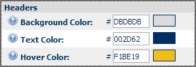
| Background Color |
Specify here the background color of the headers that mark the start of a section. You can see a preview of the color for the value entered. |
| Text Color |
Specify here the color of the text that will be displayed on the headers that mark the start of a section. You can see a preview of the color for the value entered. |
| Hover Color |
Specify here the hover color - that is the color in which the text is displayed when you bring your mouse pointer over it. You can see a preview of the color for the value entered. |
Tabs
Tabs are used to provide structure to a web page by logically dividing the material in a page.
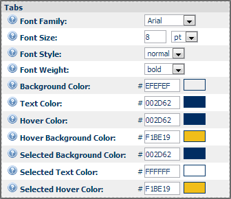
| Font Style |
Using the drop-down provided, select the font style of the text that will be displayed. |
| Font Weight |
Using the drop-down provided, select the font weight of the text (normal, bold, and so on) that will be displayed. |
Table Row Preferences
Much of the data that displays on commerce pages is displayed in tables. You can alternate row colors to make tables more reader-friendly. You can also distinguish table text with a custom color.
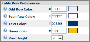
| Odd Row Color |
Specify here the background color of the odd-numbered rows of the table. You can see a preview of the color for the value entered. |
| Even Row Color |
Specify here the background color of the even-numbered rows of the table. You can see a preview of the color for the value entered. |
| Text Color |
Specify here the color of the text that will be displayed on the bars. You can see a preview of the color for the value entered. |
| Hover Color |
Specify here the hover color - that is the color in which the text is displayed when you bring your mouse pointer over it. You can see a preview of the color for the value entered. |
| Row Height |
Using the drop-down provided, select the height of the rows of the table. |
Error Message
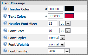
| Header Color |
Specify here the color of the error message header. |
| Text Color |
Specify here the color of the error message text that will be displayed. You can see a preview of the color for the value entered. |
| Header Font Size |
Using the drop-down provided, select the font size of the error message header. |
| Font Size |
Using the drop-down provided, select the font size of the text that will be displayed in the error message. |
| Font Style |
Using the drop-down provided, select the font style of the text that will be displayed in the error message. |
| Font Weight |
Using the drop-down provided, select the font weight of the text (normal, bold, and so on) that will be displayed in the error message. |
| Font Family |
Using the drop-down provided, select the font family of the text that will be displayed in the error message. The default font is Tahoma. |
Buttons
Buttons enable users to perform operations. You can customize the background, text color, and sizes of all the buttons on your site.
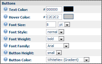
| Text Color |
Specify here the color of the text that will be displayed on the buttons. You can see a preview of the color for the value entered. |
| Hover Color |
Specify here the hover color - that is the color in which the text is displayed when you bring your mouse pointer over it. You can see a preview of the color for the value entered. |
| Font Size |
Using the drop-down provided, select the font size of the text that will be displayed on the buttons. |
| Font Style |
Using the drop-down provided, select the font style of the text that will be displayed on the buttons. |
| Font Weight |
Using the drop-down provided, select the font weight of the text (normal, bold, and so on) that will be displayed on the buttons. |
| Font Family |
Using the drop-down provided, select the font family of the text that will be displayed on the buttons. The default font is Tahoma. |
| Button Height |
Using the drop-down provided, select the height of the button. |
| Button Color |
Using the drop-down provided, select the color of the buttons. |
Administration
JET UI Style Customization
As with Legacy UI, you can apply styling to Classes, ID's, and HTML elements. The ID tags created by Oracle CPQ for each attribute, action, product families, product lines, models, and custom classes all remain the same in the JET HTML structure. However, the HTML structure itself is very different from the Legacy UI because of the new framework used to create the HTML. Additionally, classes in JET are distinctly different from Legacy classes. Classes in JET for the UI components and content are prefixed with an ‘oj’ for Oracle JET.
Upload a Stylesheet for the JET UI
- Click Admin to go to the Admin Home Page.
-
Click Stylesheet in the Styles and Templates section.
The Stylesheet Manager page opens.
- Click Choose File.
- Select the applicable css file, then click Open.
- Click Accept to upload the file or Cancel to close without saving changes.
Legacy UI Style Customizations
Customizing your Stylesheet
- Specify the fonts and color palette of your choice.
- Do one of the following:
Branding changes take effect immediately after clicking Accept. If the changes do not appear on a page, it is likely the browser is displaying a cached copy of the page. When this happens, click the browser's Refresh button to update the page.
When using top navigation for your site, the sidebar background color should be set to white (FFFFFF) and the text should be a dark, high-contrast color.
Only web safe colors can be selected from the color palette pop-up. RGB color codes display in the text box next to the color preview box.
For non-web safe colors, you can enter RGB color codes and the corresponding color will be shown in the color preview box.
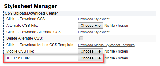
Downloading a CSS File
This file is useful for developing XSL template files as it enables you to view the classes you can use in XSL.
-
Click the Download Stylesheet link.
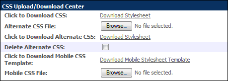
- Save the downloaded CSS file, modify it, and then update it as an alternate CSS file.
Uploading a CSS File
-
Click Browse in the Alternate CSS File.
The File Upload dialog box appears.
- Browse for, select the required file, and click Open. This displays the selected file name for the Alternate CSS Information field.
- Click Accept on the Stylesheet Manager page.
Specifying Icons for Top & Bottom Bars
-
Click Browse within the Top Corner Icon bar to search for and select a new logo.
The File Manager- Browse window appears.
-
Select the folder from which you desire to import the new logo, using the Folder drop-down.
Selecting a folder name displays the logo images present in the folder, along with a Preview, Description, and the date and time the logo was imported to the folder.
-
Click Select the entry for the desired logo.
This closes the File Manager - Browse window, and displays the name of the selected image in the Home Page Set Up.
-
Click Clear to remove the selected icon.
The maximum size allowed for the icon is 20px by 20px.
CSS Styles for Page Navigation in the Line Item Grid
CSS styles are available to indicate pages with validation errors, within the list of line items. These styles can be modified, but by default they are not defined, to avoid changes to any customized button styles.
To customize the style:
- Click Admin to go to the Admin Home Page.
-
Click Stylesheet in the Style and Templates section.
The Stylesheet Manager page opens.
- Download the Alternate CSS.
-
Add the following style classes to the CSS file, providing the appropriate style rules, and save it.
The following sample of CSS rules can be used as a starting point for customizing the Pagination buttons to match your site’s branding:
/* Style rules specific to pagination buttons. These can be added to your site's CSS properties for your custom buttons if desired */
button.pagingbtn{ /* Paging button container */ }
span.pagination-button-left { /* Left side of button */ }
span.pagination-button-left span.pagination-button-middle { /* Button text properties */ }
span.pagination-button-left span.pagination-button-right{ /* right side of button */ }
/* Style rule to ensure pagination buttons are not hidden */
div.paging-tools span{
visibility: visible;
padding: 0px;
}
/* Style rule to set height and alignment for the “Go To” menu */
div.sel-menu select.selpaging{
height: 22px;
text-align: left;
}
/* Style rule to add black border around the current page button */
div.page-number ul.paging li button.pagingbtn.current{
border: 1px solid #333333;
}
/* Style rule adds red border for the current page button whose line items contain at least 1 constraint/validation error */
div.page-number ul.paging li button.pagingbtn.current.invalid-page{
border: 1px solid #FF0000;
}
/* Style rule sets text to red for a non-current page button whose line items contain at least 1 constraint/validation error */
div.page-number ul.paging li button.pagingbtn.invalid-page{
color: #FF0000;
}
/* Style rule adds red border for the “Go To” menu to indicate that there is a page whose line items contain at least 1 constraint/validation error */
div.sel-menu select.selpaging.invalid-page{
border: 1px solid #FF0000;
}
- Upload the new CSS file.
Notes
- By default, the sidebar contains the site's navigation links. Alternatively, navigation links can also be displayed across the top of the page. If you use sidebar navigation, then you can customize the sidebar's background color, text color and background image.
- The width of a sidebar image should be a maximum of 150 pixels.
- It is recommended that you select one font to use across your entire site; it lends consistency to your site.
- The default font is Tahoma.
Additional Information
For more information regarding design principles, see these web sites:
Related Topics
See Also


