Overview
Elements hold the content of the document. Elements cannot be placed directly in the Template Flow, but must be placed either in a Section or a Header & Footer Layout. All Elements should be placed in a Section and some Elements can be placed in a Header & Footer. No Elements can be placed in a Table of Contents Layout because of the default Elements that are provided with it.
There are nine Elements types that can be added to the template:
Administration
Text Elements can hold both static text and dynamic attribute values. Text can be added to Sections, Table cells, and Headers and Footers.
After a Text Element has been dropped in the template, the Text Element dialog box will appear.
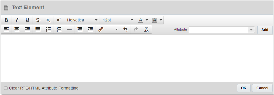
Text can be added and formatted within the Text Element editor window. Clicking OK will save the contents of the Text Element. The Text Element editor window can be reopened by double-clicking the Text Element within the Template Flow.
Attribute values can also be added to Text Elements. For more information on adding attribute values, see the topic Document Designer and Attribute Values.
- If administrators apply formatting (e.g. font family, font size, line spacing, indentation, and style options such as bold, italic, and underline) to a RTE or HTML attribute from within the Text Element dialog, selecting the Clear RTE/HTML Attribute Formatting checkbox will override this formatting with Text Element formatting in the output document.
- If the content added inside an RTE or HTML attribute contains a default font family or font size, the Text Element formatting is applied. This occurs regardless of whether or not the administrator selects the Clear RTE/HTML Attribute Formatting checkbox.
- When HTML attributes contain an image within an HTML tag that has formatting such as bold, italic, or font size, the text content may overlap the image in the output document. To correct this, try removing the formatting from the HTML tag or moving the image outside the tag.
When a Text Element is selected in the Template Flow, the following properties can be modified in the Properties pane:
| Property | Description |
|---|---|
|
Font |
The font of all text within the Text Element. If multiple fonts are used within the Text Element, an “*” will appear in the Font drop-down. Selecting a font will overwrite all font modifications that were made within the Text Element editor window. |
|
Size |
The size of all text within the Text Element. If multiple sizes are used within the Text Element, an “*” will appear in the Size drop-down. Selecting a size will overwrite all size modifications that were made within the Text Element editor window. |
|
Options |
Options include Font Color, Bold, Italics, and Clear Formatting. Changing any one of these options will affect all text within the Text Element. |
|
Keep Together |
When selected, if the Text Element is long enough so that it will be split between two pages, the Text Element will be moved to a new page so that all text content appears on the same page in the output. |
|
Line Spacing |
The line spacing between all lines in the Text Element. If multiple line spacing settings are used within the Text Element, an “*” will appear in the Line spacing drop-down. Selecting a Line spacing setting will overwrite all line spacing modifications that were made within the Text Element editor window. |
|
Padding |
The space between the Text Element and other Elements (when defined for Top and Bottom) and between the Text Element and the margins of the page (when defined for Left or Right). If the Text is inside a Table cell, margins will determine the distance between the Element and the borders of the cell. |
Image Elements can reference images stored in the File Manager, images stored in Commerce File Attachment attributes, or external images. Images can be added to Sections, Table cells, and Headers and Footers.
After an Image Element has been dropped in the template, the Browse File Manager window will appear.
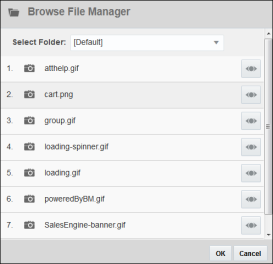
Select a File Manager folder using the Select Folder drop-down to locate the correct image. Images can be viewed in a new window using the Preview (![]() ) button. To add a File Manager image to the Image Element, select the image from the list and then click OK.
) button. To add a File Manager image to the Image Element, select the image from the list and then click OK.
![]() File Attachment Attribute Images
File Attachment Attribute Images
To use an image that is stored in a File Attachment attribute, click Cancel when the Browse File Manager window appears. With the Image selected in the Template Flow, the Image Properties pane will show in the Properties panel. From the Attribute (Default) drop-down, select the File Attachment attribute for the Image Element to pull from.

To use an external image, click Cancel when the Browse File Manager window appears. With the Image selected in the Template Flow, the Image Properties pane will show in the Properties panel. Enter the external image’s full URL into the Image URL field.
An Image Element linked to a File Attachment attribute can also have a File Manager image or an external image associated with it as a backup. The Image Element will always show the image in the File Attachment attribute if one is present, but if the File Attachment attribute is empty, the Image Element will show the associated File Manager image or external image.
If the file in the File Attachment attribute is not an image file (for example, a PDF), the associated File Manager image or external image will show in the output.
If there is no image present in a File Attachment attribute that is linked to an Image Element and no File Manager image is associated with the Image Element, nothing will show in the output where the Image Element would have been.
When an Image Element is selected in the Template Flow, the following properties can be modified in the Properties pane:
| Property | Description |
|---|---|
|
Attribute (Default) |
The File Attachment attribute where the image that will be displayed in the output is stored. |
|
Image URL |
The URL of the external image or the File Manager image that will be displayed in the output. If a File Manager image is selected, the “URL” will display with the syntax The Browse File Manager button ( |
|
Height |
When set to Auto, the height of the image will be the actual height of the image file.
|
|
Width |
When set to Auto, the width of the image will be the actual width of the image file.
|
|
Alignment Options |
Where the image is aligned on the page. For example, left-aligned, centered, or right-aligned. |
|
Margins |
The space between the Image Element and other Elements (when defined for Top and Bottom) and between the Image Element and the margins of the page (when defined for Left or Right). If the Image is inside a Table cell, margins will determine the distance between the Element and the borders of the cell. |
Table Elements can be used to organize content and present it in a logical way to the reader of the document. Tables can be placed in Sections and Headers and Footers.
When a Table Element is added to the template, by default the Table will have one row and one column. Additional rows and columns can be added by clicking the Add Row or Add Column icon ( ), located within the bottommost row and rightmost column, respectively, or by modifying the Row and Column fields in the Properties pane. Both rows and columns can be rearranged within a table via drag and drop.
By default, each cell in a Table will contain a Text Element. That Text Element can be modified or removed from the cell, and additional Elements can be added to the cell. Text, Image, Heading, Spacer, and XSL Snippet Elements can all be added to Table cells. Tables cannot be nested.
When a Table is selected in the Template Flow, the following properties can be modified in the Properties pane:
| Property | Description |
|---|---|
|
Rows |
The number of rows in the Table. |
|
Columns |
The number of columns in the Table. |
|
Background Color |
The background color of all cells within the Table. |
|
Borders |
The color and width (in pixels) of borders within the Table. |
|
Use Header |
When selected, the first row in the Table becomes a header row. If a Table spans multiple pages in the output, the header row will appear at the top of each new page. Cells within a header row cannot be merged with cells in other rows. When a header row is specified, if the row did not have a background color, the row will have a gray background applied to it in the Document Designer editor. This gray background will not show in the output, and the admin can assign the header row a background color. |
| Table Alignment | Change the alignment of a table by left−aligning, centering, or right−aligning the table based on the width of the page. By default, tables are left−aligned. When multiple tables are selected, the selected table alignment option applies to all of the tables. |
|
Keep Together |
|
|
Padding |
The space between the borders of the cells within the Table and the Elements within the cells. |
When a row is selected in the Template Flow, the Clear Row button (![]() ) will appear in the Dynamic Content Bar. Clicking Clear Row will clear all contents from all cells in the row.
) will appear in the Dynamic Content Bar. Clicking Clear Row will clear all contents from all cells in the row.
A common use of Tables is to recreate the Line Item Grid or a portion of the Line Item Grid by creating a Loop on a row to loop over a set of attribute values. For more information on Loops, see the topic Document Designer and Loops.
When a row is selected in the Template Flow, the following properties can be modified in the Properties pane:
| Property | Description |
|---|---|
|
Background Color |
The background color of all cells within the row. |
|
Borders |
The color and width (in pixels) of the row’s borders. |
|
Padding |
The space between the borders of the cells within the row and the Elements within the cells. |
When a column is selected in the Template Flow, the Clear Column button (![]() ) will appear in the Dynamic Content Bar. Clicking Clear Column will clear all contents from all cells in the column.
) will appear in the Dynamic Content Bar. Clicking Clear Column will clear all contents from all cells in the column.
When a column is selected in the Template Flow, the following properties can be modified in the Properties pane:
| Property | Description |
|---|---|
|
Width |
The width of the Table column, in inches, millimeters, centimeters, pixels, and % (percentage of total page width). When specifying a column width as a percentage of the total page width, no column can have a width of more than 100%. If the sum of column widths for all the columns is greater than 100%, content on the right will be cut off. There is no validation if the sum of all column widths, in percent, is greater than 100% or not. Since columns can be dynamically shown or hidden, it is up to the admin to make sure column widths do not exceed page margins. After changing % values for different column widths, the effect can be seen in the document preview/print. All columns in a Table must use the same units for width. Changes to the width unit for a single column will apply to all columns in the same Table. |
|
Background Color |
The background color of all cells within the column. |
|
Borders |
The color and width (in pixels) of the column’s borders. |
|
Padding |
The space between the borders of the cells within the column and the Elements within the cells. |
When a cell is selected in the Template Flow, the Clear Cell button (![]() ) will appear in the Dynamic Content Bar. Clicking Clear Cell will clear all contents from the cell.
) will appear in the Dynamic Content Bar. Clicking Clear Cell will clear all contents from the cell.
When a cell is selected in the Template Flow, the following properties can be modified in the Properties pane:
| Property | Description |
|---|---|
|
Background Color |
The background color of the cell. |
|
Borders |
The color and width (in pixels) of the cell’s borders. |
|
Padding |
The space between the borders of the cell and the Elements within the cell. |
When a cell is selected in the Template Flow, the Merge Cell button ( ![]() ) will appear in the Dynamic Content Bar. Clicking Merge Cell will bring up the Merge Cell overlay.
) will appear in the Dynamic Content Bar. Clicking Merge Cell will bring up the Merge Cell overlay.
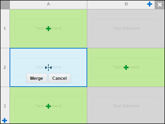
Click the cell(s) to merge with the selected cell. Cells that will be merged will be light-blue and have a merge cell icon on them.
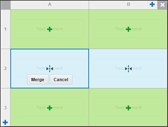
Click Merge to merge the cells.
A row that contains a merged cell cannot have a Loop or a Condition applied to it.
A column that contains a merged cell cannot have a Condition applied to it.
Merged cells must form a rectangle. For example, two cells in row one cannot merge with one cell in row two.
Splitting Merged Cells
When a cell that has been merged is selected in the Template Flow, the Split Cell button (![]() ) will appear in the Dynamic Content Bar. Clicking Split Cell will split the selected cells that were previously merged.
) will appear in the Dynamic Content Bar. Clicking Split Cell will split the selected cells that were previously merged.
Nested tables can be added within tables, enabling the display of hierarchical information in the output document. For example: Using nested tables, customers can create a quote format that includes a table within a table structure. They can create a table of configurations, where each configuration displays a table of products grouped and sub-totaled by product type (e.g. hardware, software, maintenance).
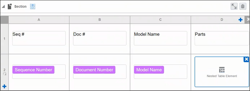
Administrators can add a nested table within a table by selecting a table cell and performing one of the following actions:
-
Double click the Table element in the Elements pane
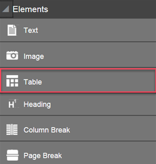
- Drag the Table element from the Elements pane to a cell within an existing table
-
Click the Table icon on the Palette

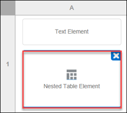
Once a nested table is added, the parent cell populates with "Nested Table Element" text.
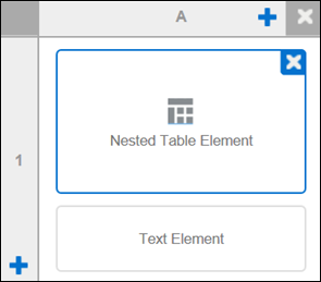
Notes:
- After merging parent table cells, administrators can add a nested table.
- Multiple nested tables are allowed in a single table cell.
- Nesting a table inside another nested table is not supported.
- Administrators can delete a nested table by hovering over it and clicking on the displayed “X”.
- Administrators can move a nested table to another cell of the parent table.
Administrators can open a nested table for editing by double clicking the Nested Table Element. This opens the Table pane where administrators can edit the table properties.
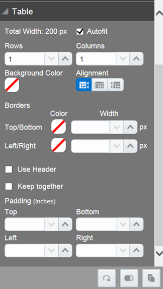
Notes:
- Nested tables inherit the properties of their parent table, including Background Color and Borders.
- The Autofit setting is a default setting for both nested tables and their parent table.
- Oracle recommends enabling the Autofit setting on the nested table to prevent the nested table's content from overflowing and cutting out from the output document if the total column width exceeds the parent cell's column width.
![]() View a Nested Table in Full View Mode
View a Nested Table in Full View Mode
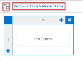
Administrators can view a nested table in Full View Mode by double clicking the Nested Table Element.
-
Double Click on Parent Cell to Open Full View Mode
-
Exit Full View Mode by Clicking Link in Full View Mode
Notes:
- "Section" (referenced above) refers to the default name of the section where the nested table is located. The name changes to whatever the administrator names the section.
- If a parent table is located in the header, footer, or body of the template, the link will reflect this. For example: Header > Table > Nested Table.
- In Full View Mode, administrators can delete a nested table by hovering over it and clicking on the displayed "X".
- Administrators can exit Full View Mode and return to the parent table by clicking the link or the Return to Layout icon (both outlined above in red).
![]() Apply Conditions and Loops to a Nested Table
Apply Conditions and Loops to a Nested Table
Administrators can loop over and apply conditions to nested tables.
Notes:
- Administrators can create a simple or advanced loop over a nested table in Document Designer. Only simple loops over nested tables are supported in Email Designer.
- Creating a loop over a nested table looks and operates the same as creating a loop over a parent table.
![]() Total Width and Auto-Adjust Table Width
Total Width and Auto-Adjust Table Width
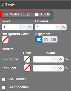
Total Width property and an Autofit property in the Table panel.
Autofit Property
The Autofit property is by default turned off. When administrators select the Autofit checkbox to turn the property on, the width of a table’s columns automatically adjusts to fit the table within the margins of the output document. This enhancement is useful in situations where administrators conditionally hide Document Designer table columns from the output document.
For example: When a table has five columns with each one set to 20% of the page, the table columns do not automatically expand to the full width of the page when two of the columns are conditionally hidden and the Autofit property is turned off. Selecting the Autofit checkbox addresses this scenario and ensures a table’s columns expand across the full width of the output document.
Total Width Property
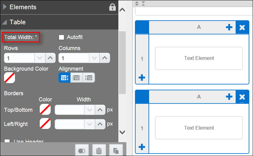
The Total Width property is a read-only property that displays the sum of the width of the columns in a table and the corresponding unit of measure. The Total Width property includes all columns in the table, even when the table includes conditionally hidden columns. This enhancement makes it easier for administrators to adjust the width of individual table columns when the Autofit property is disabled.
When administrators select multiple tables, an asterisk displays next to the Total Width property.
Heading Elements can be used to introduce new sections of content while creating an entry for the content area in the Table of Contents. Headings can only be added to Sections.
After a Heading Element has been dropped in the template, the Heading Element editor window will appear.
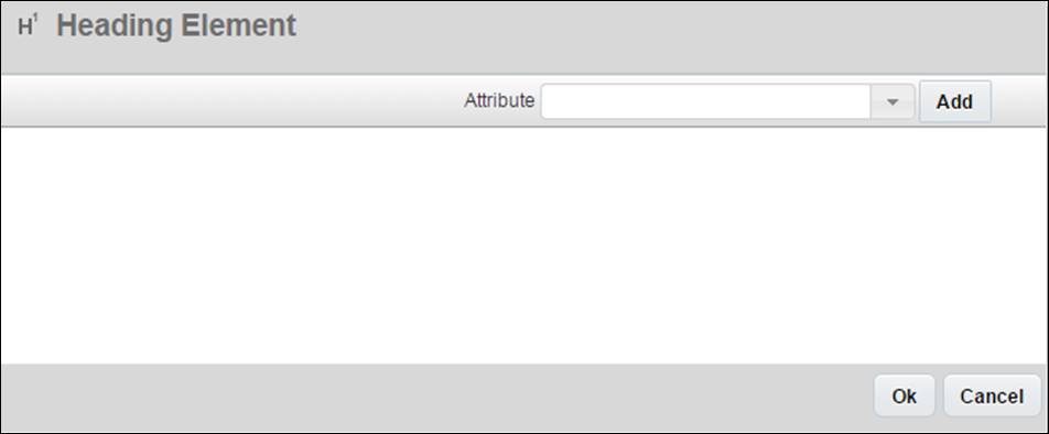
The name of the Heading can contain both static text and/or attribute values. For more information on adding attribute values, see the topic Document Designer and Attribute Values. Clicking OK will save the contents of the Heading Element. The Heading Element editor window can be reopened by double-clicking on the Heading Element within the Template Flow.
When a Heading Element is selected in the Template Flow, the following properties can be modified in the Properties pane:
| Property | Description |
|---|---|
|
Heading Style |
All Heading Style Sets and Heading Styles within each Heading Style Set will appear in the drop-down. Selecting different Heading Styles will affect the formatting of the Heading and possibly the template’s Table of Contents. For more information on Heading Style Sets and Heading Styles, see the topic Heading Styles and Style Sets. |
|
Reset Numbering |
When selected, the number of the Heading will reset to 1 (or i, I, a, or A depending on the Number Style of the Heading style) regardless of what number Heading it is within the Template Flow. For more information of Heading Style numbering, see the topic Heading Styles and Style Sets. |
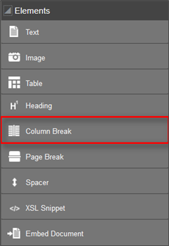
The column break element allows administrators to drag and drop one or more column break elements onto a section to start the content in the next column. In a section with only a single column, the column break behaves like a page break. Column break elements only display in Document Designer and are not visible to users in the output document.
The Column Break element is available in the Elements panel of Document Designer.
Page Break Elements can be added to a Section to specify when Elements should be split between different pages in the output. Page Breaks can only be added to Sections.
When a Page Break is added to the Template, all Elements below it in the Template Flow will begin on a new page in the output. Page Break Elements do not have any properties that can be modified in the Properties panel.
Spacer Elements create blank space between Elements. Spacers can be added to Sections and Header & Footers. Spacer Elements have two properties that can be modified in the Properties pane when the Spacer is selected; Height and Bind Elements.
The Height of a Spacer determines how much blank space the Spacer will create in the output. Height can be specified in inches, millimeters, centimeters, and pixels.
When Bind Elements is selected, the Element directly above and the Element directly below the Spacer in the Template Flow will appear on the same page in the output when possible. Spacers can have their height set to zero if two Elements need to appear on the same page, but no extra space is needed between them.
In the following example, a Heading Element should appear on the same page as the Text Element below it. To ensure this, Spacer Element is placed between the Heading and Text Elements, the Height of the Spacer is set to 0 inches, and Bind Elements is selected. In this scenario, the Heading and Text Elements will appear on the same page when possible. If the text is long enough that it must move to the next page, the header will move with it.

XSL Snippet Elements can be used to affect the output of the document by referencing XSL variables. XSL Snippets can be added to a Section, a Table cell, or a Header & Footer. For more information on XSL Snippets, see the topic Document Designer and XSL.
Embed Document Elements serve two distinct purposes:
- To embed a PDF document from the File Manager, a File Attachment attribute, or a URL in the PDF output of a template
- To add the contents of a Rich Text attribute to the template.
Embed Document Elements can only be added to Sections.
After an Embed Document Element has been dropped in the template, the Browse File Manager window will appear.
The admin can select a File Manager folder using the Select Folder drop-down to locate the correct PDF file. Only PDF files will be shown in the list, and each file can be viewed in a new window using the Preview (![]() ) button.
) button.
- To add a PDF that is in the File Manager to the Embed Document Element, select the PDF in the list and then click OK.
- To embed a PDF file that is stored in a File Attachment attribute or is accessed via a URL, click Cancel when the Browse File Manager window appears. With the Embed Document Element selected in the Template Flow, the Embed Document pane will show in the Properties panel.
- To add a PDF from a URL, select the PDF radio button and paste the URL file location into the PDF field.
- To add a PDF that is stored in a File Attachment attribute, select the File Attachment radio button and then select the desired attribute from the drop-down.
If there is no file present in the File Attachment attribute that is linked to an Embed Document Element upon printing of the document, nothing will show in the output where the embedded document would have been.
![]() Adding Rich Text Attribute Contents
Adding Rich Text Attribute Contents
The contents of Commerce Rich Text attributes can be added to the template through Embed Document Elements. The contents of a Rich Text attribute will not be given its own page(s) in the output, as an embedded PDF would, but will rather appear within the flow of the document amongst the other Elements around the Embed Document Element.
With the Embed Document Element selected, select the Rich Text radio button in the Properties pane and then select the desired Rich Text attribute from the drop-down in order to have the Embed Document Element reference the contents of a Rich Text attribute.
![]() Dynamically Embed External Documents
Dynamically Embed External Documents
In prior releases, administrators used the Document Designer Embed Document element to merge content from external PDF documents and content from RTE/HTML attributes with the output document. While sufficient for document merging when conditional logic is at the Transaction header level, limitations occur when factoring in Transaction line items.
For example: Administrators could only merge one document using the Embed Document element. As a result, they were required to put a condition on each instance of the element to ensure the document was merged only when the condition was true, which is usually to validate if a certain product is present in the Transaction.
Beginning in Release 18A, administrators can merge multiple external documents with the output document using a Document Map Attribute option in the Embed Document element. By dynamically embedding a document on the Transaction line item level, customers can select documents to include in the output file based on the products in the current Transaction.
Display Embedded Document References in a Transaction
Administrators can use a single select menu, multi-select menu, text area, or text field to display embedded document references in a Transaction. When setting up a single select menu or a multi-select menu to display embedded document references in a Transaction, the URL value comes from the variable name of the single select or multi-select menu. A unique variable name is required. As a result, administrators cannot enter more than one document with the same URL. URLs within the Commerce attribute in use have a semi-colon delimiter. The document URLs are merged from the text or menu attribute and all documents present in the attribute are merged with the output file.
Notes:
- Files from File Manager are listed in the following format: FILEMANAGER#<file_name.pdf>. Multiple files are separated by a semicolon.
- Only PDF files are supported and should be present in the setup. Merging occurs only for PDF formats and fails for other formats, such as DOCX.
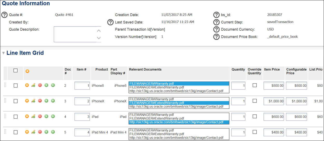
If sales representatives want to send a customer information about products in a Transaction, they can do so by adding a single Embed Document element with a Document Map Attribute to a Document Designer template. This allows them to preview and produce multiple documents based on one Document Map Attribute populated in the Transaction. In prior releases, administrators had to embed multiple Embed Document elements in the layout and apply conditions to each to achieve the same functionality.
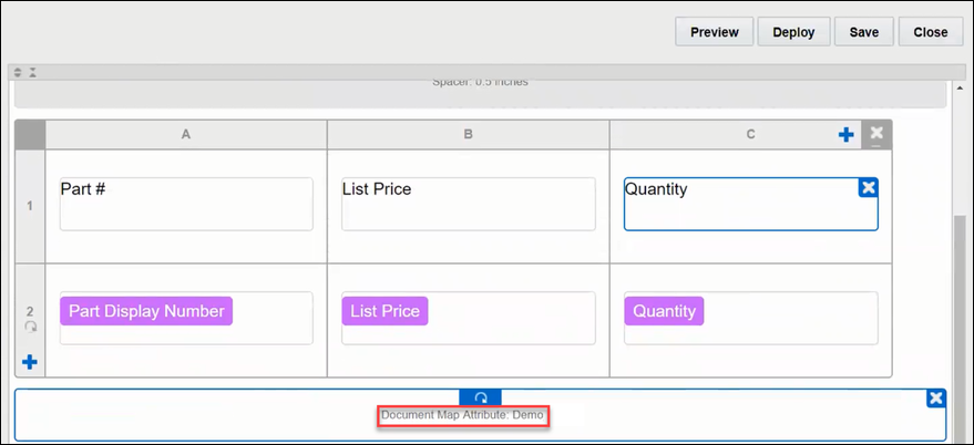
Administrators must add an Embed Document element with a Document Map Attribute to a Document Designer template. The Document Map Attribute must reference a text or menu attribute at the Transaction line item level. To accomplish this, a Document Map Attribute option is available in the Embed Document panel. By default, the drop-down menu displays only Transaction attributes of the Text and Menu type. From the drop-down menu, administrators must select a specific attribute to include in the template.
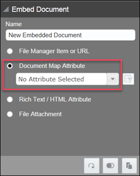
The following screenshot shows a Document Map Attribute (below the table) as it appears in Document Editor.
Notes:
- If an Embed Document element is properly placed inside a looped section, the Document Map Attribute will also display Transaction line attributes of the Text and Menu type.
- When an Embed Document element contains a Document Map Attribute that is a Transaction Line attribute, administrators can drag and drop the Embed Document element inside other looped sections.
- Administrators can copy and paste a section containing a Document Map Attribute.
- A Custom Variable is available in the Document Map Attribute drop-down. Once selected, a text field opens and allows the entry of a global XSL variable. Only one XSL variable is allowed, but it can contain multiple documents as long as they are separated by a semicolon. Unsupported file types (everything other than PDF) are ignored.
![]() Filter the Document Map Attribute
Filter the Document Map Attribute
As shown below, a filter for the Document Map Attribute is available in the Embed Document panel.
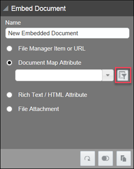
Upon clicking the filter button, a Conditional dialog opens and allows administrators to apply a condition to the Document Map Attribute. This narrows the number of documents merged in the output file and when previewing the output file in Document Designer. When no filter is applied, the output file will contain everything from the related Commerce text or menu attribute.

Notes:
- The filter allows administrators to use a new "_currentIndexValue" variable in the filter. Like any XSL, it must have a "$" before the variable name. For example: $_currentIndexValue
- The variable is not visible or available outside of the Document Map Attribute filter.
Administrators can view the Document Designer output file containing the merged external documents when previewing the output file. Any filter applied to the Document Map Attribute is reflected in the merged output file.
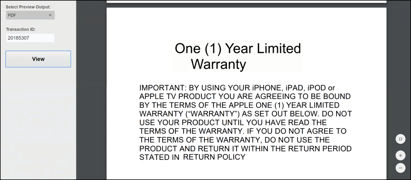
Sample Output File - Warranty Document Embedded in Transaction
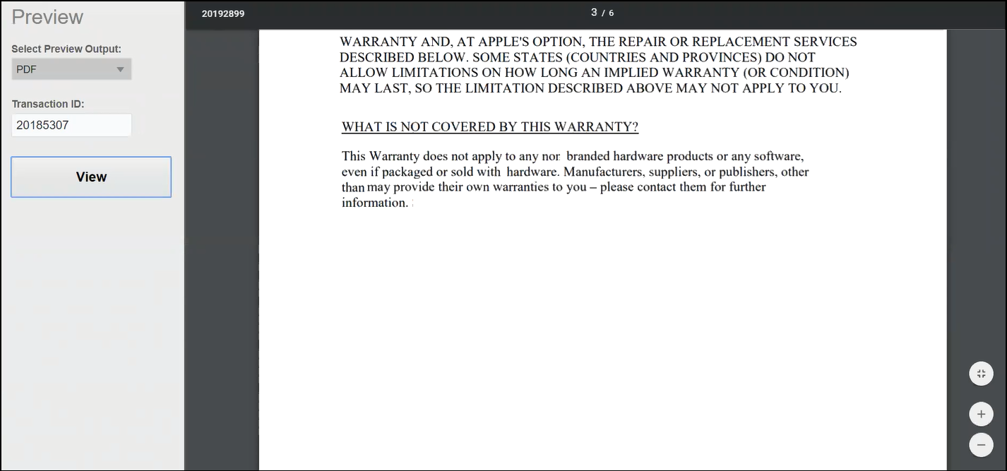
Sample Output File – Extended Warranty Document Embedded in Transaction
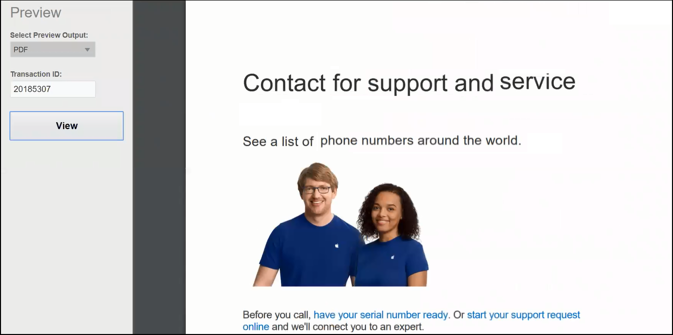
Sample Output File – Contact Document Embedded in Transaction
Refer to Supported Fonts to view a list of fonts that can be used in Text and Heading Elements:


