Overview
Elements hold the content of the email. Besides the Text Element that exists in the subject by default, Elements cannot be placed in the subject and must be placed in the body.
There are three Element types:
Text
Text Elements can hold both static text and dynamic attribute values. A Text Element exists in the subject by default, and additional Text Elements can be added to the body.
After a Text Element has been dropped in the template, the Text Element dialog box appears.
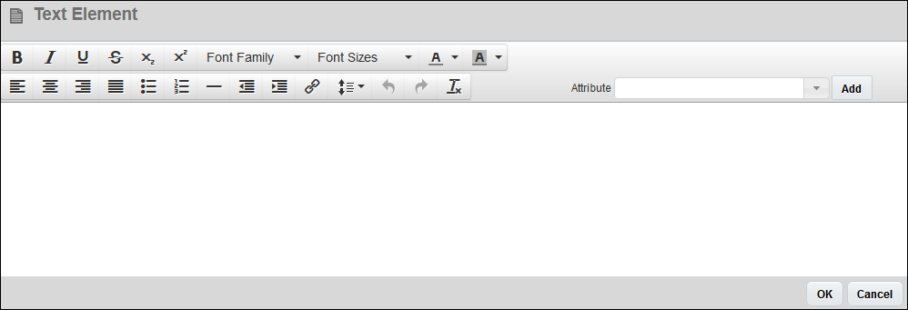
Text can be added and formatted within the Text Element dialog box.
| Element | Icon | Description |
|---|---|---|
| Font Formatting Icons |

|
Select text and click bold icon (B), italic icon (I), or underline icon (U). |
| Strike-through |

|
Select text and click strike-through icon to place a line through the selected text. |
| Sub and Superscript |

|
Select the text to be modified and click the Superscript or Subscript button to apply formatting. |
| Font Family |

|
Select a font family from the drop-down. The menu contains all supported fonts. The user's computer and/or email client will need the same fonts for the email to render properly. |
| Font Size |

|
Select a font size using the drop-down. All font sizes are defined in points (pt). |
| Font Color |

|
Select text and use the drop-down to select a font color. |
| Highlight |

|
Choose a color to highlight selected text. |
| Attributes |

|
Use filter and/or drop-down to add user or main-document attributes to the email body. |
| Alignment |

|
Select text and choose Align Left, Align Center, Align Right or Justify to apply to the text. |
| Bullets or Numbered List |

|
Select text and click the bulleted list or ordered list icon to apply formatting. |
| Horizontal Line |

|
Place your cursor in the editor and click horizontal line icon to add it to the template. |
| Indent and Outdent |

|
Select the text to indent or out-dent, or place your cursor on the line that needs to be indented/out-dented. |
| Undo and Redo |

|
Click the Undo button to undo the last action. Click the Redo button to redo an action you've undone. |
| Eraser |
|
Select text and click the eraser icon to remove text formatting. |
Clicking OK will save the contents of the Text Element dialog box. Reopen the dialog box by double-clicking on the Text Element within the Template Flow.
Attribute values can also be added to Text Elements. For more information on adding attribute values, see the topic Email Designer and Attribute Values.
When a Text Element is selected in the Template Flow, the following properties can be modified in the Properties pane:
| Property | Description |
|---|---|
|
Font |
The font of all text within the Text Element. If multiple fonts are used within the Text Element, an “*” will appear in the Font drop-down. Selecting a font will overwrite all font modifications that were made within the Text Element dialog box. |
|
Size |
The size of all text within the Text Element. If multiple sizes are used within the Text Element, an “*” will appear in the Size drop-down. Selecting a size will overwrite all size modifications that were made within the Text Element dialog box. |
|
Options |
Options include Font Color, Bold, Italics, and Clear Formatting. Changing any one of these options will affect all text within the Text Element. |
|
Line Spacing |
The line spacing between all lines in the Text Element. If multiple line spacing settings are used within the Text Element, an “*” will appear in the Line spacing drop-down. Selecting a Line spacing setting will overwrite all line spacing modifications that were made within the Text Element dialog box. |
|
Padding |
The space between the Text Element and other Elements (when defined for Top and Bottom) and between the Text Element and the margins of the email (when defined for Left or Right). If the Text is inside a Table cell, margins will determine the distance between the Element and the borders of the cell. |
Images
Image Elements can reference images stored in the File Manager, images stored in Commerce File Attachment attributes, or external images. Images can be added to the Body.
After an Image Element has been dropped in the template, the Browse File Manager dialog box will appear.
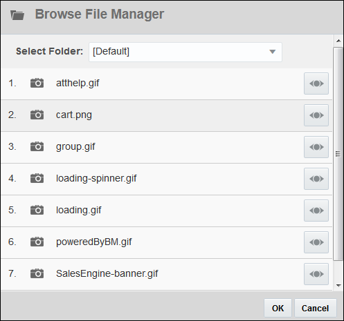
Select a File Manager folder using the Select Folder drop-down to locate the correct image. Images can be viewed in a new window using the Preview (![]() ) button. To add a File Manager image to the Image Element, select the image from the list and then click OK.
) button. To add a File Manager image to the Image Element, select the image from the list and then click OK.
To use an image that is stored in a File Attachment attribute, click Cancel when the Browse File Manager dialog box appears. With the Image selected in the Template Flow, the Image Properties pane will show in the Properties panel. From the Attribute (Default) drop-down, select the File Attachment attribute for the Image Element to pull from.
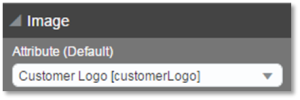
To use an external image, click Cancel when the Browse File Manager dialog box appears. With the Image selected in the Template Flow, the Image Properties pane will show in the Properties panel. Enter the external image’s full URL into the Image URL field.
An Image Element linked to a File Attachment attribute can also have a File Manager image or an external image associated with it as a backup. The Image Element will always show the image in the File Attachment attribute if one is present, but if the File Attachment attribute is empty, the Image Element will show the associated File Manager image or external image.
If the file in the File Attachment attribute is not an image file (for example, a PDF), the associated File Manager image or external image will show in the output.
If there is no image present in a File Attachment attribute that is linked to an Image Element and no File Manager image is associated with the Image Element, nothing will show in the output where the Image Element would have been.
When an Image Element is selected in the Template Flow, the following properties can be modified in the Properties pane:
| Property | Description |
|---|---|
|
Attribute (Default) |
The File Attachment attribute where the image that will be displayed in the output is stored. |
|
Image URL |
The URL of the external image or the File Manager image that will be displayed in the output. If a File Manager image is selected, the “URL” will display with the syntax The Browse File Manager button appears to the right of the Image URL field, and can be used to open the Browse File Manager dialog box to select an image from the File Manager. |
|
Height |
When set to Auto, the height of the image will be the actual height of the image file. The height can also be set to a certain number of pixels (PX) or to a percentage (%) of the vertical margins of the email or the percentage of the height of a Table cell that the Image Element is within. |
|
Width |
When set to Auto, the width of the image will be the actual width of the image file. The width can also be set to a certain number of pixels (PX) or to a percentage (%) of the horizontal margins of the page or the percentage of the width of a Table cell that the Image Element is within. |
|
Alignment Options |
Where the image is aligned on the email. For example, left-aligned, centered, or right-aligned. |
|
Margins |
The space between the Image Element and other Elements (when defined for Top and Bottom) and between the Image Element and the margins of the email (when defined for Left or Right). If the Image is inside a Table cell, margins will determine the distance between the Element and the borders of the cell. |
Width (%) displays the image that percentage wide, relative to the column it is in. So, in a column with 100px, an image width of 50% would make the image 50px wide.
Height (%) does not affect the image. It will stay at its native height because HTML tables have no height definition in rows, so there is nothing for the % to work against. Use pixels to change the height of an Image.
Click the Condition button ( ![]() ) in the Dynamic Content Bar to add a Condition to the Image. For more information, see the topic Email Designer and Conditions.
) in the Dynamic Content Bar to add a Condition to the Image. For more information, see the topic Email Designer and Conditions.
Tables
Table Elements can be used to organize content and present it in a logical way to the reader of the email. Tables can be placed in the Body.
When a Table Element is added to the template, by default the Table will have one row and one column. Additional rows and columns can be added by clicking the Add Row or Add Column icons ( ), located within the bottommost row and rightmost column, respectively, or by modifying the Rows and Columns fields in the Properties pane. Both rows and columns can be rearranged within a Table via drag and drop.
By default, each cell in a Table will contain a Text Element. That Text Element can be modified or removed from the cell, and Text and Image Elements can be added to the cell using drag and drop. Once content has been added to a Text or Image Element within the Table, the content will be visible in the Table. You can drag and drop content from one Text or Image Element in the Table to another cell or to another Table in the Template Flow.
Tables cannot be nested; that is, one Table cannot be inside another.
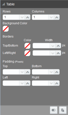
When a Table is selected in the Template Flow, the following properties can be modified in the Properties pane:
| Property | Description |
|---|---|
|
Rows |
The number of rows in the Table. The default is 1. |
|
Columns |
The number of columns in the Table. The default is 1. |
|
Background Color |
The background color of all cells within the Table. Applies to every cell in the Table. |
|
Borders |
The color and width (in pixels) of borders within the Table. |
|
Padding |
The space between the borders of the cells within the Table and the Elements within the cells. |
-
Click the
 icon to add a Column to the Table.
 - When a Column is selected, its border and Column header are highlighted blue.
- Columns can be individually dragged and dropped by clicking a Column header bar, dragging it to a new location within the same Table, and releasing the Column.
- Remove rows by selecting the row and clicking
 in the Properties pane.
- When a column is selected in the Template Flow, the Clear Column button (
 ) will appear in the Dynamic Content Bar. Clicking Clear Column will clear all contents from all cells in the column.
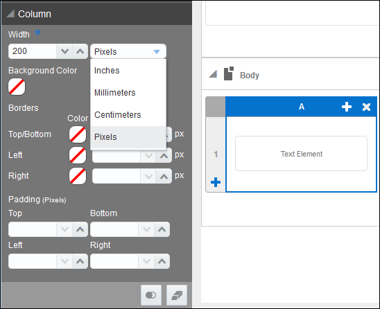
When a Column is selected in the Template Flow, the following properties can be modified in the Properties pane:
| Property | Description |
|---|---|
|
Width |
The width of the Table column, in inches, millimeters, centimeters, and pixels. All columns in a Table must use the same units for width. Changes to the width unit for a single column will apply to all columns in the same Table. |
|
Background Color |
The background color of all cells within the column. Applies to every cell in the column. |
|
Borders |
The color and width (in pixels) of the column’s borders. Adjacent borders on the same level will overwrite each other. For example, if you edit the border of column A, it will change the left border of column B, because they are the same. |
|
Padding |
The space between the borders of the cells within the column and the Elements within the cells. |
-
Click the
 icon to add a Row to the Table.
 - When a Row is selected, its border and Row number is highlighted blue.
- Rows can be individually dragged & dropped by clicking a Row header bar, dragging it to a new location within the same Table, and releasing the Row.
- Remove rows by selecting the row and clicking
 in the Properties pane.
 -
When a row is selected in the Template Flow, the Clear Row button (
 ) will appear in the Dynamic Content Bar. Clicking Clear Row will clear all contents from all cells in the row.
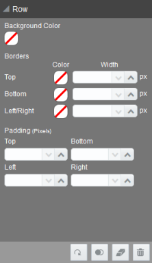
When a row is selected in the Template Flow, the following properties can be modified in the Properties pane:
| Property | Description |
|---|---|
|
Background Color |
The background color of all cells within the row. Applies to every cell in the row. |
|
Borders |
The color and width (in pixels) of the row’s borders. Adjacent borders on the same level will overwrite each other. For example, if you edit the bottom border of row 1, it will change the top border of row 2, because they are the same. |
|
Padding |
The space between the borders of the cells within the row and the Elements within the cells. |
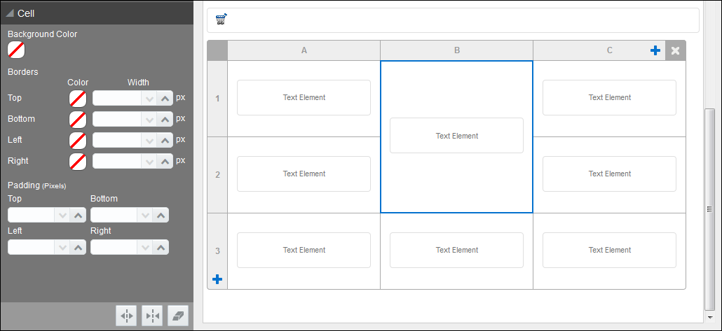
- When a Cell is selected, its border is highlighted blue. Elements within a Cell are indicated by an individual highlighted blue border.
- When a cell is selected in the Template Flow, the Clear Cell button (
 ) will appear in the Dynamic Content Bar. Clicking Clear Cell will clear all contents from the cell.
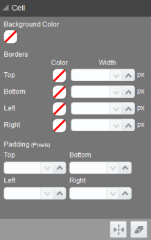
When a cell is selected in the Template Flow, the following properties can be modified in the Properties pane:
| Property | Description |
|---|---|
|
Background Color |
The background color of the cell. |
|
Borders |
The color and width (in pixels) of the cell’s borders. Adjacent borders on the same level will overwrite each other. |
|
Padding |
The space between the borders of the cell and the Elements within the cell. |
Working with Cells
When a cell is selected in the Template Flow, the Merge Cell button ( ![]() ) will appear in the Dynamic Content Bar. Clicking Merge Cell will bring up the Merge Cell overlay.
) will appear in the Dynamic Content Bar. Clicking Merge Cell will bring up the Merge Cell overlay.
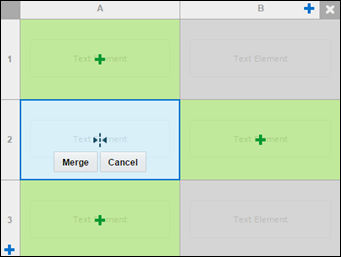
Click the cell(s) to merge with the selected cell. Cells that will be merged will be light-blue and have a merge cell icon on them.
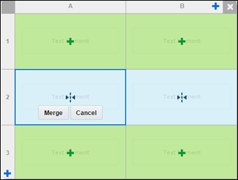
Click Merge to merge the cells.
A column that contains a merged cell cannot have a Condition applied to it.
When a cell that has been merged is selected in the Template Flow, the Split Cell button ( ![]() ) will appear in the Dynamic Content Bar. Clicking Split Cell will split the selected cells that were previously merged.
) will appear in the Dynamic Content Bar. Clicking Split Cell will split the selected cells that were previously merged.


