Overview
Single Select and Multi Select Menu attribute types are only available for Text, Float, and Integer attribute data types. These menus can also be displayed as image menus. The following sections show the different display options available for menu attributes on the JET Configuration UI.
Single Select Menus allow end users to select a single option from a list of options that are pre-defined by an administrator. The following display types are available: Select Choice, Radio Button Horizontal, and Radio Button Vertical.
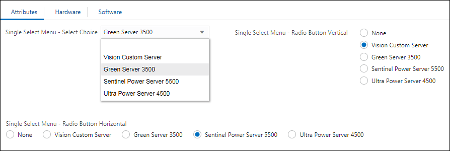
Multi-Select Menus allow end users to select multiple options from a list of options that are pre-defined by an administrator. The following display types are available: Select Choice, Checkbox Horizontal, and Checkbox Vertical
Note: When a user selects items from the Select Choice menu the options are removed from the drop-down list. The user can click on the "x" on the right side of the selected items to deselect an item. After an item is deselected it is added back into the drop-down list.

Cardinality for Multi-Select Menu Attributes
Beginning in Oracle CPQ 24D, administrators can define cardinality options for Configuration Multi-Select Menu attributes to control the minimum and maximum number of menu items an end user can select. Sales users will receive an error message if they attempt to select a number of menu options that fall outside of the defined range. Once the maximum number of selections is reached, the remaining selections are disabled and grayed out.
The cardinality setting for Multi-Select Menus makes it easier for administrators to define minimum and maximum number of selectable items. This will reduce the need to define Configuration Constraint Rules to govern cardinality in these objects.
In Oracle CPQ, you can display images next to an attribute, as well as show menu values as images instead of text. This allows users to choose a menu value by clicking on the image. Image Menus are available for both array and non-array type single-select menus, multi-select menus, and single select pick lists.
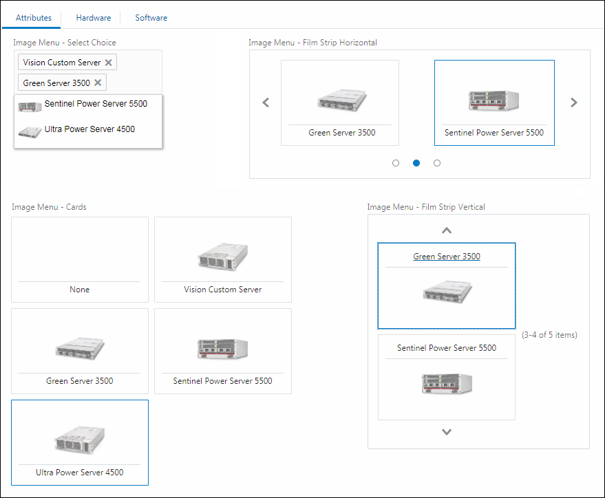
JET Display Type Select Choice, Cards, Film Strip Horizontal, and Film Strip Vertical options are available when Image Menus are enabled for Single Select Menus, Multi Select Menus, or Single Select Pick Lists.
-
Select Choice - Allows for display of images in the list of options. Once selected, only the display name of the selected option is shown in the attribute field.
Notes:
-
When a user selects items from the Select Choice menu the options are removed from the drop-down list. The user can click on the "x" on the right side of the selected items to deselect an item. After an item is deselected it is added back into the drop-down list. Also note that the images for the Select Choice menu are not displayed for selected items, they are only displayed in the drop-down list.
-
Array type attributes only allow the Select Choice option.
-
-
Cards - Allows for display of all or most images at all times. Once selected, the card visually indicates that it is selected.
-
Film Strips Horizontal and Film Strip Vertical - The Film Strip expands in size to show as many images as space allows, making it ideal for mobile users. Film Strip can be set in the Attribute definitions to show horizontally or vertically.
Single Select Menus: Single Select Menu, Radio Button Horizontal, and Radio Button Vertical
The following image shows the Legacy Display Types for Single Select Menus.
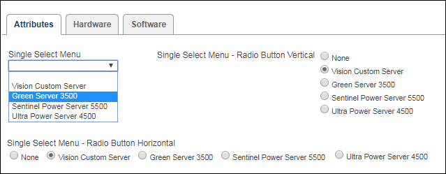
Multi Select Menus: Multi Select Menu, Checkbox Horizontal, and Checkbox Vertical
The following image shows the Legacy Display Types for Multi Select Menus.
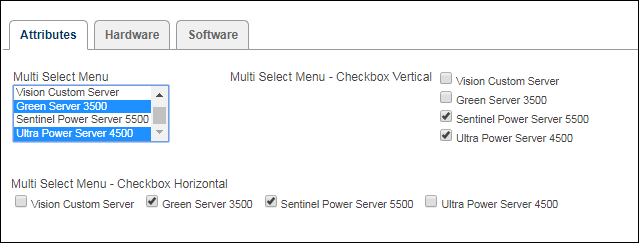
Image Menus - Legacy Display Type Drop-down Menu and Grid options are available when Image Menus are enabled for Single Select Menus, Multi Select Menus, or Single Select Pick Lists.
-
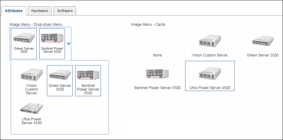
Drop-down Menu - Images are displayed compactly in a menu box that is only visible when selecting. This is typically used when Users need to see a visualization while making their selection, but otherwise it is preferred to keep this attribute compact.
- Grid - All images are displayed in a grid format on the layout. This is typically used when Users need to see a visualization while making their selection and to see that selection even after making their choice.
Note: Array type attributes only allow the Single Select Menu option.
The following image shows the Legacy Display Type Image Menus. The Drop-down Menu is a Multi Select Menu and the user can select multiple items from the drop-down. The Grid is a Single Select Menu and only one item can be selected.
-
Attribute Value Pricing
Attribute Value Pricing (AVP) is an easy way to maintain pricing, instead of creating a pricing rule for each attribute. Administrators can associate static prices with the values of a menu type configuration attribute, so that these prices can be displayed to the user when they select the menu values on the Model Configuration page. A unique aspect of attribute value pricing is the ability to update the price totals of a configurable item instantly, without refreshing the page. ![]() View more information for AVP
View more information for AVP
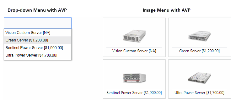
AVP highlights
- AVP is available for multi-select and single-select attributes for all data types, including array type single-select menu attributes.
- Static prices affect the final price of a product, much like pricing rules, and are also carried over as component prices to Commerce.
-
On the user side, the static prices can be displayed in the pricing section along with other pricing rules.
You can choose to include the static price in the total price and/or display it in the other prices section.
Administration
![]() Add a Single Select or Multi Select Menu Attribute
Add a Single Select or Multi Select Menu Attribute 
-
Navigate to Admin Home page.
-
Click Catalog Definition in the Products section.
-
Navigate to the applicable configuration item (All Product Families, Product Family, Product Line, or Model)
-
Select Attributes from the applicable Navigation drop-down, and then click List.
-
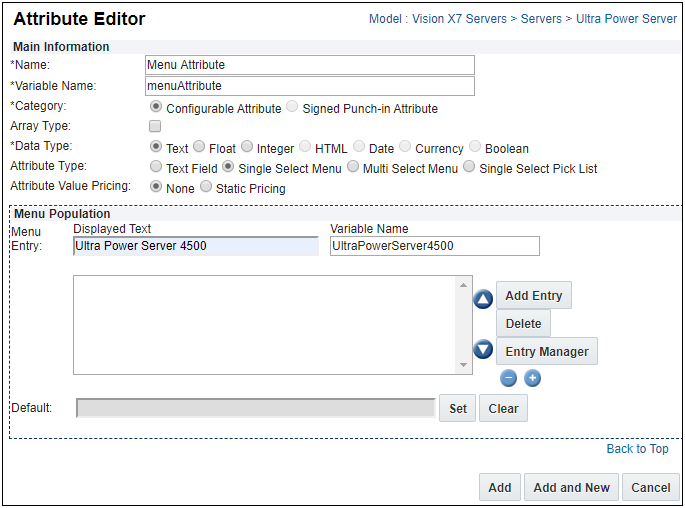
Click Add. The Attribute Editor page opens.
-
Enter information for the fields listed below.
Note: Fields preceded by an asterisk (*) are required.
Field Description *Name
Enter the attribute name.
*Variable Name
The Variable Name field populates automatically. Variable names can only contain alpha-numeric characters and underscores. The entry can be changed before saving, but after saving the value is read-only.
Note: Customers should not use any of the following names for Configuration attribute variable names. Using these values may cause issues with customer configurations and could possibly alter site functionality.
action_idbm_cm_process_id_bom_bs_idcommerce_doc_url_paramscommerce_list_iddocument_iddocument_numberfolder_idformactionfrom_configscrollTopshopping_cart_idstep_idtokenversion_id
*Category Select Configurable Attribute.
Array Type
Select this checkbox if the attribute can be used as a column in an array set.
*Data Type
Select Text, Float, or Integer.
The Image Menu option does not appear when an attribute is being created. It only appears in an attribute that has been saved during creation, or has been re-opened.Attribute Type
Select Single Select Menu or Multi Select Menu.
Refer to Single Select Pick Lists to add or edit Single Select Pick Lists:
Average Value Pricing
Select Static Pricing to enable Attribute Value Pricing functionality.
For more information, see the topic Attribute Value Pricing (AVP).
-
Enter menu items in the Menu Population section.
You must create at least one menu entry before you can save menu attributes. -
Enter a value for Displayed Text.
The Variable Name field populates automatically. Variable names can only contain alpha-numeric characters and underscores. The entry can be changed before saving, but after saving the value is read-only.
-
Click Add Entry.
The values you entered for Displayed Text and Variable Name appear in the list.
- Click Entry Manager or Show Entry Details to edit the order of the menu attribute, change the menu display names, or add images to each menu value.
- Set a Default menu value by selecting a menu value and clicking Set.
-
Click one of the following:
- Cancel to return to the Attributes List page without saving changes.
- Add and New to save changes and create another attribute.
- Add to save changes and open the Menu Attribute Editor, proceed to Edit a Single Select or Multi-Select Menu Attribute.
![]() Edit a Single Select or Multi Select Menu Attribute
Edit a Single Select or Multi Select Menu Attribute 
-
Navigate to Admin Home page.
-
Click Catalog Definition in the Products section.
-
Navigate to the applicable configuration item (All Product Families, Product Family, Product Line, or Model)
-
Select Attributes from the applicable Navigation drop-down, and then click List.
-
Click on the applicable attribute..
-
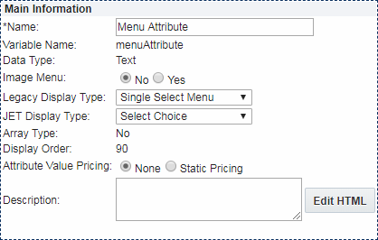
Edit information in the following sections, as required.
Field Description Name
The name of the attribute
The Name value appears as the attribute label when this item is added to a Configuration layout.Image Menu
Select Yes to enable Image Menus.
Individual images are added in the Menu Population section and display options are set in the Image Properties section.
Display Type
The following Display Types are available:
-
Legacy Display Type:
- Single Select Menus without Image Menus:
Single Select Menu, Radio Button Horizontal, Radio Button Vertical - Multi Select Menus without Image Menus:
Multi Select Menu, Checkbox Horizontal, Checkbox Vertical -
Image Menus Enabled: Drop-down Menu and Grid
Note: Array type attributes only allow the Single Select Menu option.
- Single Select Menus without Image Menus:
-
JET Display Type:
- Single Select Menus without Image Menus:
Select Choice, Film Strip Horizontal, Film Strip Vertical, Cards, Radio Button Horizontal, Radio Button Vertical - Multi Select Menus without Image Menus:
Select Choice, Film Strip Horizontal, Film Strip Vertical, Cards, Checkbox Horizontal, Checkbox Vertical -
Image Menus Enabled:
Select Choice, Film Strip Horizontal, Film Strip Vertical, CardsNote: Array type attributes only allow the Select Choice option.
- Single Select Menus without Image Menus:
Average Value Pricing
Select Static Pricing to enable Attribute Value Pricing functionality.
For more information, see the topic Attribute Value Pricing (AVP).
Description
The attribute description.
When an attribute Help Icon is displayed on a layout, the description appears when the user hovers over the help icon. Refer to Help Icons for more information.
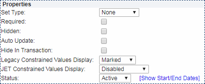
Field Description Set Type - None: The user can input any value without encountering an error message.
-
Set: A recommendation rule can change the value entered by the user unless the attribute is locked by the user.
-
Auto Lock - When Auto Lock is on, user selections made to an attribute after a Recommendation rule “Set” the attribute to a different value will be retained if the Recommendation Rule is fired again (such as upon an Update).
 Auto Lock Example
- Recommendation rule 1 runs and sets Attribute X to A. The user then sets Attribute X to B. The user then clicks Update, and Attribute X retains its value of B. The recommendation message defined in Recommendation rule 1 for option A will appear.
- Auto Lock is on by default for all Recommendation rules that have a set type of “Set.” The Admin can turn Auto Lock off within an attribute by selecting “Set” for the set type and by not selecting Auto Lock. If this were done to Attribute X, the user would experience the following:
- Recommendation rule 1 runs and sets Attribute X to A. The user then sets Attribute X to B. The user then clicks Update, and Recommendation rule 1 runs and sets Attribute X to A.
-
- Forced Set: A recommendation rule will change the value of the attributes regardless of what the user enters and if the attribute is locked or not.
Required
This will require the user to enter a value before proceeding to a commerce transaction.
Hidden This attribute will not appear to the user. It can be used in rules.
Auto Update This will by updated by the system without the user invoking an action.
Legacy Constrained Values Display:
- Removed: Constrained attribute values will be removed from the menu.
- Marked: Constrained attribute values will be marked with an asterisk (*) in the menu.
- Normal: Constrained attribute values will appear in menus without being marked.
JET Constrained Values Display:
- Disabled: Constrained attribute values will be disabled.
- Removed: Constrained attribute values will be removed from the menu.
- Normal: Constrained attribute values will appear in menus without being marked.
-
Strike Through: Constrained attribute values will be struck through (i.e. crossed out).
The Strike Through option is not available for Image Menus.
Hide Transaction
This attribute is hidden within a commerce document.
Status
-
Active: An attribute that is active will appear to the buyer and/or be included in rules.
All attributes are active by default.
- Inactive: An inactive attribute cannot appear in a rule to the user.
- Internal: An internal attribute will only appear to FullAccess users.
-
Show Start/End Dates: Click to specify how long the attribute will remain in the chosen status.
If no duration is specified, the attribute maintains its status until the administrator changes it.
 Attribute Value Pricing (Attribute Value Pricing Properties and Menu Entry Prices appear when Average Value Pricing is set to Static Pricing)
-
Set Attribute Value Pricing Properties
- Pricing Display Options: Choose None if you don't want to display the attribute value price or choose Show Pricing Next to Attribute Values.
-
Display Price at Bottom to User: Select to display the attribute value price in the Price section on the configuration layout.
Depending on the configuration layout you've chosen, this might not be at the bottom.
-
Include in Total Price: Select to include the attribute value price in the Grand Total in the Price section on the configuration layout.
Zero static price is not shown in the Pricing Section - If the AVP price for a menu attribute is zero, then this price is not shown in the pricing section.
-
Add pricing in Menu Population section.
- Create new menu values and add pricing for each available currency.
-
Click Entry Manager to add a price to individual menu values.

- When AVP price is not given for a certain currency and exchanges rates are not defined, the user is shown the message that the price is not defined.
- Negative prices are not supported.
- When a newly added currency is assigned to an AVP attribute and the new currency is not enabled prior to migration, the AVP value for that currency does not migrate.
- When AVP price is not given for a certain currency, the price for that currency is calculated using the AVP price in the base currency and the defined exchange rate.
- Attributes displayed on the Search Flow and subsequently on the Configuration Flow exhibit AVP pricing behavior based on the value retained from the Search Flow.
- The user cannot save changes to the value of this attribute.
- It is recommended that the FullAccess user either hide the attributes carried over from the search flow or make them read-only for the benefit of the end user.
 Image Menu Properties (Image Menu Properties appear when Image Menus are enabled)
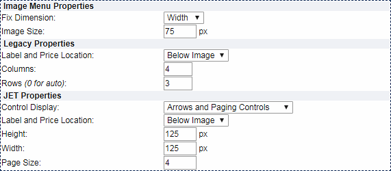
Image Menu Properties
-
Fix Dimension: Base the image size on Height or Width.
The images will be auto-scaled to preserve the proportions of the image to fit the layout.
-
Image Size: Set the image size in pixels.
Create your images in a size similar to the one in which they will be displayed, to keep the image dimensions consistent and avoid distortion.
Legacy Properties
-
Label and Price Location: Select: Above Image, Below Image, or Hover
Sets where the menu item labels and the optional attribute value prices are displayed.
 View location examples
-
Rows and Columns: Set the number of Rows and/or Columns.
If Rows are set to "0", the number of rows will be auto-populated based on the number of columns.
- To display 12 menu items in rows of 3, enter 3 for Columns.
- To display just the first 2 rows, instead of displaying all 4 rows, set the number of Rows to 2. The image menu will contain a scroll bar so users can scroll to view the rest of the rows.
- To display 12 menu items in rows of 3, enter 3 for Columns.
JET Properties
-
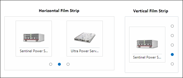
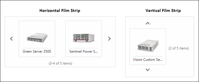
Control Display: Set film strip pagination controls
*Available for Film Strip Horizontal and Film Strip Vertical
 View Arrow and Paging Controls example
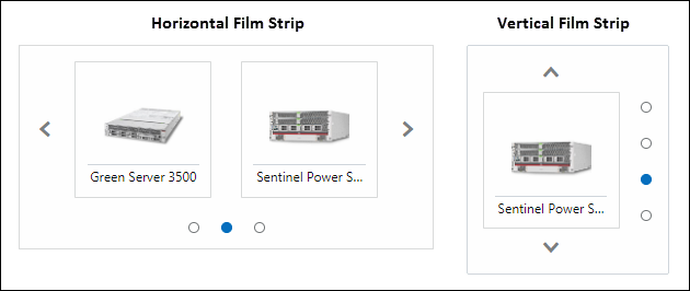
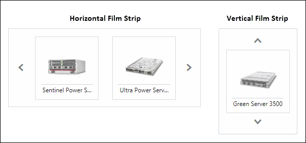
 View Arrows and Paging Information example
-
Label and Price Location: Select: Above Image, Below Image, or Hover
Sets where the menu item labels and the optional attribute value prices are displayed.
 View location examples
-
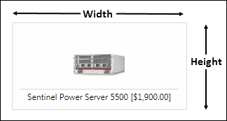
Height and Width: Set the image frame size
 View frame size example
*Available for: Film Strip Horizontal, Film Strip Vertical, Cards
-
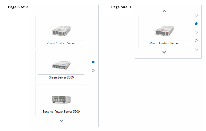
Page Size: Set the number of frames displayed in the vertical film strip
 View page size example
*Available for Film Strip Vertical

-
Enter menu items
-
Enter a value for Displayed Text.
The Variable Name field populates automatically. Variable names can only contain alpha-numeric characters and underscores. The entry can be changed before saving, but after saving the value is read-only.
-
Click Add Entry.
The values you entered for Displayed Text and Variable Name appear in the list.
- Click Entry Manager or Show Entry Details to edit the order of the menu attribute, change the menu display names, or add images to each menu value.
- Set a Default menu value by selecting a menu value and clicking Set.
-
-
(Optional) If desired define cardinality. Only available for Multi-Select Menus
-
Select Cardinality form the Validation drop-down.
-
Enter the desired values for the Min Selectable Items and/or Max Selectable Items.

Valid values:
-
Any positive, non-zero integer that doesn't exceed the total number of associated menu entries.
-
Blank values - Blank means there either is no min or max depending on the field(s) left blank.
-
-
-
(Optional) Add images for Image Menus.
Images can be added using the Entry Manager or Entry Details.
Make sure your images have already been uploaded to the File Manager.-
Entry Manager Method
-
In the Menu Population section, click Entry Manager.
If you get a message about saving attributes, click OK.
The Menu Items List page opens.
-
For each Menu Item, click Browse to search the File Manager and select the image you'd like to correspond with your menu value.
Click Clear to clear an existing image.
- Click Apply to save changes and remain on the Menu Items List page, click Update to save changes and return to the Configurable Attributes Administration List Menu Attribute Editor.
-
-
Entry Details Method
- In the Menu Population section, select a Menu Item and click Show Entry Details.
-
Click Browse to search the File Manager and select the image you'd like to correspond with your menu value.
-
Click Clear to clear an existing image.
-
-
-
Select one of the following options:
-
If translations are required, click Translations and provide translated values for the label and description fields.
- Click Apply to save changes and remain on the Attribute Editor page.
-
Click Update to save changes and return to the Configurable Attributes Administration List.
-
Click Update and New to define another attribute.
-
Click Back to return to the Configurable Attributes Administration List without saving changes.
-
Use Case
![]() Override Constrained Value Display
Override Constrained Value Display
Customers can constrain the same Configurable Attribute differently depending on different conditions. Administrators can override the "Constrained Value Display" option defined in single select and multi-select menu-type configurable attributes within the action area of a constraint rule. For example, a customer has two constraint rules that have different Override Constrained Values Display options. The first constraint rule has the Override Constrained Values Display set to Disabled for "Sports" and "Luxury" vehicle values when the "Outright SUV buy" option is selected.
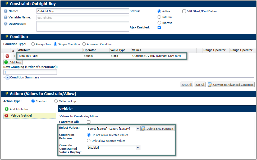
When a sales user chooses the "Outright SUV buy" option, the Sports and Luxury options are grayed out (i.e. disabled).

The second constraint rule has the Override Constrained Values Display set to Normal and user message displayed for the "Luxury" vehicle value when the "SUV Lease" option is selected and the "Expense Limit" is less than $1000.
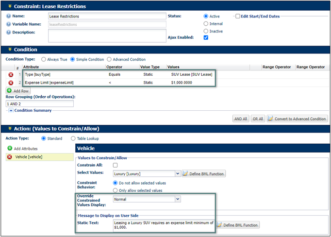
When a sales user chooses the "SUV Lease" option, sets the "Expense Limit to $500, and selects the Luxury option, the option appears normal, but the vehicle options are outlined in red to indicate an error and the defined error message is displayed.
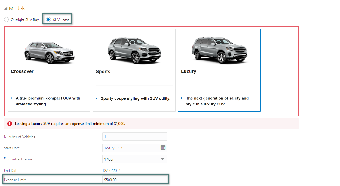
The Constrained Value Display Override is applied from the last constraint rule executed on the attribute. The order is defined by the order of the rules on the Constraint: Rules List page.
Notes
- NULL and blank Integer values are treated as separate values:
- NULL= 0
- Blank = ""
- Using NULL as an attribute value is strongly discouraged.
- If you use logic that tests for NULL values in rule conditions or BML, confirm that the logic takes this difference into account.
Best Practices
-
Have as few attributes "auto-update" as possible.
-
The number of total menu entries should be less than 65536 in order to prevent issues during granular migration.
-
When using Single Select Menus, Multi-Select Menus, or Single Select Pick Lists in a BOM Mapping implementation CPQ recommends that all menu option values are mapped in the BOM Item Mapping table to ensure proper operation.
For more information, refer to BOM Item Mapping Table and BOM Mapping Implementation Resources.
Notes:
-
Overrides can be applied to single select and multi-select menu type attributes in new and existing constraint rules.
-
The Constrained Values Display Override is only available for the JET Configuration UI.


