Overview
The Commerce Layout Editor provides the same functionality as the previous editors combined with improved usability. The new Commerce Layout Editor provides administrators with a simple and intuitive way to create and edit JET and legacy Transaction UI pages within Oracle CPQ. This editor provides the groundwork for a common user experience across all Oracle CPQ administration pages.
The editor contains a layout panel and a collapsible side panel. Administrators can easily select items from the side panel and drag-and-drop the item into layout.
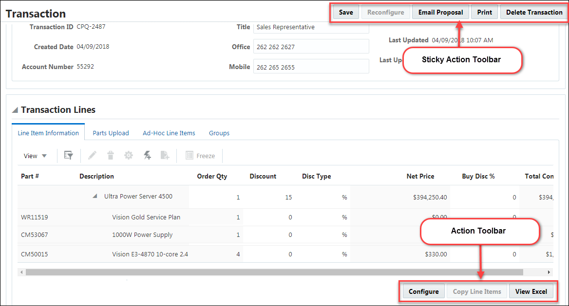
The following image illustrates how layout elements are displayed on the user side Transaction page.
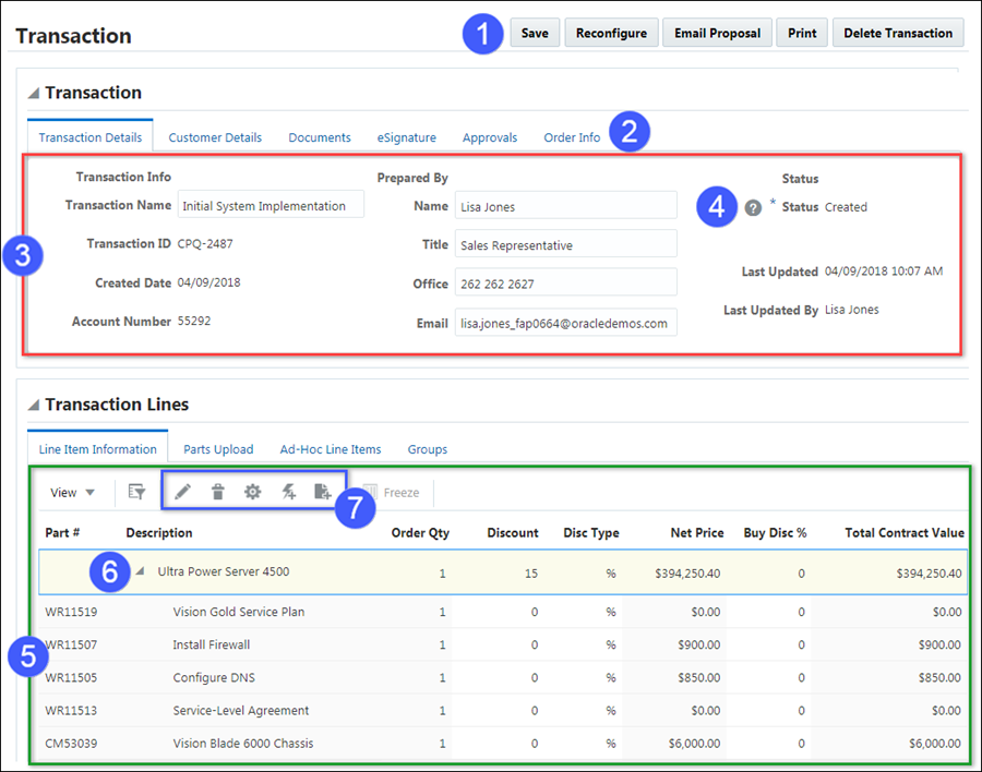
| Item | Description |
|---|---|
| 1 |
Action Bar |
| 2 |
Tabs |
| 3 |
Panel |
| 4 |
Help Icon |
| 5 |
Line Item Grid |
| 6 |
Collapse Line Items |
| 7 |
Enhanced Action Icons |
JET Transaction UI Line Item Grid Action Icons
| Action | Icon | Description |
|---|---|---|
| Edit |
|
Allows user to view and edit the sub-document. |
|
Remove Line Item |
|
Allows user to remove highlighted line items if the line items aren't mandatory. |
| Reconfigure |
|
Takes user back to a model configuration. |
| Quick Add |
|
Opens the Quick Add window. |
| Advanced Add From Catalog |
|
Add to Catalog type action with advanced destination rules. |


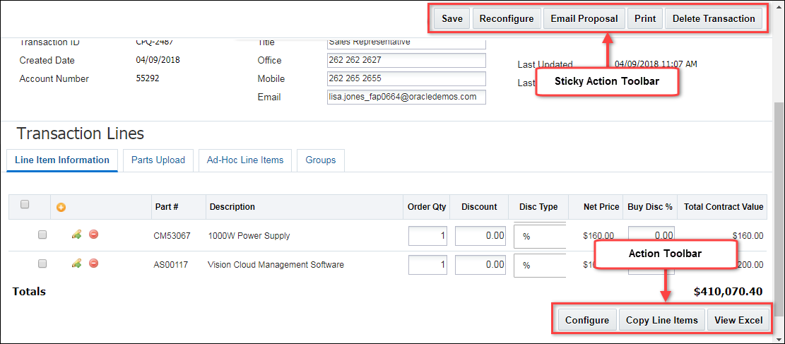
 Legacy User Side Transaction UI
The following image shows how layout elements are displayed on the user side Transaction UI.
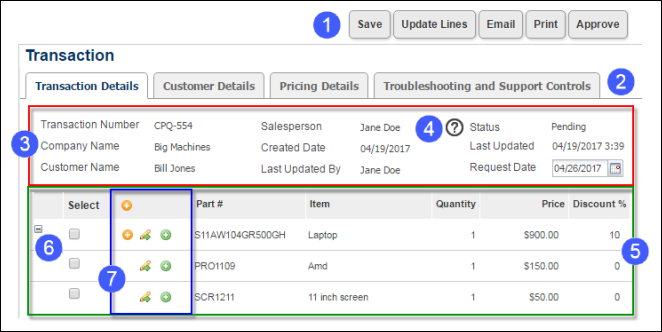
| User Side Elements | |
|---|---|
| 1 |
Toolbar |
| 2 |
Tabs |
| 3 |
Panel |
| 4 | Help Icon |
| 5 | Line Item Grid |
| 6 | Collapse Line Items |
| 7 | Enhanced Action Icons |
| Enhanced Actions | Description |
|---|---|
| Open Sub Document | Allows user to view and edit the sub document. |
| Reconfigure | Takes user back to a model configuration. |
| Add from Catalog | Adds items from the catalog. |
| Remove Line Item | Allows user to remove a corresponding line item if it isn't mandatory. |
| Collapse/Expand | Collapses and expands parent line items so that only the parent line item is visible. |
The editor contains a layout panel and a collapsible side panel. Administrators can easily select items from the side panel and drag-and-drop the item into layout.
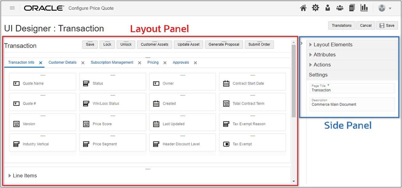
The side panel contains Layout Elements, Attributes, Actions, and Settings. The Settings section will display the properties for items that are selected in the layout panel. The document properties are displayed when no items are selected.
Administration
Layout Elements
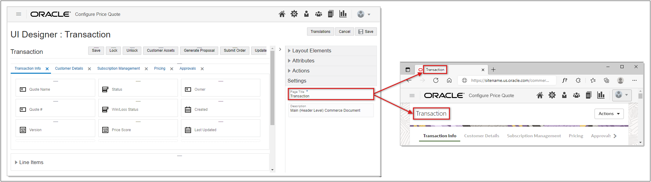
Without any items selected in the Layout Panel, select the Settings section in the left-hand side panel, and then specify a title and optional description for the layout. The layout title will then display at the top of the Transaction page as well as in the browser tab.
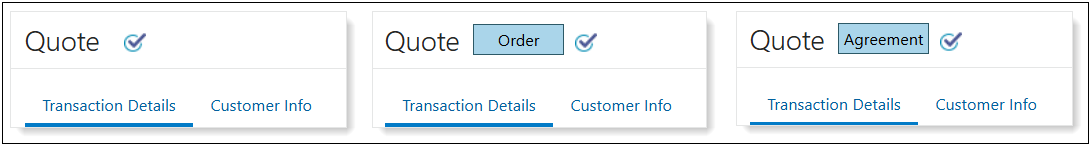
Oracle CPQ 25A introduces a new transaction Badge Attribute Layout Editor setting for JET and Legacy Transaction UIs.
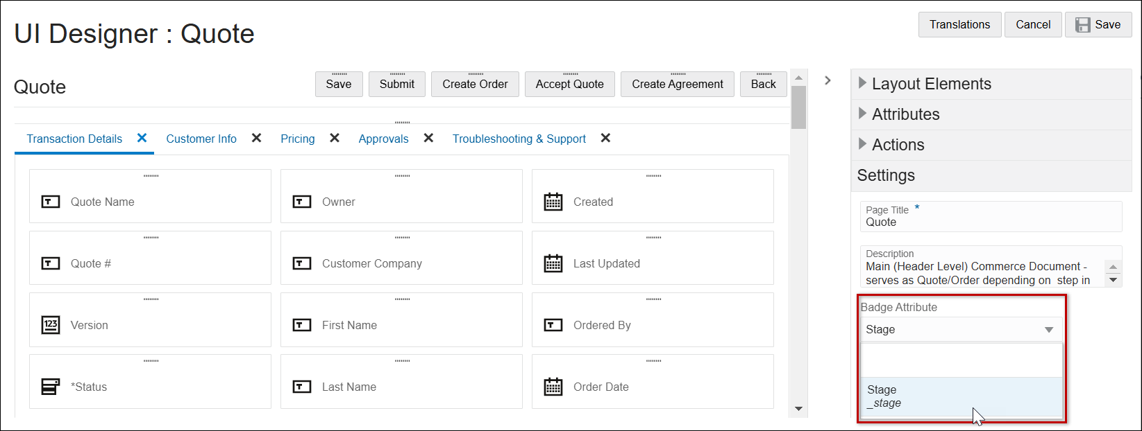
When enabled, the new stage badge quickly identifies subsets of transactions that are in the agreement or ordering phase of the transaction lifecycle.
Complete the following steps to enable the Stage badge for a JET or legacy Transaction UI.
-
Navigate to the Commerce Layout Editor for the applicable JET Transaction UI.
(Admin > Process Definition > Documents > JET Responsive Layout)
-
Open the side panel Settings section.
-
Select Stage from the Badge Attribute drop-down.
-
Click Save.
-
Deploy the Commerce Process.
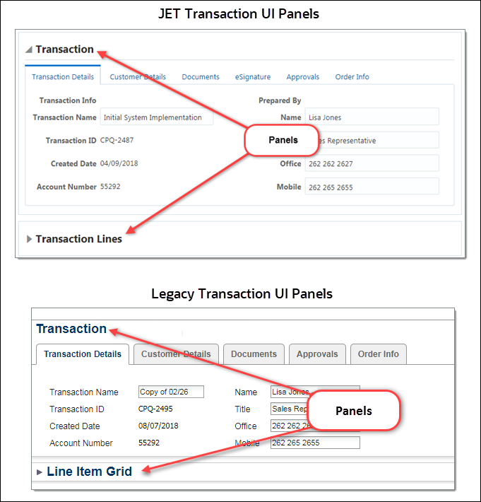
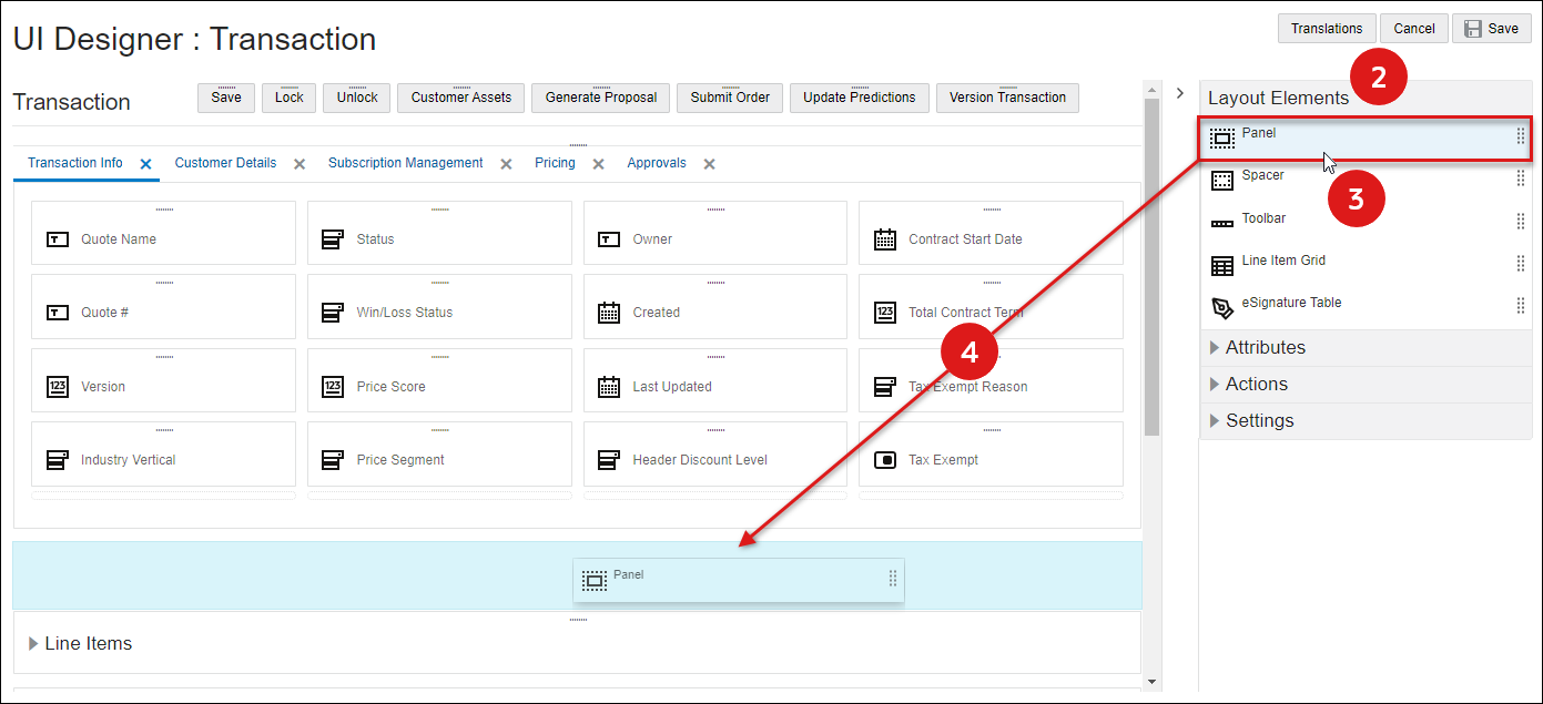
Panels are containers for layout elements.
- When a Panel element is inserted in the top level of the layout, a Panel element containing a single Tab is added.
- When a Panel element is inserted inside an existing panel, a Tab element is added.
They include a label, tabs, and a collapse and expand icon. Layouts can have multiple panels. The administrator can choose to show or hide the label and whether to make the panel collapsible by default.
The following image shows two panels on the Transaction UI. The Transaction panel is not collapsible and the Transaction Lines/Line Item Grid panel is collapsible.
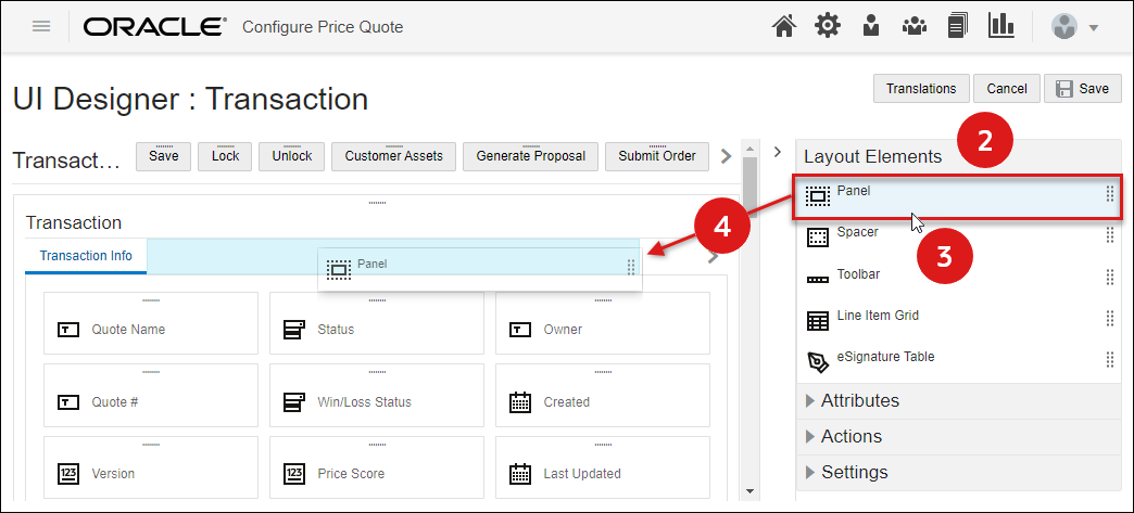
- Navigate to the Commerce Layout Editor.
Click Admin to go to the Admin Home Page.
Click Process Definition in the Commerce and Documents section.
- For the applicable process, select Documents in the Navigation column, and then click List.
For the applicable document, select JET Responsive Layout or Legacy Layout in the Navigation column, and then click List.
-
Open the side panel Layout Elements.
-
Select the Panel element.
-
Drag and drop the Panel element into the layout editor.
- Blue background highlighting indicates the panel can be dropped in the current hover position.
- A prohibition sign
 displays if the panel cannot be dropped in the current hover position.
 - When a new panel is initially added, a tab is automatically created and labeled Tab.
-
Click Save to retain the layout changes or Cancel to exit the layout editor without saving the changes.
-
To modify panel setting, proceed to Edit Panel Settings.
- Navigate to the Commerce Layout Editor.
Click Admin to go to the Admin Home Page.
Click Process Definition in the Commerce and Documents section.
- For the applicable process, select Documents in the Navigation column, and then click List.
For the applicable document, select JET Responsive Layout or Legacy Layout in the Navigation column, and then click List.
-
Click on the appropriate Panel, the panel should be outlined in blue.
-
Open the side panel Settings section to modify the panel properties.
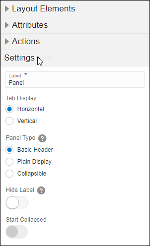
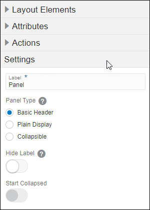
Select one of the following options to set panel properties:
- Label: Enter the text that should appear on the panel.
-
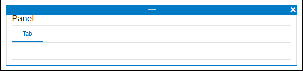
Tab Display: Select Horizontal or Vertical display.
View Horizontal and Vertical Tab Display Examples
Horizontal Tab Display
Vertical Tab Display
-
Panel Type: Select one of the following options:
- Basic Header:Non-collapsible panel with the label at the top of the panel of the panel.
- Plain Display:Panel without a label or the ability to expand or collapse.
- Collapsible: Collapsible panel, can be set to start collapsed.
-
Hide Label: Enable this option to hide the panel header label.
- Not available for Plain Display.
- Defined labels will remain for accessibility requirements.
-
Start Collapsed: Enable this option to start the panel collapsed.
Not available for Basic Display or Plain Display.
- Label: Enter the text that should appear on the panel.
-
Panel Type: Select one of the following options:
- Basic Header:Non-collapsible panel with the label at the top of the panel of the panel.
- Plain Display:Panel without a label or the ability to expand or collapse.
- Collapsible: Collapsible panel, can be set to start collapsed.
-
Hide Label: Enable this option to hide the panel header label.
- Not available for Plain Display.
- Defined labels will remain for accessibility requirements.
-
Start Collapsed: Enable this option to start the panel collapsed.
Not available for Basic Display or Plain Display.
- Click Save to retain the layout changes or Cancel to exit the layout editor without saving the changes.
To move the panel, drag and drop the panel into a new position.
- Blue background highlighting indicates the panel can be dropped in the current hover position.
- A prohibition sign displays if the panel cannot be dropped in the current hover position.
- Navigate to the Commerce Layout Editor.
Click Admin to go to the Admin Home Page.
Click Process Definition in the Commerce and Documents section.
- For the applicable process, select Documents in the Navigation column, and then click List.
For the applicable document, select JET Responsive Layout or Legacy Layout in the Navigation column, and then click List.
-
Click on the appropriate Panel, the panel should be outlined in blue.
-
Click on the Delete icon (
 ).
).If the panel contains any items, a warning message is displayed.
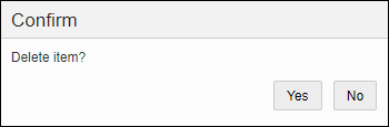
- Click Yes to remove the panel, click No to cancel.
- Click Save to retain the layout changes or Cancel to exit the layout editor without saving the changes.
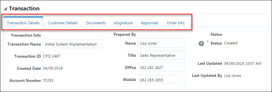
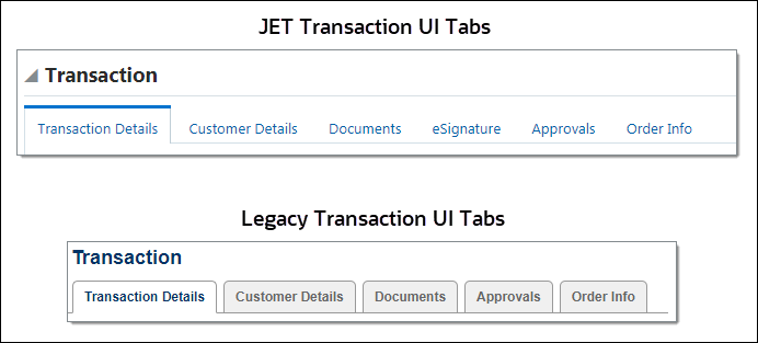
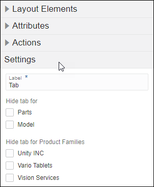
Tabs are displayed inside a panel and there can be multiple tabs in a panel. Tabs can be mapped to hide parts, models or special product families. Tabs contain one ore more panel columns.
The following image displays multiple tabs on the Transaction UI.
- Navigate to the Commerce Layout Editor.
Click Admin to go to the Admin Home Page.
Click Process Definition in the Commerce and Documents section.
- For the applicable process, select Documents in the Navigation column, and then click List.
For the applicable document, select JET Responsive Layout or Legacy Layout in the Navigation column, and then click List.
-
Open the side panel Layout Elements
-
Select the Panel element.
-
Drag and drop the Panel element into an existing panel in the layout editor.
- Blue background highlighting indicates the panel can be dropped in the current hover position.
- A prohibition sign displays if the panel cannot be dropped in the current hover position.
- Click Save to retain the layout changes or Cancel to exit the layout editor without saving the changes.
- To modify tab settings, proceed to Edit Tab Settings.
- Navigate to the Commerce Layout Editor.
Click Admin to go to the Admin Home Page.
Click Process Definition in the Commerce and Documents section.
- For the applicable process, select Documents in the Navigation column, and then click List.
For the applicable document, select JET Responsive Layout or Legacy Layout in the Navigation column, and then click List.
- Click on the appropriate Tab.
-
Open the side panel Settings section to modify the tab properties.
- Enter the Label text that should appear on the tab.
-
Select the appropriate checkbox if the tab should be hidden from any Parts, Models or special Product Segments.
- Click Save to retain the layout changes or Cancel to exit the layout editor without saving the changes.
Notes:
- To move the tab, drag and drop the tab into a new position inside an existing panel.
- Blue background highlighting indicates the tab can be dropped in the current hover position.
- A prohibition sign displays if the tab cannot be dropped in the current hover position.
- To edit the tab display for JET layouts, refer to Edit Panel Settings > JET UI Panel Settings.
- Navigate to the Commerce Layout Editor.
Click Admin to go to the Admin Home Page.
Click Process Definition in the Commerce and Documents section.
- For the applicable process, select Documents in the Navigation column, and then click List.
For the applicable document, select JET Responsive Layout or Legacy Layout in the Navigation column, and then click List.
- Click on the appropriate tab.
-
Click on the Delete icon (
 ).
).If the tab contains any items, a warning message is displayed.
-
Click Yes to remove the tab, click No to cancel.
- Click Save to retain the layout changes or Cancel to exit the layout editor without saving the changes.
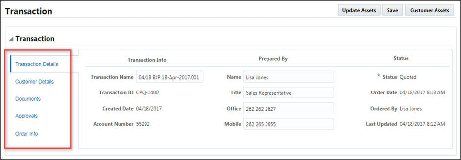
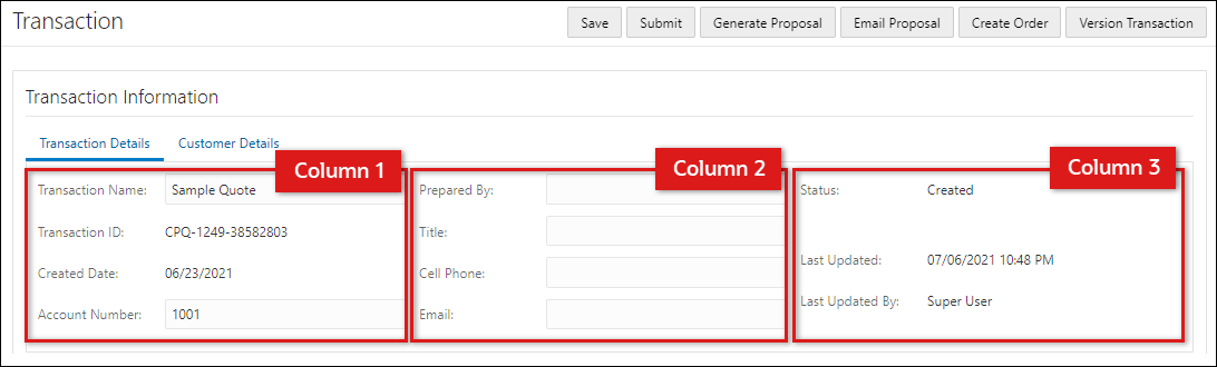
The Commerce Layout Editor does not have a Column Panel layout element. Columns are created by adding elements next to each other within a tab. Columns are layout elements can contain attributes, spacers, toolbars, and line item tables.
The following images displays a Transaction UI with three columns.
- Navigate to the Commerce Layout Editor.
Click Admin to go to the Admin Home Page.
Click Process Definition in the Commerce and Documents section.
- For the applicable process, select Documents in the Navigation column, and then click List.
For the applicable document, select JET Responsive Layout or Legacy Layout in the Navigation column, and then click List.
- Open the applicable side panel section:Layout Elements, Actions, or Attributes.
In the following example we are inserting an attribute, so the Attributes section was selected.
-
Select an Action, Attribute, Line Item Grid, or Spacer from the side panel.
In the example above an attribute was selected.
-
Drag and drop the selected item next to an existing action bar, attribute, Line Item Grid, or spacer in the layout editor.
- Blue background highlighting indicates the item can be dropped in the current hover position.
- A prohibition sign displays if the item cannot be dropped in the current hover position.
- Click Save to retain the layout changes or Cancel to exit the layout editor without saving the changes.
- Navigate to the Commerce Layout Editor.
Click Admin to go to the Admin Home Page.
Click Process Definition in the Commerce and Documents section.
- For the applicable process, select Documents in the Navigation column, and then click List.
For the applicable document, select JET Responsive Layout or Legacy Layout in the Navigation column, and then click List.
-
Click on the appropriate column in the layout section.
-
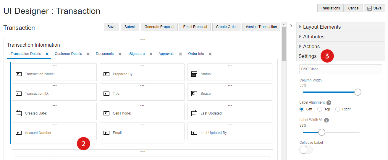
Open the side panel Settings to modify column properties.
Select one of the following options to set column properties:
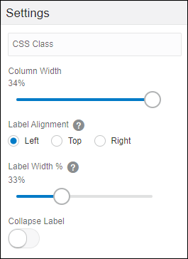
CSS Class: Enter the name of a custom CSS class to associate with this column. This custom class can be used to create styling specifically for the elements associated with this class.
- Column Width: Set the width of the column.
Label Alignment: Select one of the following options.
View label alignment options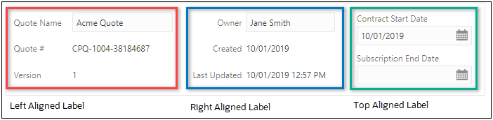
- Label Alignment: Select one of the following options
Left: Left aligns column panel labels at the side of the input fields.
Top: Places column panel labels above the input fields.
Right: Right aligns column panel labels at the side of the input fields.
- Label Width (%): Enter the desired width of the Column area reserved for the attribute label.
- Collapse Label: Checking this box hides all of the labels and collapses the label area, showing only the input fields.
-
CSS Class: Enter the name of a custom CSS class to associate with this column. This custom class can be used to create styling specifically for the elements associated with this class.
- Column Width: Set the width of the column.
- Select the column width type: % or px
-
Label Alignment: Select one of the following options.
View label alignment options
- Label Alignment: Select one of the following options
Left: Left aligns column panel labels at the side of the input fields.
Top: Places column panel labels above the input fields.
Right: Right aligns column panel labels at the side of the input fields.
- Label Width: Enter the desired width of the Column area reserved for the attribute label.
- Select the label width type: % or px
- Collapse Label: Checking this box hides all of the labels and collapses the label area, showing only the input fields.
- Label Padding (px): Enter the number of pixels for label padding.
- Click Save to retain the layout changes or Cancel to exit the layout editor without saving the changes.
- There is a maximum of 12 columns allowed under one Tab.
- For best results, all columns in the panel column should add up to 100%.
- Columns cannot add to more than 100%.
A Spacer is a blank space with a defined height that is displayed vertically between other inputs. Spacers are displayed with a height that is defined by the FullAccess user.
- Navigate to the Commerce Layout Editor.
Click Admin to go to the Admin Home Page.
Click Process Definition in the Commerce and Documents section.
- For the applicable process, select Documents in the Navigation column, and then click List.
For the applicable document, select JET Responsive Layout or Legacy Layout in the Navigation column, and then click List.
-
Open the side panel Layout Elements
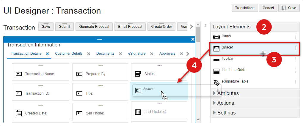
-
Select the Spacer element.
-
Drag and drop the spacer into an existing panel in the layout editor.
- Blue background highlighting indicates the spacer can be dropped in the current hover position.
- A prohibition sign displays if the spacer cannot be dropped in the current hover position.
-
Click Save to retain the layout changes or Cancel to exit the layout editor without saving the changes.
-
To modify spacer settings proceed to Edit Spacer Settings.
- Navigate to the Commerce Layout Editor.
Click Admin to go to the Admin Home Page.
Click Process Definition in the Commerce and Documents section.
- For the applicable process, select Documents in the Navigation column, and then click List.
For the applicable document, select JET Responsive Layout or Legacy Layout in the Navigation column, and then click List.
- Click on the appropriate Column in the layout section.
-
Open the side panel Settings section to modify the spacer properties.
.
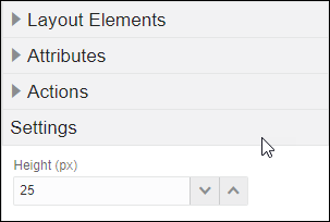
- Enter the Height (px ) in pixels.
- Click Save to retain the layout changes or Cancel to exit the layout editor without saving the changes.
To move the spacer, drag and drop the spacer into a new position inside an existing panel.
- Blue background highlighting indicates the spacer can be dropped in the current hover position.
- A prohibition sign displays if the spacer cannot be dropped in the current hover position.
- Navigate to the Commerce Layout Editor.
Click Admin to go to the Admin Home Page.
Click Process Definition in the Commerce and Documents section.
- For the applicable process, select Documents in the Navigation column, and then click List.
For the applicable document, select JET Responsive Layout or Legacy Layout in the Navigation column, and then click List.
-
Click on the Delete icon (
) for the appropriate SpacerTab. - Click Save to retain the layout changes or Cancel to exit the layout editor without saving the changes.
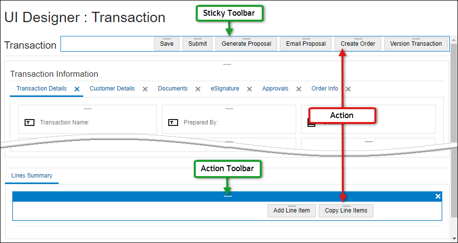
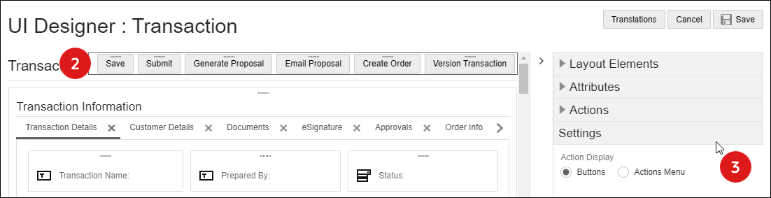
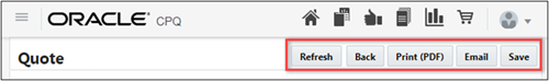
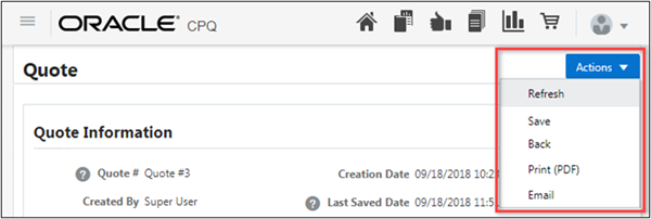
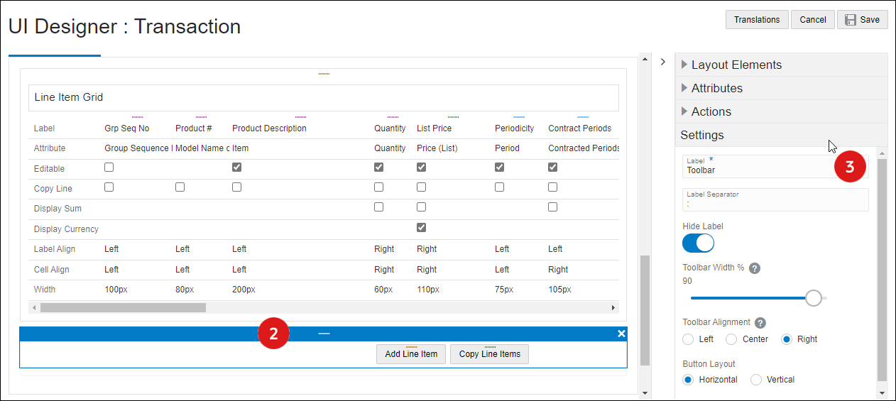
Toolbars (i.e. Action Toolbars or Sticky Action Toolbars) contain one or more actions. The administrator can choose the width and alignment of the actions in a toolbar.
The Sticky Actions Toolbar is always visible in the user's browser, regardless of where the user scrolls on the page.
User Side Toolbars and Layout Editor Views
JET User Side Toolbars
Legacy User Side Toolbars
Actions and Toolbars in Layout Editor
- Navigate to the Commerce Layout Editor.
Click Admin to go to the Admin Home Page.
Click Process Definition in the Commerce and Documents section.
- For the applicable process, select Documents in the Navigation column, and then click List.
For the applicable document, select JET Responsive Layout or Legacy Layout in the Navigation column, and then click List.
-
Open the side panel Layout Elements
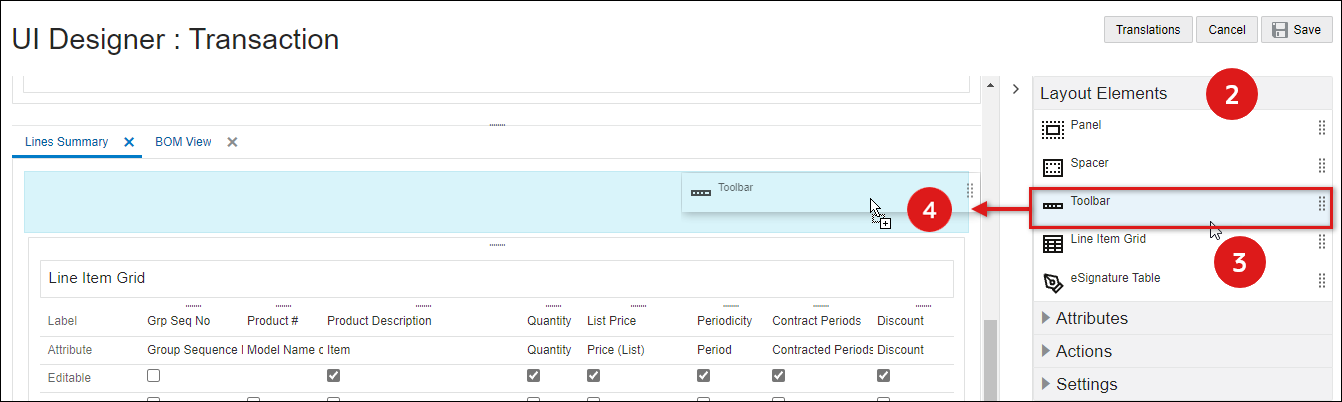
- Select the Toolbar element from the side panel.
-
Drag and drop the toolbar into the layout editor
- Blue background highlighting indicates the toolbar can be dropped in the current hover position.
- A prohibition sign displays if the toolbar cannot be dropped in the current hover position.
-
Click Save to retain the layout changes or Cancel to exit the layout editor without saving the changes.
- To modify a toolbar, proceed to Edit Toolbar Settings.
- Navigate to the Commerce Layout Editor.
Click Admin to go to the Admin Home Page.
Click Process Definition in the Commerce and Documents section.
- For the applicable process, select Documents in the Navigation column, and then click List.
For the applicable document, select JET Responsive Layout or Legacy Layout in the Navigation column, and then click List.
- Click on the appropriate Toolbar in the layout section.
- Open the side panel Settings section to modify the toolbar properties.
-
Select one of the following options to set toolbar properties:
-
Select the Action Display option.
-
Buttons
-
Action Menu
-
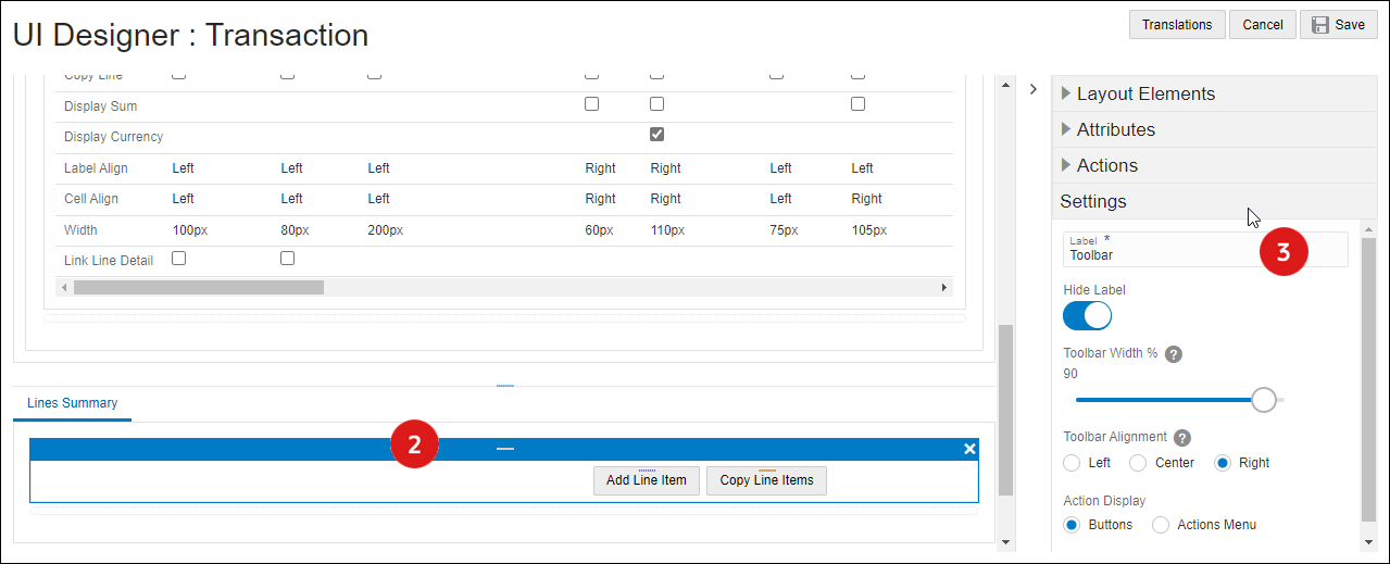
- Enter the Label Text for the toolbar.
- Select the Hide Label checkbox to hide the label for the action toolbar.
- Select the desired Toolbar Width (%)
- Select the Toolbar Alignment: Left, Center or Right.
-
Select the Action Display.
-
Buttons
-
Action Menu
-
-
Enter the Label Text for the toolbar
- Enter a Label Separator (optional). This is a character or text to append to the end of a label.
- Select the desired Toolbar Width (%)
- Select the Toolbar Alignment: Left, Center or Right.
- Select the Button Layout: Horizontal or Vertical.
Horizontal actions are laid side by side. Vertical actions are stacked on top of each other.
-
- Click Save to retain the layout changes or Cancel to exit the layout editor without saving the changes.
To move a toolbar, drag and drop the toolbar into a new position inside an existing panel.
- Blue background highlighting indicates the toolbar can be dropped in the current hover position.
- A prohibition sign displays if the r cannot be dropped in the current hover position.
- Navigate to the Commerce Layout Editor.
Click Admin to go to the Admin Home Page.
Click Process Definition in the Commerce and Documents section.
- For the applicable process, select Documents in the Navigation column, and then click List.
For the applicable document, select JET Responsive Layout or Legacy Layout in the Navigation column, and then click List.
-
Select the appropriate toolbar.
-
Click on the Delete icon (
). -
Click Save to retain the layout changes or Cancel to exit the layout editor without saving the changes.
Delete toolbar is not available for Sticky Action Toolbars.
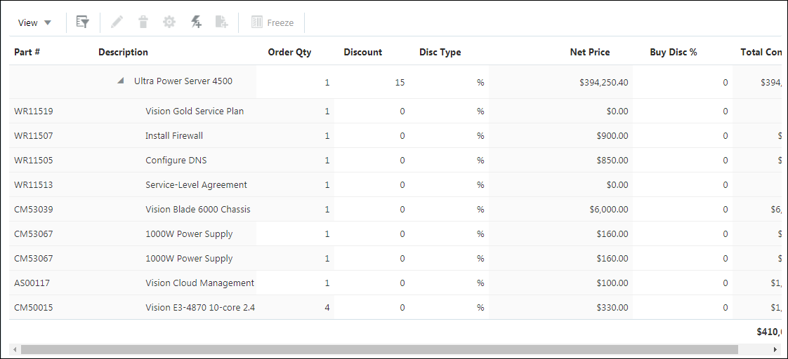
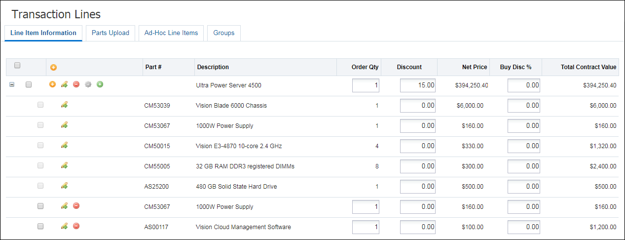
Adding Transaction Line attributes to the Line Item Grid and editing their behavior is significantly easier using the Commerce Layout Editor Administrators simply drag-and-drop the Transaction Line Attributes from the side panel to the layout Line Item Grid. Mapping the attributes is no longer required. After Transaction Line attributes have been added to the Line Item Grid, the attribute behavior can be modified directly in the layout or the side panel Settings..
JET User Side Line Item Grid
Legacy User Side Line Item Grid
- Navigate to the Commerce Layout Editor.
Click Admin to go to the Admin Home Page.
Click Process Definition in the Commerce and Documents section.
- For the applicable process, select Documents in the Navigation column, and then click List.
For the applicable document, select JET Responsive Layout or Legacy Layout in the Navigation column, and then click List.
-
Open the side panel Layout Elements
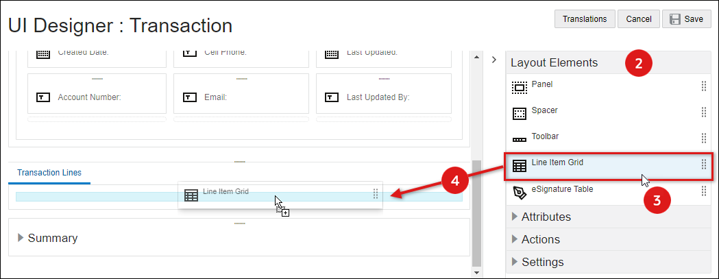
- Select the Line Item Grid element from the side panel.
-
Drag and drop the toolbar into the layout editor.
- Blue background highlighting indicates the LIG can be dropped in the current hover position.
- A prohibition sign displays if the LIG cannot be dropped in the current hover position.
-
Click Save to retain the layout changes or Cancel to exit the layout editor without saving the changes.
-
To modify Line Item Grid settings proceed to Edit Line Item Grid Settings.
- Navigate to the Commerce Layout Editor.
Click Admin to go to the Admin Home Page.
Click Process Definition in the Commerce and Documents section.
- For the applicable process, select Documents in the Navigation column, and then click List.
For the applicable document, select JET Responsive Layout or Legacy Layout in the Navigation column, and then click List.
-
Click on the Line Item Grid element in the layout section.
-
Open the side panel Settings section.
Note: These are general settings for the Line Item Grid element, refer to Line Item Grid Attributes to add, edit, or delete attributes within the Line Item Grid.
Select the one of following UI types:
JET UI Line Item Grid Settings 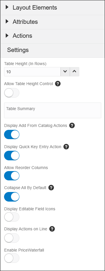
-
Table Height (In Rows) - Set this option to enable pagination of the Line Item Grid. On the transaction document, the user can control the number of lines visible by using the +/- icons to increment or decrement the number of line items on the page.
-
Allow Table Height Control - Select this option to allow sales users to define the number of rows to be visible in the Line Item Grid.
-
Table Summary: - (Optional) Enter summary text for the Line Item Grid table.
-
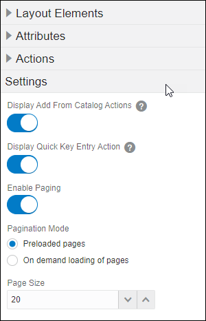
Display Add From Catalog Actions - Select this option if you wish to enable Add Parts within Commerce.
-
Display Quick Key Line Items - Select this option to enable Quick Key Line Items.
-
Allow Reorder Columns - Select this option to allow end users to reorder Line Item Grid columns.
-
Collapse All By Default - Select this option to set default collapsed or expanded behavior for hierarchical products in the Line Item Grid.
-
Display Editable Field Icons - Select this option to display indicator icons for editable JET Transaction UI line items.
-
Display Actions on Line - Select this option to display Reconfigure, Edit, Delete, and Charge Details action icons for Line Item Grid line items.
-
Enable Price Waterfall - Select this option to display price waterfall content in the charge drawer and the sub-document UI.
Legacy UI Line Item Grid Settings
-
Select the Display Add From Catalog Actions option if you wish to enable Add Parts within Commerce.
-
Select the Display Quick Key Line Items option to enable Quick Key Line Items.
-
Select the Enable Paging to enable pagination of the line items upon opening the Transaction. This is the default pagination mode for new Line Item Grids.
When this option is disable the Line Item Grid displays all of the line items upon opening the Transaction.
Note: Pagination Mode and Page Size are only available when paging is enabled.
-
Select the Pagination Mode.
-
Preloaded pages: All of the pages of line items are retrieved from the server when the Transaction is opened. This could mean a longer loading time initially, when opening the Transaction, but allows for faster display when paging through the line items.
This setting is recommended if the load time is acceptable for Transactions with a typical number of line items. This is usually when a typical Transaction has fewer than 200 line items, but because the number of line items columns vary between implementations, your site may have different results.
-
On demand loading of pages: Only the first page of line items is retrieved from the server when the Transaction is opened. This allows for a shorter loading time initially, when opening the Transaction, but could mean a short delay when paging through the line items.
This setting is recommended for sites with more than 200 line items in a typical Transaction. However, because line items columns vary in size, depending on things like the number of Sub-Document attributes, your site may have different results.
This setting can also be useful for sites where typical Transactions have fewer than 200 line items, if users would like a faster load time when a Transaction is opened or an action is completed.
For this setting to take effect, Desktop Transaction caching must be enabled. Desktop Transaction caching is enabled by default.
The appearance of the Line Item Grid will be the same for both Preloaded pages or On demand loading of pages pagination modes. The only difference is invisible to the user: how and when line item information is retrieved from the server.
-
-
Page Size: Set the default number of rows for the Line Item Grid. On the transaction document, the user can control the number of lines visible by using the +/- icons to increment or decrement the number of line items on the page.
-
- Click Save to retain the layout changes or Cancel to exit the layout editor without saving the changes.
- Navigate to the Commerce Layout Editor.
Click Admin to go to the Admin Home Page.
Click Process Definition in the Commerce and Documents section.
- For the applicable process, select Documents in the Navigation column, and then click List.
For the applicable document, select JET Responsive Layout or Legacy Layout in the Navigation column, and then click List.
- Click on the Line Item Grid item in the layout section.
-
Click on the Delete icon (
).If the Line Item Grid contains any attributes a warning message is displayed.
-
Click Yes to remove the Line Item Grid, click No to cancel.
- Click Save to retain the layout changes or Cancel to exit the layout editor without saving the changes.
Add an Attribute to a Line Item Grid
- Navigate to the Commerce Layout Editor.
Click Admin to go to the Admin Home Page.
Click Process Definition in the Commerce and Documents section.
- For the applicable process, select Documents in the Navigation column, and then click List.
For the applicable document, select JET Responsive Layout or Legacy Layout in the Navigation column, and then click List.
-
Open the side panel Attributes element.
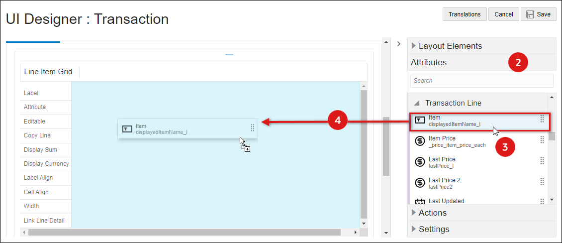
-
Select the appropriate sub-document (e.g. Transaction Line) attribute.
-
Drag and drop the attribute into the Line Item Grid element in the layout editor.
- Blue background highlighting indicates the attribute can be dropped in the current hover position.
- A prohibition sign displays if the attribute cannot be dropped in the current hover position.
- Click Save to retain the layout changes or Cancel to exit the layout editor without saving the changes.
-
To modify attribute settings, proceed to Edit Attribute Settings for Line Item Grid Attributes.
Edit Attribute Settings for Line Item Grid Attributes
- Navigate to the Commerce Layout Editor.
Click Admin to go to the Admin Home Page.
Click Process Definition in the Commerce and Documents section.
- For the applicable process, select Documents in the Navigation column, and then click List.
For the applicable document, select JET Responsive Layout or Legacy Layout in the Navigation column, and then click List.
-
Click on the attribute within the Line Item Grid.
You can edit the attribute settings in the layout section or click on Settings in the side panel.
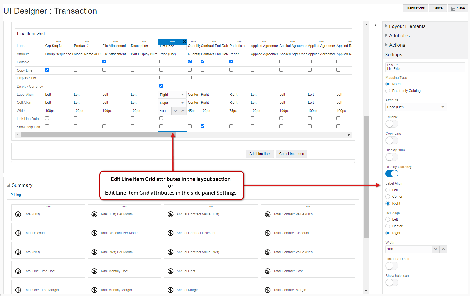
-
Label: enter or edit the name for the Line Item Grid column header.
-
Select the Mapping Type.
-
Normal: Select this option to map to most attributes
-
Attribute Select the appropriate attribute from the drop-down.
-
-
Read-only Catalog Select this option to display different values for models and parts.
-
If Model Select the attribute to display it the item is a model.
-
If Part Select the attribute to display it the item is a part.
Setting one of the columns to Read-Only Catalog will enable a hierarchical display of BOM items/System Configuration Models.
-
-
-
Select the Editable option to allow end users to modify this field.
-
Select the Copy Line option if the field to copy this field when the line item is copied.
-
Select the Display Sum option to show the sum of all the values in the column to the user.
-
When Price Waterfall is enabled, select the Display in Price Waterfall option to display selected attributes in the Charge Details View.
-
When Price Waterfall is enabled, select the Is Net Price Attribute option to identify the attribute for the unit price net of all discounts for this charge. Typically this is the Net Price attribute.
Note: You must select an attribute as Is Net Price Attribute when Price Waterfall is enabled.
-
Select the Display Currency option to show a tooltip that will appear if the stored precision value is different than the displayed precision and the numbers are not equivalent.
Note: This option is available only on currency attributes
-
Label Align: Select Left, Center, or Right.
-
Cell Align: Select Left, Center, or Right
-
Enter the Width (in pixels) of this LIG attribute column.
-
Select the Link Line Detail option
Note: This option is available only for the JET Transaction UI. The first attribute in the LIG is linked to Line Item Details for the Legacy Transaction UI .
-
Select the Show help icon option to display a help icon for the applicable attribute in the Line Item Grid column header, When a user hovers over the help icon, the description text for the attribute is displayed.
-
- Click Save to retain the layout changes or Cancel to exit the layout editor without saving the changes.
Delete an Attribute from a Line Item Grid
- Navigate to the Commerce Layout Editor.
Click Admin to go to the Admin Home Page.
Click Process Definition in the Commerce and Documents section.
- For the applicable process, select Documents in the Navigation column, and then click List.
For the applicable document, select JET Responsive Layout or Legacy Layout in the Navigation column, and then click List.
- Click on the attribute within the Line Item Grid.
-
Click on the Delete icon (
). - Click Save to retain the layout changes or Cancel to exit the layout editor without saving the changes.
Do not display a Summation Attribute in the Line Item Grid. Never create a Summation Attribute at the line-item level. The following Attributes cannot be displayed on the Line Item Grid:
- RTE Attributes
- HTML Attributes
- File Attachment Attributes
- History Attributes
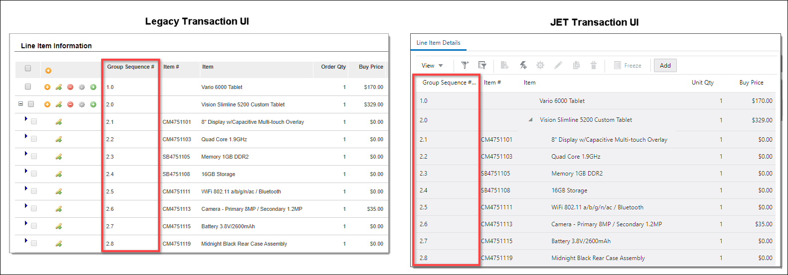
Enabling Group Sequence Numbers
End users can view recommended items and child line items with sequence numbers that are counted based on the parent line item's sequence. This functionality is enabled when you add the _group_sequence_number attribute to the attribute list and the Line Item Grid instead of _sequence_number. End users can order line items through drag and drop when the sequence number/group sequence number is on the Line Item Grid.
Example: A parent line item can have a group sequence number of 1 and then the child items will have group sequence number of 1.1, 1.2, 1.3..and so on.
Complete the following steps to enable Group Sequence Numbers.
-
Verify there is a Group Sequence Number sub-document (line) attribute with the variable name
_group_sequence_number.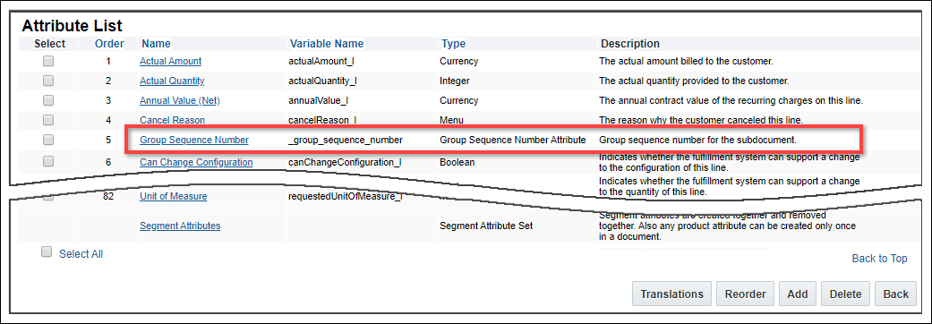
If the 'Group Sequence Number' attribute does not exist, complete the following steps to add the attribute:
- Scroll to the bottom of the sub-document Attribute List page and click Add.
- Select Group Sequence Number Attribute from the Attribute Type drop-down menu.
- Click Add, and then click Update.
-
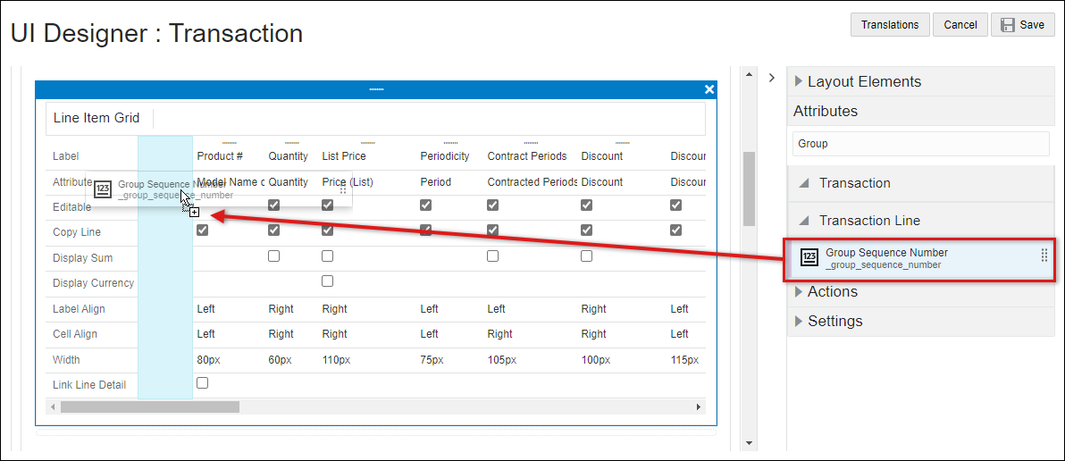
Add the Group Sequence Number to the Line item Grid in the layout editor.
- Group Sequence Number functionality is independent of Sequence Number. It should not be used in conjunction with Sequence Number.
- Line items are automatically re-sequenced if the user enters a value in the group sequence number field. However, if the user enters an invalid value, then the user's input is ignored.
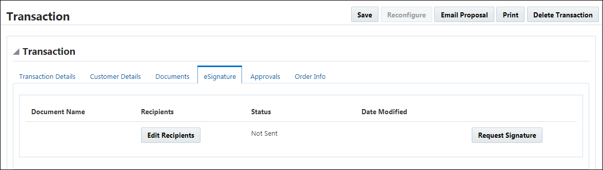
The eSignature functionality allows an Oracle CPQ user to attach a document to the quote and then request signatures using an eSignature vendor (e.g. DocuSign). The documents can be created by print action or uploaded by the user.
- Navigate to the Commerce Layout Editor.
Click Admin to go to the Admin Home Page.
Click Process Definition in the Commerce and Documents section.
- For the applicable process, select Documents in the Navigation column, and then click List.
For the applicable document, select JET Responsive Layout or Legacy Layout in the Navigation column, and then click List.
-
Open the side panel Layout Elements
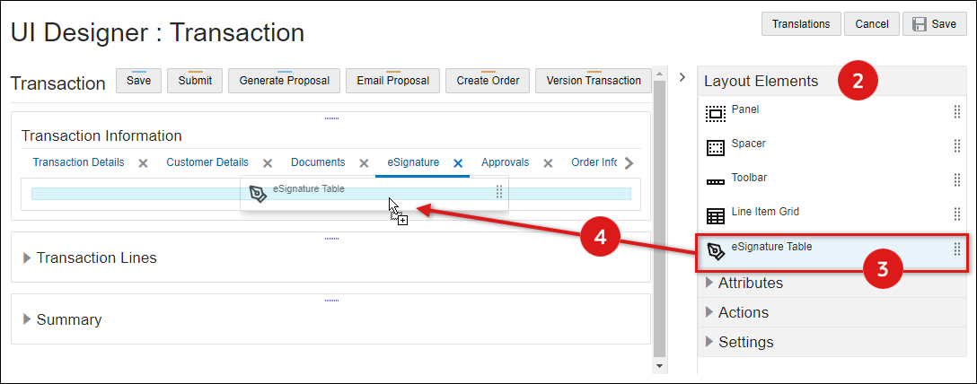
- Select the eSignature Table element from the side panel.
-
Drag and drop the eSignature table into the layout editor
- When an eSignature Gide is placed into a tab, a panel column with a single column is automatically created.
- Blue background highlighting indicates the eSignature table can be dropped in the current hover position.
- A prohibition sign displays if the eSignature table cannot be dropped in the current hover position.
- Click *Save to retain the layout changes or Back to exit the layout editor without saving the changes.
- Navigate to the Commerce Layout Editor.
Click Admin to go to the Admin Home Page.
Click Process Definition in the Commerce and Documents section.
- For the applicable process, select Documents in the Navigation column, and then click List.
For the applicable document, select JET Responsive Layout or Legacy Layout in the Navigation column, and then click List.
- Click on the eSignature table.
-
Click on the Delete icon (
).A warning message is displayed.
-
Click Yes to remove the eSignature table, click No to cancel.
- Click Save to retain the layout changes or Cancel to exit the layout editor without saving the changes.
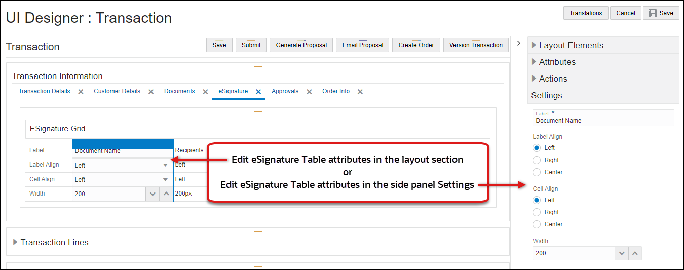
Edit eSignature Table Attribute Settings
- Navigate to the Commerce Layout Editor.
Click Admin to go to the Admin Home Page.
Click Process Definition in the Commerce and Documents section.
- For the applicable process, select Documents in the Navigation column, and then click List.
For the applicable document, select JET Responsive Layout or Legacy Layout in the Navigation column, and then click List.
-
Click on the attribute within the eSignature Table.
You can edit the attribute settings in the layout section or click on Settings in the side panel.
-
Label Align: Select Left, Center, or Right.
-
Cell Align: Select Left, Center, or Right
-
Enter the Width (in pixels) of this eSignature table attribute column.
-
- Click Save to retain the layout changes or Cancel to exit the layout editor without saving the changes.
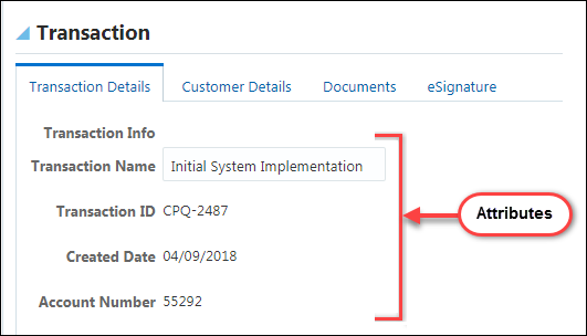
Attributes, Array Sets, and Actions
Attributes are input elements used to display Commerce attributes on the Transaction UI. Attributes are placed inside columns.
The following images displays multiple attributes on the Transaction UI.
- Navigate to the JET Responsive Layout Editor.
Click Admin to go to the Admin Home Page.
Click Process Definition in the Commerce and Documents section.
The Processes page opens.
- For the applicable process, select Documents in the Navigation column and click List.
For the applicable document, select JET Responsive Layout in the Navigation column and click List.
The JET Responsive Layout Editor opens.
-
Open the side panel Attributes.
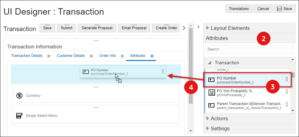
- Select an attribute from the side panel.
-
Drag and drop the attribute into the layout editor
- Blue background highlighting indicates the attribute can be dropped in the current hover position.
- A prohibition sign displays if the attribute cannot be dropped in the current hover position.
-
Click Save to retain the layout changes or Cancel to exit the layout editor without saving the changes.
- To modify attribute settings, proceed to Edit Attribute Settings.
- Navigate to the Commerce Layout Editor.
Click Admin to go to the Admin Home Page.
Click Process Definition in the Commerce and Documents section.
- For the applicable process, select Documents in the Navigation column, and then click List.
For the applicable document, select JET Responsive Layout or Legacy Layout in the Navigation column, and then click List.
-
Click on the attribute in the layout section.
-
Open the side panel Settings section.
Note: The Attribute Variable Name and Data Type fields are displayed, but these fields cannot be edited.
Select the one of following UI types:
- Label: Enter the name for the attribute label.
- Enter the Height (px) value.
This field is only available for Text Area attributes - Field Alignment: Select the field alignment: Left, Center or Right.
- Select the Hide Label box if you do not wish to display the Attribute Label.
-
Message Target: Determine the location where an error text should be displayed:
- Mouseover - Displays a quick tip when the user hovers over the field.
- Below - Adds a block beneath the field displaying the error text.
- Select the Enable Help Icon option to display the attribute description as Help Text.
-
Display Type: Available options are based on the attribute type:
Select one of the following options:
-
Switch

-
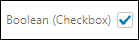
Checkbox
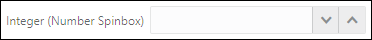
Currency, Float, and Integer Attributes
Select one of the following options:
-
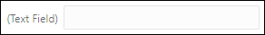
Text Field
-
Number Spinbox
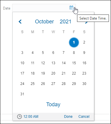
The only option available for date attributes is Datepicker.
Datepicker
Select one of the following options.
-
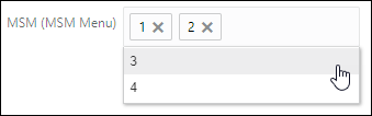
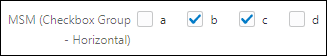
Multi-Select Menu
-
Checkbox Group: Select the Number of Columns and Fill Direction.
-
Number of Columns: Enter the number of columns for this field.
-
Fill Direction: Select Vertical or Horizontal.
- Vertical
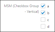
- Horizontal
-
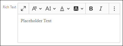
The only option available for RTE attributes is JET Inline Editor.
JET Inline Editor
Select one of the following options.
-
Select Menu
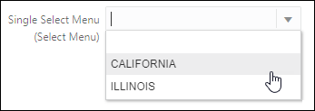
-
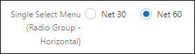
Radio Group: Select the Number of Columns and Fill Direction.
-
Number of Columns: Enter the number of columns for this field.
-
Fill Direction: Select Vertical or Horizontal.
- Vertical
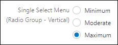
- Horizontal
-
The only option available for text attributes is Text Field.
Text Field
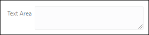
The only option available for text area attributes is Text Area.
Text Area
-
-
Show Currency Tooltip
This field is only available for Currency attributes
Select this option to display a hover tooltip that will appear if the stored precision value is different than the displayed precision and the numbers are not equivalent.
-
Select the Hide Label option if you do not wish to display the attribute label.
- Select the Enable Help Icon option to display the attribute description as Help Text.
-
Message Target: Determine the location where an error text should be displayed:
- Mouseover - Displays a quick tip when the user hovers over the field.
- Below - Adds a block beneath the field displaying the error text.
-
Right Side - Adds an error icon to the right of the field with a pop-up on hover.
- Field Alignment: Select the field alignment: Left, Center or Right.
-
Label Separator: This is an optional character or text to append to the end of a label.
-
Enter the Height (px) value.
This field is only available for Text Area attributes -
Enter the desired Field Width. The field width can be defined in either percent or pixels. For best results, ensure that all columns in the layout add up to 100%.
-
Select the field width type: % or px
-
Display Type: Available options are based on the attribute type:
Select one of the following options:
-
Checkbox
-
Radio Group
Select one of the following options.
-
Multi-Select
-
Checkbox Group: Select the Number of Columns and Fill Direction.
-
Fill Direction: Select Vertical or Horizontal.
-
Number of Columns: Enter the number of columns for this field.
-
Select one of the following options.
-
Combo Box
-
Radio Group: Select the Number of Columns and Fill Direction.
-
Fill Direction: Select Vertical or Horizontal.
-
Number of Columns: Enter the number of columns for this field.
-
-
-
Show Currency Tooltip
This field is only available for Currency attributes
Select this option to display a hover tooltip that will appear if the stored precision value is different than the displayed precision and the numbers are not equivalent.
- Click OK to save changes and close the dialog box or click Cancel to close the dialog box without saving your changes.
- Click *Save to retain the layout changes or Back to exit the Layout Editor without saving the changes.
- Navigate to the Commerce Layout Editor.
Click Admin to go to the Admin Home Page.
Click Process Definition in the Commerce and Documents section.
- For the applicable process, select Documents in the Navigation column, and then click List.
For the applicable document, select JET Responsive Layout or Legacy Layout in the Navigation column, and then click List.
- Click on the attribute in the layout section.
-
Click on the Delete icon (
). - Click Save to retain the layout changes or Cancel to exit the layout editor without saving the changes.
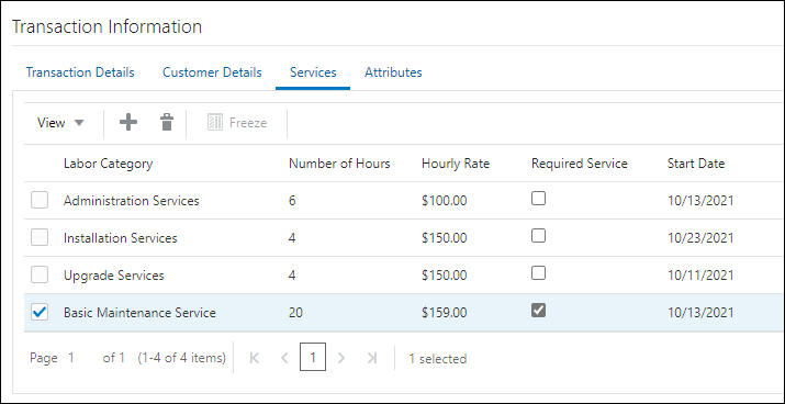
Array Set Tables (Transaction Arrays)
Attributes are input elements used to display Commerce attributes on the Transaction UI. Attributes are placed inside columns.
The following image shows a Transaction Array that has been added to a JET Transaction UI.
- Navigate to the Commerce Layout Editor.
Click Admin to go to the Admin Home Page.
Click Process Definition in the Commerce and Documents section.
- For the applicable process, select Documents in the Navigation column, and then click List.
For the applicable document, select JET Responsive Layout in the Navigation column, and then click List.
-
Open the side panel Attributes.
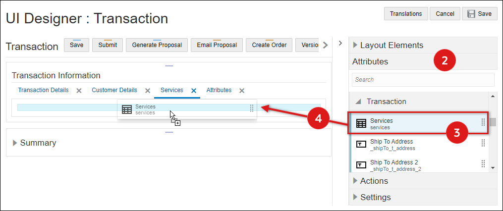
- Select the applicable Array Set element from the side panel.
-
Drag and drop the array set into the layout editor
- Blue background highlighting indicates the array set can be dropped in the current hover position.
- A prohibition sign displays if the array set cannot be dropped in the current hover position.
- Click *Save to retain the layout changes or Back to exit the layout editor without saving the changes.
- Navigate to the Commerce Layout Editor.
Click Admin to go to the Admin Home Page.
Click Process Definition in the Commerce and Documents section.
- For the applicable process, select Documents in the Navigation column, and then click List.
For the applicable document, select JET Responsive Layout in the Navigation column, and then click List.
-
Click on the array set element in the layout section.
-
Open the side panel Settings section.
Note: These are general settings for the array set element, refer to Array Set Attributes to edit or delete attributes within the Array Set.
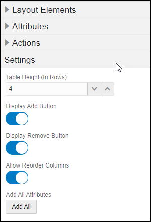
-
Set the Table Height (In Rows) to enable pagination of theArray Set. On the transaction document, the user can control the number of lines visible by using the +/- icons to increment or decrement the number of line items on the page.
-
Select the Display Add Button option to display the Add Row icon.
-
Select the Display Remove Button option to display the Remove icon.
-
Select the Add All Attributes
-
It is recommended for administrators to use Document Views tab and Steps Administration to hide the array attributes from the buy-side UI.
-
If attributes are removed using the delete icon, administrators can click the Add All Attributes button to expose removed attributes.
-
-
- Click Save to retain the layout changes or Cancel to exit the layout editor without saving the changes.
- Navigate to the Commerce Layout Editor.
Click Admin to go to the Admin Home Page.
Click Process Definition in the Commerce and Documents section.
- For the applicable process, select Documents in the Navigation column, and then click List.
For the applicable document, select JET Responsive Layout in the Navigation column, and then click List.
- Click on the Array Set.
-
Click on the Delete icon (
).A warning message is displayed.
-
Click Yes to remove the eSignature table, click No to cancel.
- Click Save to retain the layout changes or Cancel to exit the layout editor without saving the changes.
Edit Attribute Settings for Array Set Attributes
- Navigate to the Commerce Layout Editor.
Click Admin to go to the Admin Home Page.
Click Process Definition in the Commerce and Documents section.
- For the applicable process, select Documents in the Navigation column, and then click List.
For the applicable document, select JET Responsive Layout in the Navigation column, and then click List.
-
Click on the attribute within the Array Set.
You can edit the attribute settings in the layout section or click on Settings in the side panel.
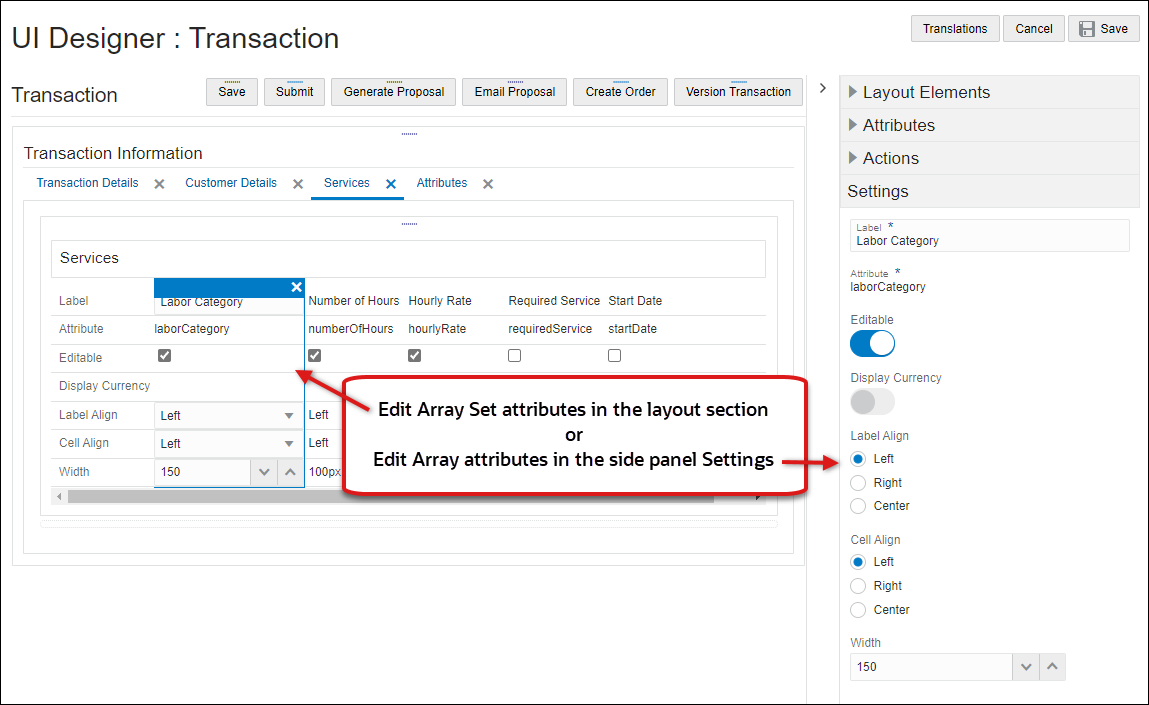
-
Label Align: Select Left, Center, or Right.
-
Cell Align: Select Left, Center, or Right
-
Enter the Width (in pixels) of this array set attribute column.
-
- Click Save to retain the layout changes or Cancel to exit the layout editor without saving the changes.
- Navigate to the Commerce Layout Editor.
Click Admin to go to the Admin Home Page.
Click Process Definition in the Commerce and Documents section.
- For the applicable process, select Documents in the Navigation column, and then click List.
For the applicable document, select JET Responsive Layout in the Navigation column, and then click List.
- Click on the attribute within the array set in the layout section.
-
Click on the Delete icon (
). - Click Save to retain the layout changes or Cancel to exit the layout editor without saving the changes.
Notes:
- After an Array Set is added to the layout, any newly created array attributes are automatically added to the Array Set Table layout.
- The order of the array attributes is based on the array attribute Order in the Attribute Array Set Editor. To re-order array attributes, refer to Transaction Arrays - Edit Array Set or Array Set Attribute. Each time administrators change the order, the array attributes in the Array Set Table layout are re-ordered.
Administrators can place actions in Toolbars or the Sticky Action Toolbar A Toolbar element is automatically created if an action is not inserted inside an existing toolbar..
- Navigate to the Commerce Layout Editor.
Click Admin to go to the Admin Home Page.
Click Process Definition in the Commerce and Documents section.
- For the applicable process, select Documents in the Navigation column, and then click List.
For the applicable document, select JET Responsive Layout or Legacy Layout in the Navigation column, and then click List.
-
Open the side panel Actions
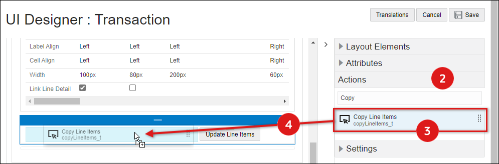
- Select the appropriate action from the side panel.
-
Drag and drop the action into the layout editor. Actions can be placed in toolbars or the sticky action toolbar. If the action is not placed inside a toolbar, a toolbar element is automatically created.
- When an action is not placed inside a toolbar, a toolbar element is automatically created.
- Blue background highlighting indicates the action can be dropped in the current hover position.
- A prohibition sign displays if the action cannot be dropped in the current hover position.
-
Click Save to retain the layout changes or Cancel to exit the layout editor without saving the changes.
- Navigate to the Commerce Layout Editor.
Click Admin to go to the Admin Home Page.
Click Process Definition in the Commerce and Documents section.
- For the applicable process, select Documents in the Navigation column, and then click List.
For the applicable document, select JET Responsive Layout or Legacy Layout in the Navigation column, and then click List.
- Click on the appropriate action in the layout section.
-
Open the side panel Settings section to modify the action properties.
.
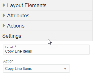
- Label: Enter the text that should appear on the action button or the action menu.
- Action: If you wish to change the specified action, select a new action from the list.
- Click Save to retain the layout changes or Cancel to exit the layout editor without saving the changes.
- To change the appearance of actions, refer to Edit Toolbar Settings.
- To move the spacer, drag and drop the spacer into a new position inside an existing panel.
- Blue background highlighting indicates the action can be dropped in the current hover position.
- A prohibition sign displays if the action cannot be dropped in the current hover position.
- Navigate to the Commerce Layout Editor.
Click Admin to go to the Admin Home Page.
Click Process Definition in the Commerce and Documents section.
- For the applicable process, select Documents in the Navigation column, and then click List.
For the applicable document, select JET Responsive Layout or Legacy Layout in the Navigation column, and then click List.
- Click on the action in the layout section.
-
Click on the Delete icon (
). - Click Save to retain the layout changes or Cancel to exit the layout editor without saving the changes.
Notes
- The FullAccess user must be careful when using alternate stylesheets as it can affect the enhanced commerce UI adversely. Some things to look out for are resizing menu or text type attributes, placement of HTML attributes, and so on. Also, the FullAccess user should test any alternate CSS on all supported browsers since CSS behavior can vary greatly by browser.
- Deleting a layout container like a panel, tab or column layout will delete all elements within the container as well.
- You cannot mix pixels and percentages within a column layout.
- HTML attributes that contained malformed HTML might break the UI. The admin is advised to check if an HTML attribute contains tags that are not enclosed in tags.
- Including prototype.js in the header or footer of the transaction page may interfere with the functionality available to the end user, such as switching tabs, uploading files using the File Attachment attribute, expand/collapse of line items, and so on. Admins are discouraged from using prototype in any advanced customization on the transaction page.
- The Main Document layout editor looks the same as the Sub-Document Layout Editor. The only exceptions are that in the sub-document layout editor, you cannot add attributes , you can only show line item attributes, and Add Action Strip only shows line item commerce actions.
- Height of spacers, attributes and action strips within a column are consistent in the Layout Editor. All layout elements within a column are drawn with the same height on the Layout Editor for better usability.
- Numeric fields can only have the value field right-aligned in the line item grid.
- Horizontal scrolls are not provided by default. If the column width is bigger than the page width, then some fields may appear to be cut off on the transaction page. The admin can enable the horizontal scroll by using the alternate stylesheet.
- Single-select menus and multi-select menus can be changed from one to another, but they first have to be removed from the layout and then changed in the attribute editor itself.
- If labels intrude into the column space, either increase the label width or provide a space in the label text so that it can wrap.
- Refer to Stylesheet Manager > JET UI Style Customization for information on the following JET UI CSS customizations:
- Force Content to Stay in a Fixed Position (Non-responsive behavior)
- Create Sub-Headers Styles
- Create Tab Label Styles
- Create Button Styles


