Overview
Administrators can create easily create standard Configuration layouts using the Configuration Layout Editor, which provides a graphical drag & drop feature for creating and managing the display of the model Configuration page(s). You have the ability to create multiple grids (formerly known as groups) and tabs, greater flexibility in laying out UI elements and more, from a single page.
A single configuration flow UI layout is used for both legacy and JET Configuration UIs. The JET-specific features will display only in the JET Configuration UI - when the end user has access rights to the JET Configuration UI for the associated Product Family. This approach differs from Commerce, where legacy and JET have separate layouts.
Once you have created your Configuration Flow, you can open the Configuration Layout Editor and begin to layout the user-side Configuration page.
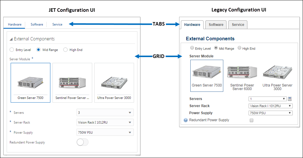
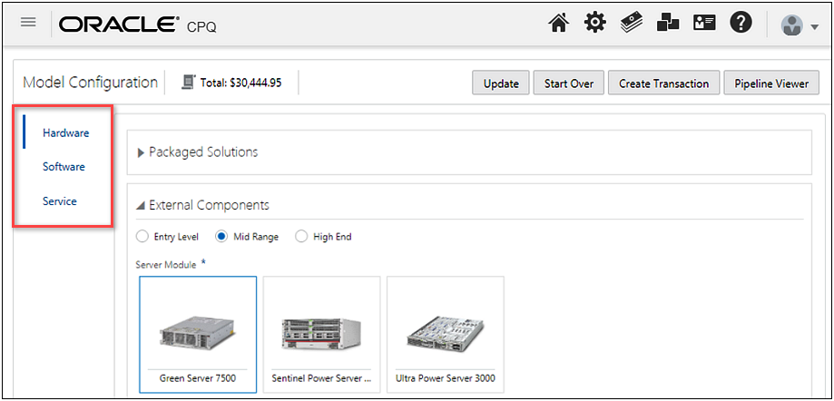
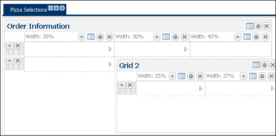
 Configuration Layout Page Example
Administration
You can customize and brand the user-side Configuration UI in an easy and intuitive way thanks to drag & drop functionality, previews, grouping and more. The Layout Editor allows you to customize the look and feel of your Configuration UI by using Tabs, Grids, Flow and Attribute Properties and a Configuration Stylesheet.
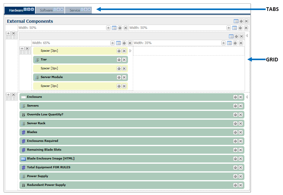
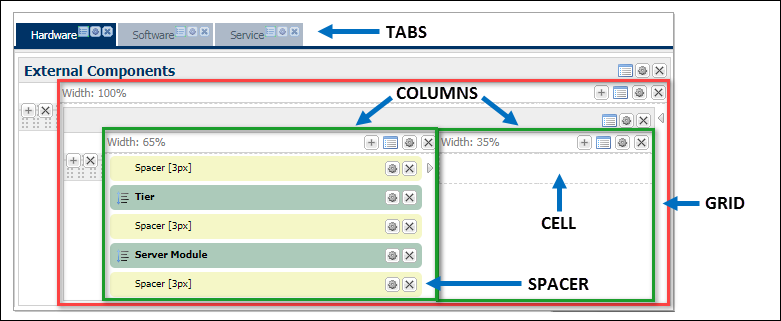
The Visual Editing Area is a fixed-width page that is divided into the following areas:
The Configuration Layout Editor contains a strip of administrative action buttons.
| Action Button | What does it do? |
|---|---|

|
Click the Back button to return to the previous page without saving your changes. The application does not save your changes if this button is used.
|

|
Click Save to save layout changes. An asterisk is appended to the Save button to alert the FullAccess user that changes have been made to the layout and they need to be saved. |

|
Click Flow Properties to view the Configuration Flow Properties page. The variable name is read-only. |
|
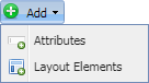
Click Add, to select and add Attributes or Layout Elements to the Configuration layout. |

|
Click All Attributes to open a window where you can edit the display properties associated with any attribute that is referenced on this Configuration Page Layout. This includes all tabs on the current layout. Filtering features help you to find the specific attribute or group of attributes that your are looking for. |
|
|
Click Layout Properties to open a dialog where you can select layout stylesheets and templates and define behavior for tabs and the JET price table, item lists, and sidebar. |

|
Click the Preview button to preview the user-side interface, based on the latest changes to the Configuration Page Layout Editor. The preview only displays the Legacy Configuration UI. |
|
|
Click Translations to provide translations for supported languages of the Label, Description and Default value. |


| Icon | Description |
|---|---|

|
Click to add a row or column element to a grid. |

|
Click to delete a layout element; tabs, grids, columns, rows, and attributes. |

|
Click to edit element properties such as tab properties, grid properties, and column properties. |

|
Click to edit attribute properties like labels, displaying help and set type. |
Note: The following JET-specific properties are not applicable to Legacy UIs.
- Tab Display
- JET Item List Display
- JET Price Table Display
- Sidebar Behavior
- Navigation Panel Location
- Navigation Panel Size
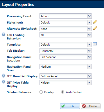
The following table lists the layout properties for Configuration UIs and identifies which layouts are impacted.
|
Option |
Layout |
Description |
|---|---|---|
|
Processing Event |
Legacy and JET |
Specify the Processing Event:
|
|
Stylesheet |
Legacy |
Select a Stylesheet from the drop-down. Click the pencil icon JET uses a different CSS stylesheet from the legacy standard and alt stylesheets. As a result, CSS customizations may need to be refactored to work correctly with the JET Configuration UI. For additional details, refer to Oracle CPQ JET CSS: Branding and Styling (Doc ID 2462711). |
|
Alternate Stylesheet |
Legacy |
Select an Alternate Stylesheet from the drop-down. Click the pencil icon JET uses a different CSS stylesheet from the legacy standard and alt stylesheets. As a result, CSS customizations may need to be refactored to work correctly with the JET Configuration UI. For additional details, refer to Oracle CPQ JET CSS: Branding and Styling (Doc ID 2462711). |
|
Tab Loading Behavior |
Legacy and JET |
Select a tab loading behavior.
Users might see a loading page appear when the switch tabs, as the next set of data is being loaded. Selecting this option improves performance and rendering speed on larger Configuration Flows. |
|
Template |
Legacy |
Select a template for Legacy layouts. The layout Template is only used for Legacy layouts. Templates do not control the layout for JET Configuration UIs. |
|
Tab Display |
JET |
Select the placement for tabs on the JET Configuration UI
Refer to Display Vertical Tabs on the JET Configuration UI for more information. |
| Navigation Panel Location | JET |
Select the location of the System Navigation Panel
|
| Navigation Panel Size | JET |
Set the size of the System Navigation Panel to Small, Medium, or Large. The medium panel size is the only option available when the System Navigation Panel is displayed in the right sidebar. |
|
JET Item List Display |
JET |
This option controls whether items lists (e.g. recommended items, mandatory items, and BOM items) are displayed in the right sidebar or the bottom panel. |
|
JET Price Table Display |
JET |
This option controls whether price tables are displayed in the right sidebar, bottom panel, or hidden. When item lists are displayed in the right sidebar, the price table can only be displayed in the right sidebar or hidden. |
|
Sidebar Behavior |
JET |
This option controls sidebar behavior when price tables or item lists are displayed as right sidebars. Overlay or push content behavior can be selected. |
 to make changes to the stylesheet.
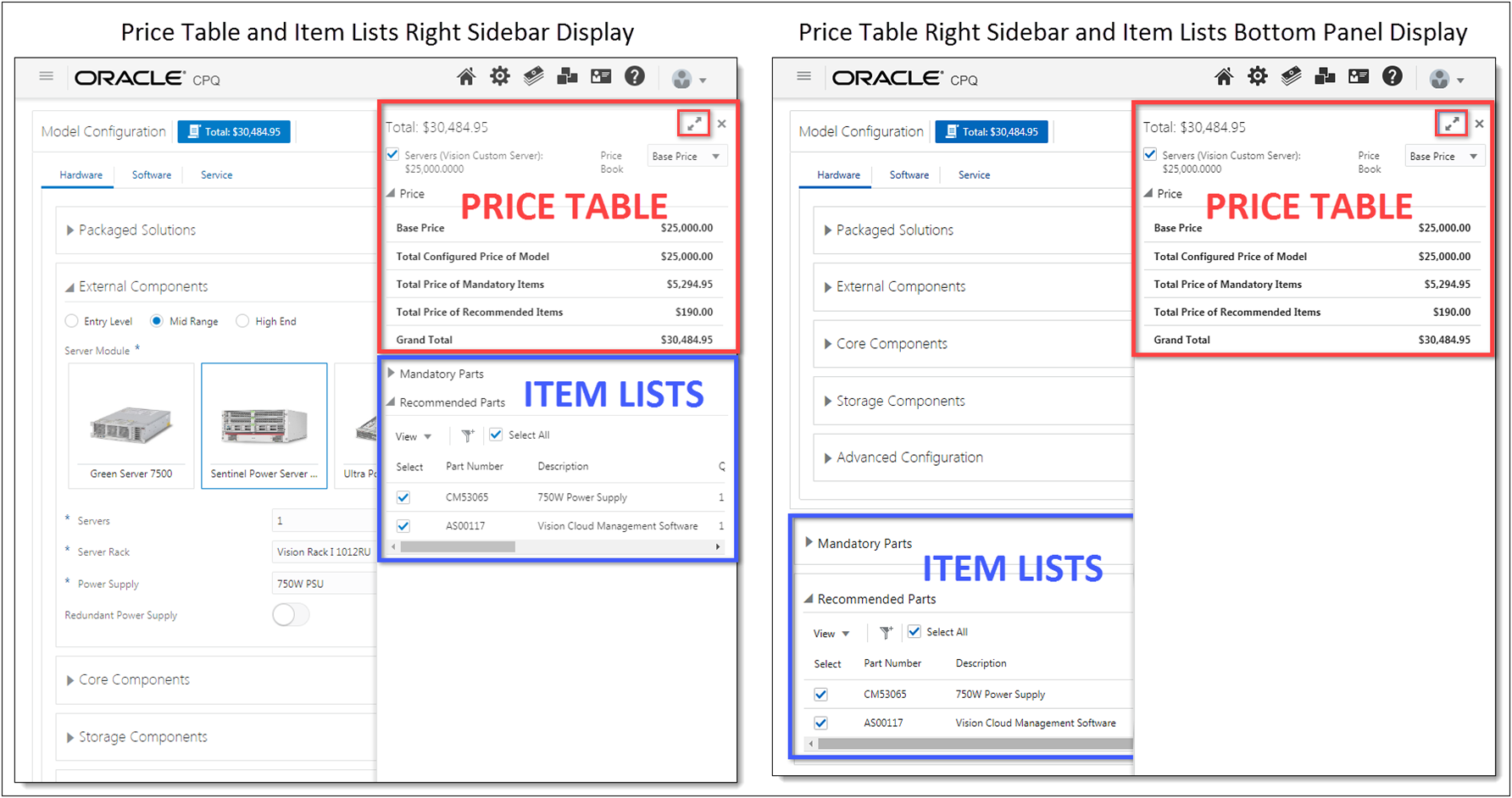
View user-side JET Item List Display, Price Table Display, and Sidebar Behavior
Administrators can individually select the placement of price tables and items lists (e.g. recommended items, mandatory items, and BOM items). Right sidebars are initially hidden on the JET Configuration UI. To view the sidebar the user clicks on the Total price button. The following image shows two of the possible display options.
The Configuration Layout Editor allows the FullAccess user to add elements to the page and nest some page elements within each other to achieve a pleasing user experience. Some layout elements are color-coded for faster identification.
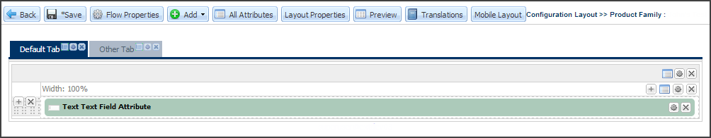
The first step in organizing your Configuration page(s) will be to create tabs. You can add as many Configuration tabs as you’d like. When you first open the Configuration Layout Editor, you’ll notice that one tab is already available: Default Tab. Rename this tab and use it, or add additional tabs and delete this one later.
- Navigate to the Admin Home page.
- Click Catalog Definition in the Products section.
- Navigate to the applicable Product Family, Product Line, or Model.
- Select Configuration Flows from the Navigation drop-down, and then click List.
-
Click the “Desktop” Layout link.
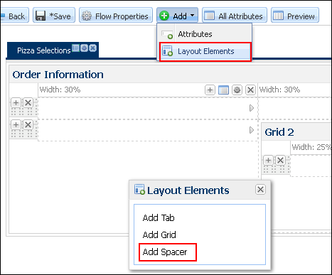
- Click Add from the Admin Action Bar.
- Select the Layout Elements menu.
-
Drag and Drop Add Tab from the Layout Elements menu to the top bar.
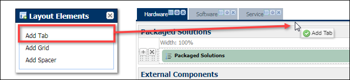 A green check mark lets you know that the cursor position where you’d like to place the tab is accepted. A pop-up window will appear where you define the Tab Properties.
 -
Set the Tab Properties.
The tab properties can also be found by clicking the icon next to the tab name. -
Enter a unique Label and Variable Name for your Tab.
The Variable Name field populates automatically. Variable names can only contain alpha-numeric characters and underscores. The entry can be changed before saving, but after saving the value is read-only.
All other fields in the Tab Properties window are optional. You are not required to enter values, though it allows for further individualization of your application. -
Select one or more of the following options:
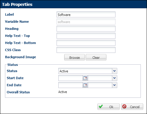
- Heading: This applies the provided text to the top of the Tab page. The Tab page heading appears directly under the tab name on the user-side. This will not display in the visual editing area.
- Help Text - Top: This displays help text either below the Tab page heading
- Help Text - Top: This displays help text either at the bottom of the Tab page.
-
CSS Class: When populated, this setting applies the specified text as a class name to the tab element.
Make sure to add this class and its properties to the stylesheet applied to the Configuration Flow.- Background Image: Click Browse and select an image from the File Manager.
Tab Status and Dates:
- If “Inactive” is specified, the tab will be inactive overall.
- If “Active” is specified with no date range, the tab will be active overall.
- If “Active” is specified with a date range, the overall status will be Active only during the date range; outside the date range, the overall status will read “Inactive”.
- “Internal” status works the same with regard to the date range and overall status as does “Active”.
-
Click OK to save change or click Cancel to close the window without saving changes.
The current tab will be shown in blue and the others will be displayed in gray.The default tab also contains a single default grid. By default, one tab, one grid, one row and one column are required for a layout and cannot be deleted.
Display Vertical Tabs on the JET Configuration UI
Beginning in Oracle CPQ 19B, administrators to display vertical tabs for the JET Configuration UI. Vertical tabs are arranged on the left side of a panel instead of on the top in horizontal space.
Perform the following steps to display vertical tabs on the JET Configuration UI:
- Navigate to the Admin Home page.
- Click Catalog Definition in the Products section.
- Navigate to the applicable Product Family, Product Line, or Model.
- Select Configuration Flows from the Navigation drop-down, and then click List.
-
Click the “Desktop” Layout link.
-
Click Layout Properties from the Admin Action Bar.
The Layout Properties dialog opens.
-
Select Vertical from the Tab Display menu.
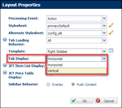
- Click OK to save change or click Cancel to close the window without saving changes.
Adding Grids and Grid Elements
Grids are used to organize layout elements, attributes and array sets. This functionality replaces Groups from previous versions of CPQ. There is a default grid provided within the Default tab. You can create a new grid and delete the default grid later, if you desire.
| Position | Element | Description |
|---|---|---|
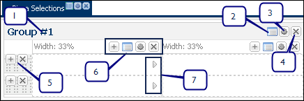
| 1 | Grid Header |
The grid header identifies each grid. You can drag and drop grids by clicking the header. Grids can be nested, meaning you can drag them inside other grids. If only one grid element spans the entire horizontal width of the layout, this grid element cannot be dragged and dropped elsewhere. When a title is applied to the grid, the text in the grid header will change to this title, currently “Group #1”. |
| 2 | All Attribute Properties | Opens a window where you can edit the display properties associated with any attribute that is referenced inside the current grid element. This includes all tabs on the current layout. |
| 3 | Grid Properties | Opens a window where you can edit grid properties such as the number of columns and rows, group title, CSS class, alignment and more. |
| 4 | Grid Delete Button | Deletes a grid and grid elements, including columns, rows and attributes. |
| 5 | Row Add/Delete Button |
Click the + icon to add a row and click the X icon to delete a row. Be careful when deleting a row as it will delete all contents within the row as well.
|
| 6 | Column Button Bar | Click the + icon to add a column and click the X icon to delete a column. Use the gear icon to adjust the column width. The list icon opens the All Attributes dialog box. |
| 7 | Column Span Arrows | Use the arrows to eliminate one or more column boundaries by spanning across columns. You can return the column to an unspanned state. |
If you have just created a tab, the Layout Elements dialog box is still be open and you can skip Steps 1-2.
- Navigate to the Admin Home page.
- Click Catalog Definition in the Products section.
- Navigate to the applicable Product Family, Product Line, or Model.
- Select Configuration Flows from the Navigation drop-down, and then click List.
-
Click the “Desktop” Layout link.
- Click Add from the Admin Action Bar.
- Select the Layout Elements menu.
-
Drag and Drop Add Grid from the Layout Elements menu to the top bar.
A green check mark lets you know that the cursor position where you’d like to place the grid is accepted.
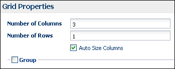
- In the Grid Properties dialog box, enter the number of columns and rows you’d like within your grid.
- Set column widths.
Select the Auto-size Columns box if the columns should be auto-sized.
Auto-Size will set the Column Layout to 100% and divide the size equally among the columns.
Deselect Auto-size Columns to change the column widths using the Column Properties button (gear icon) within each column.
Click on the Edit icon for the applicable array attribute.
Set the column width to the desired value.
For the Vertical display type the column width is set using the label width value for each array attribute.
For the Horizontal display type the column widths are set using Label and Value widths for the first array attribute.
Click OK to save the Array Properties
-
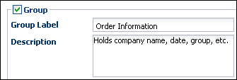
Select the Group checkbox if you’d like to set-up your Grid like a Group. This will open up additional group properties. You can have up to 200 rows.
-
Enter a Group Label. This will appear in the Grid Heading. You can also add a description to let other FullAccess users know what this group is for.
- Click Browse to select a Title Icon from the File Manager. This will appear to the left of the group label. Select Clear to remove images.
-
Enter a CSS Class for the Group.
When populated, it applies the specified class name to the DIV that surrounds all elements in the grid, allowing you to style one group differently from another. - Select the Alignment of the group label: Left, Center or Right.
-
Select the following options:
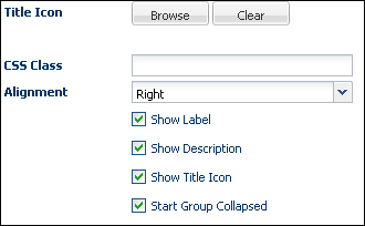
- Show Label: When checked, the Group Label will be displayed on the UI with the label alignment you selected in Step 10.
- Show Description: When checked, a link containing the group description will appear on the user-side.
- Show Title Icon: When checked, the icon that you selected in Step 8 will appear on the user-side.
-
Start Collapsed: When checked, the grid will start collapsed when the user first comes to the page.
- Click OK to save your changes or click Cancel to close the Grid Properties dialog box without saving.
-
Click Preview to take a look at how your changes affect the user-side layout. Remember to click Save if you’d like to save what you’ve done.
Grid nesting, the practice of placing one grid inside another, gives you ultimate layout flexibility.
If you add a row into a grid that contains a nested grid, the new row will be added beneath the nested grid.
You can drag and drop existing grid elements to another column or row. All contents of the grid will be transferred to the designated location, including specific column widths. Once in the new location, the column widths will expand or contract to the new element in which it resides.
If you specify a number of pixels, please ensure that the layout element(s) that contain the attribute have sufficient width to accommodate the pixel width you specified. If sufficient width is not available, unsightly visual shearing will occur on the user-side interface. Alternately, when setting a percent width, understand that the numeric input is the percent of the total width.
White space is preserved for a cell, even when all its attributes are hidden, when adjacent cells in the row have visible attributes.
White space will collapse within a cell when an attribute is hidden. It will also collapse for an entire row when all attributes within the row are hidden.
A Spacer is just a blank space with a defined height. Spacers are displayed vertically between other inputs. The default height is 25px. In the Visual Editing Area of the Layout Editor, a Spacer should be displayed with the following:
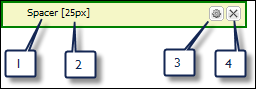
1 = Static Label: Spacer
2 = Read-only display of spacer's height value
3 = Gear icon to open Edit Properties window & edit the height (in pixels)
4 = Delete icon to remove the spacer from the column
- Navigate to the Admin Home page.
- Click Catalog Definition in the Products section.
- Navigate to the applicable Product Family, Product Line, or Model.
- Select Configuration Flows from the Navigation drop-down, and then click List.
-
Click the “Desktop” Layout link.
- Click Add in the Administration Actions toolbar.
- Click Layout Element from the menu.
-
Select Add Spacer from the menu.
- Drag and drop the Spacer into a cell. The red dotted line represents where the spacer will be placed. The green check mark indicates it can be dropped in that space.
- Determine the height of the Spacer in pixels.
-
Click OK to save changes or click Cancel to return to the Layout Editor without saving the changes.
To edit a spacer, click the gear icon to the right of the label and change the height pixels.If a spacer is added into a cell with an attribute and the attribute is hidden, the cell will not collapse.
Perform the following steps to add a Configuration action to a Configuration layout.
- Navigate to the Admin Home page.
- Click Catalog Definition in the Products section.
- Navigate to the applicable Product Family, Product Line, or Model.
- Select Configuration Flows from the Navigation drop-down, and then click List.
-
Click the “Desktop” Layout link.
-
Select Actions from the Add drop-down.
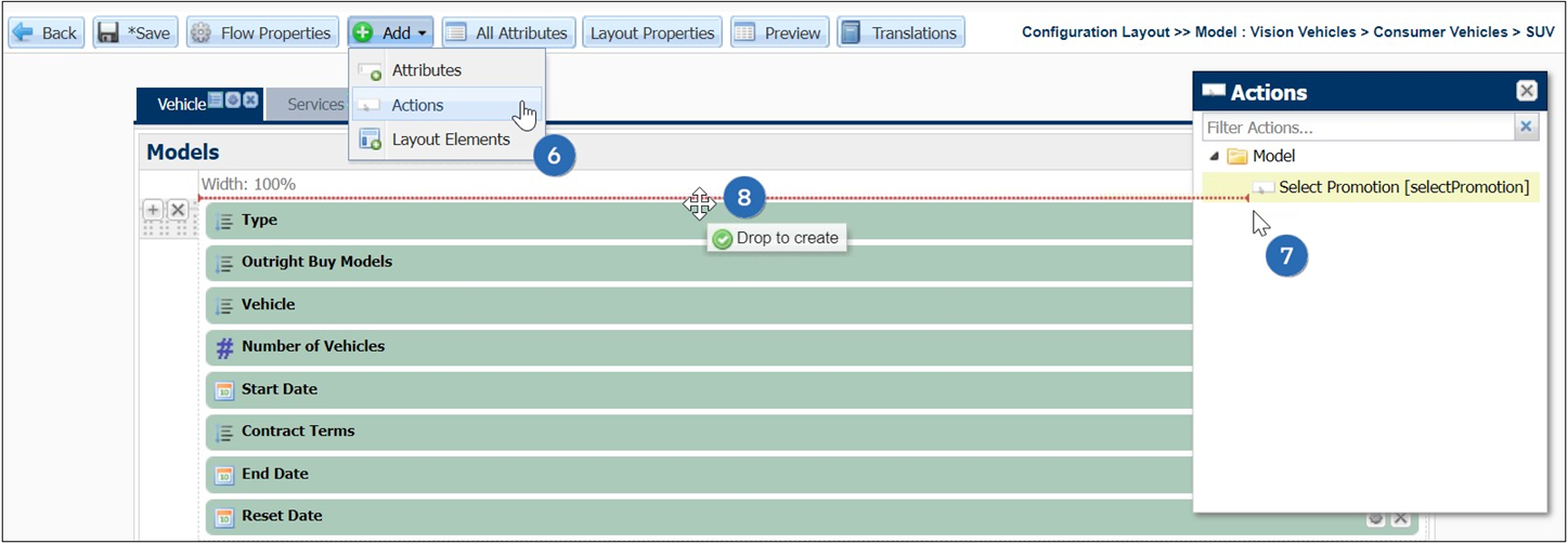
- Select the appropriate action from Actions window.
- Drag and drop the action into the layout editor.
- Click Save.
- Navigate to the Admin Home page.
- Click Catalog Definition in the Products section.
- Navigate to the applicable Product Family, Product Line, or Model.
- Select Configuration Flows from the Navigation drop-down, and then click List.
-
Click the “Desktop” Layout link.
- Click Add in the actions toolbar.
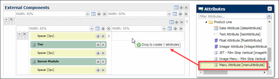
- Choose Attributes from the drop-down. Drag and drop one or more attributes into the editor using SHIFT + click to select more than one attribute from the Attributes Menu.
-
Drag and drop the selected attribute(s) into a cell. The red dotted line represents where the attribute will be placed. The green check-mark indicates that it can be dropped in that space.
-
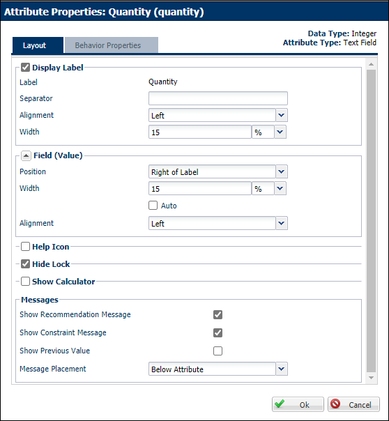
Edit any attribute in the layout by clicking the Gear icon on the far right side of the attribute to open the Attribute Properties dialog box.
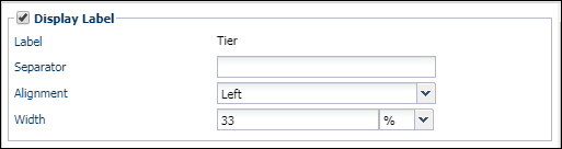
From here, you can edit only the current attribute’s properties and behaviors. Follow the steps to edit attribute properties, starting from the Attribute Properties dialog box. - Choose and edit properties for the Display Label, on the Layout Tab, in order to show the attribute label name. Deselecting this will hide the attribute label to the user. It will also not allow you to set additional related properties.
- Separator: Determine what you’d like to use to separate the label from the attribute value. What is entered here will display immediately after the label.
- Alignment: Determine the alignment of the label: Left, Center or Right.
- Width: Enter the label width in pixels or percentages.
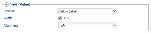
- Enter the Field (Value) properties for the attribute value fields.
- Position: Determine if you’d like to display the attribute value field to the right of the label or below the label. The default is right of the label.
- Width: Determine the field width in pixels or as a percentage. Select Auto to let the application determine the width.
- Alignment: Determine if you’d like the field to be left, center or right-aligned.
-
Select the Help Icon checkbox if you’d like to show a help icon. If selected, an option will appear allowing you to choose where to display the icon, to the left of the label or to the right of the attribute value.
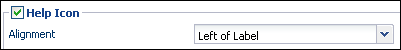
The JET layout does not support the "Right of Value" option for attribute help icons. If the "Right of Value" option is selected, the help icon will appear to the left of the attribute for JET Configuration layouts.
- Select additional options:
- Hide Lock: Select to hide the lock next to attributes. This is typically used to modify recommendation behavior.
- Show Calculator: Select to show the attribute calculator icon next to the attribute.
- Select Message options:
- Show Recommendation Message: Select to show messages when Recommendations are active on the attribute.
- Show Constraint Message: Select to show messages when Constraints are active on the attribute.
- Show Previous Value: Select to show the previous value of the recommended or constrained attribute. This will appear when an update occurs, either by clicking an Update action or if the constraint rule is marked as an AJAX.
- Message Placement: Use the drop-down to select the placement of the messages. You can display messages below the attribute, right of the attribute value, bottom of the group, bottom of the page and the top of the page.
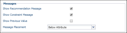 The JET layout does not support the message placement at the bottom of the page.
 -
Click on the Behavior Properties tab.
On this tab, you can manage the different display settings of the attribute. You can also override the display type, set type and default value properties that were defined when you created the attribute.
The options available in the Layout column vary according to the data type of the current attribute.
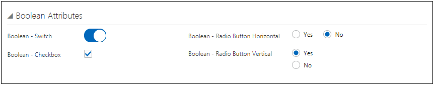
The following images show the different display options available for Boolean attributes.
-
Legacy Display Type: Checkbox
-
JET Display Type: Switch, Checkbox, Radio Button Horizontal, or Radio Button Vertical
The following image shows Behavior Properties for Boolean attributes.
- The Admin column lists the default settings that are defined using the Attribute Editor.
- The Layout column allows administrators to define property settings for this layout.
-
When Override is selected, the Layout setting will override the default setting for only this layout.
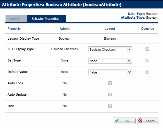
The following table describes properties that are available for Boolean attributes.
Property Description Legacy Display Type
Boolean Checkbox is the only available option for Legacy UIs.
JET Display Type
The following display options are available for JET UIs:
- Switch
- Check Box
- Radio Button Horizontal
- Radio Button Vertical
Set Type
- None: The user can input any value without encountering an error message.
-
Set: A recommendation rule can change the value entered by the user unless the attribute is locked by the user.
- Forced Set: A recommendation rule will change the value of the attributes regardless of what the user enters and if the attribute is locked or not.
Default Value
Select True or False as the attribute default selection.
Auto Lock
When Auto Lock is on, user selections made to an attribute after a Recommendation rule “Set” the attribute to a different value will be retained if the Recommendation Rule is fired again (such as upon an Update).
Auto Lock Example- Recommendation rule 1 runs and sets Attribute X to A. The user then sets Attribute X to B. The user then clicks Update, and Attribute X retains its value of B. The recommendation message defined in Recommendation rule 1 for option A will appear.
- Auto Lock is on by default for all Recommendation rules that have a set type of “Set.” The Admin can turn Auto Lock off within an attribute by selecting “Set” for the set type and by not selecting Auto Lock. If this were done to Attribute X, the user would experience the following:
- Recommendation rule 1 runs and sets Attribute X to A. The user then sets Attribute X to B. The user then clicks Update, and Recommendation rule 1 runs and sets Attribute X to A.
Auto Update
This will by updated by the system without the user invoking an action.
Hide
This attribute will not appear to the user. It can be used in rules.
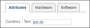
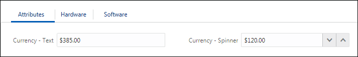
The following images show the different display options available for Currency attributes.
-
Legacy Display Type: Text
-
JET Display Type: Text and Spinner
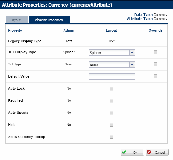
The following image shows Behavior Properties for Currency attributes.
- The Admin column lists the default settings that are defined using the Attribute Editor.
- The Layout column allows administrators to define property settings for this layout.
-
When Override is selected, the Layout setting will override the default setting for only this layout.
The following table describes properties that are available for Currency attributes.
Property Description Legacy Display Type
Text is the only available option for Legacy UIs.
JET Display Type
The following display options are available for JET UIs:
- Text
- Spinner
Set Type
- None: The user can input any value without encountering an error message.
-
Set: A recommendation rule can change the value entered by the user unless the attribute is locked by the user.
- Forced Set: A recommendation rule will change the value of the attributes regardless of what the user enters and if the attribute is locked or not.
Default Value
Enter a default value for the attribute.
Auto Lock
When Auto Lock is on, user selections made to an attribute after a Recommendation rule “Set” the attribute to a different value will be retained if the Recommendation Rule is fired again (such as upon an Update).
Auto Lock Example- Recommendation rule 1 runs and sets Attribute X to A. The user then sets Attribute X to B. The user then clicks Update, and Attribute X retains its value of B. The recommendation message defined in Recommendation rule 1 for option A will appear.
- Auto Lock is on by default for all Recommendation rules that have a set type of “Set.” The Admin can turn Auto Lock off within an attribute by selecting “Set” for the set type and by not selecting Auto Lock. If this were done to Attribute X, the user would experience the following:
- Recommendation rule 1 runs and sets Attribute X to A. The user then sets Attribute X to B. The user then clicks Update, and Recommendation rule 1 runs and sets Attribute X to A.
Required
This will require the user to enter a value before proceeding to a commerce transaction.
Auto Update
This will by updated by the system without the user invoking an action.
Hide
This attribute will not appear to the user. It can be used in rules.
Show Currency Tooltip
Select to show a tooltip that appears if the stored precision value is different from the displayed precision and the numbers are not equivalent.
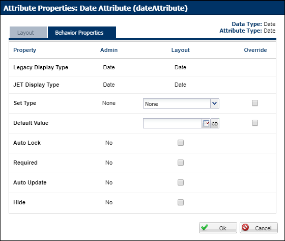
The following image shows Behavior Properties for Date attributes.
- The Admin column lists the default settings that are defined using the Attribute Editor.
- The Layout column allows administrators to define property settings for this layout.
-
When Override is selected, the Layout setting will override the default setting for only this layout.
The following table describes properties that are available for Date attributes.
Property Description Legacy Display Type
Date is the only available option for Legacy UIs.
JET Display Type
Date is the only available option for JET UIs:
Set Type
- None: The user can input any value without encountering an error message.
-
Set: A recommendation rule can change the value entered by the user unless the attribute is locked by the user.
- Forced Set: A recommendation rule will change the value of the attributes regardless of what the user enters and if the attribute is locked or not.
Default Value
Enter a default date, select a date from the date picker, or click the "Use Current Date" icon
 to use the current date as the default data.
Auto Lock
When Auto Lock is on, user selections made to an attribute after a Recommendation rule “Set” the attribute to a different value will be retained if the Recommendation Rule is fired again (such as upon an Update).
Auto Lock Example- Recommendation rule 1 runs and sets Attribute X to A. The user then sets Attribute X to B. The user then clicks Update, and Attribute X retains its value of B. The recommendation message defined in Recommendation rule 1 for option A will appear.
- Auto Lock is on by default for all Recommendation rules that have a set type of “Set.” The Admin can turn Auto Lock off within an attribute by selecting “Set” for the set type and by not selecting Auto Lock. If this were done to Attribute X, the user would experience the following:
- Recommendation rule 1 runs and sets Attribute X to A. The user then sets Attribute X to B. The user then clicks Update, and Recommendation rule 1 runs and sets Attribute X to A.
Required
This will require the user to enter a value before proceeding to a commerce transaction.
Auto Update
This will by updated by the system without the user invoking an action.
Hide
This attribute will not appear to the user. It can be used in rules.
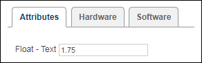
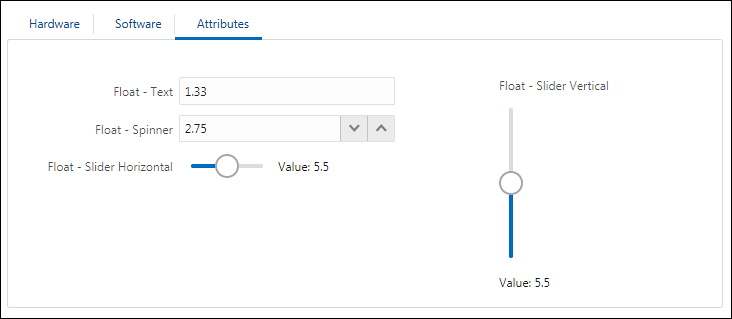
The following images show the different display options available for Float attributes.
-
Legacy Display Type: Text
-
JET Display Type: Text, Spinner, Slider Horizontal, and Slider Vertical
The following image shows Behavior Properties for Float attributes.
- The Admin column lists the default settings that are defined using the Attribute Editor.
- The Layout column allows administrators to define property settings for this layout.
-
When Override is selected, the Layout setting will override the default setting for only this layout.
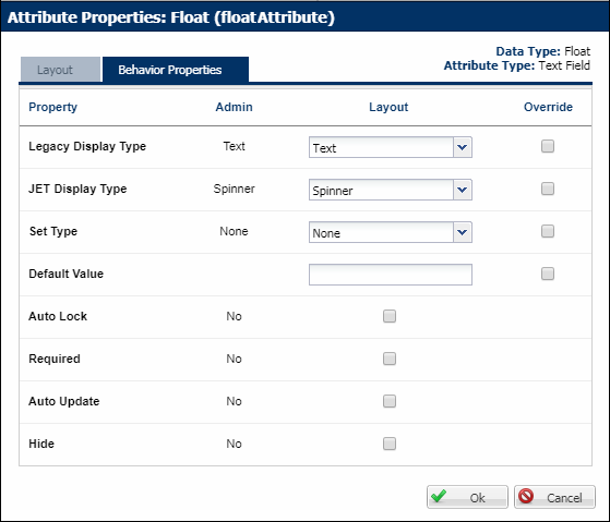
The following table describes properties that are available for Float attributes.
Property Description Legacy Display Type
Text is the only available option for Legacy UIs.
JET Display Type
The following display options are available for JET UIs:
- Text
- Spinner
- Slider Horizontal
- Slider Vertical
Set Type
- None: The user can input any value without encountering an error message.
-
Set: A recommendation rule can change the value entered by the user unless the attribute is locked by the user.
- Forced Set: A recommendation rule will change the value of the attributes regardless of what the user enters and if the attribute is locked or not.
Default Value
Enter a default value for the attribute.
Auto Lock
When Auto Lock is on, user selections made to an attribute after a Recommendation rule “Set” the attribute to a different value will be retained if the Recommendation Rule is fired again (such as upon an Update).
Auto Lock Example- Recommendation rule 1 runs and sets Attribute X to A. The user then sets Attribute X to B. The user then clicks Update, and Attribute X retains its value of B. The recommendation message defined in Recommendation rule 1 for option A will appear.
- Auto Lock is on by default for all Recommendation rules that have a set type of “Set.” The Admin can turn Auto Lock off within an attribute by selecting “Set” for the set type and by not selecting Auto Lock. If this were done to Attribute X, the user would experience the following:
- Recommendation rule 1 runs and sets Attribute X to A. The user then sets Attribute X to B. The user then clicks Update, and Recommendation rule 1 runs and sets Attribute X to A.
Required
This will require the user to enter a value before proceeding to a commerce transaction.
Auto Update
This will by updated by the system without the user invoking an action.
Hide
This attribute will not appear to the user. It can be used in rules.
The following image shows Behavior Properties for HTML attributes.
- The Admin column lists the default settings that are defined using the Attribute Editor.
- The Layout column allows administrators to define property settings for this layout.
-
When Override is selected, the Layout setting will override the default setting for only this layout.
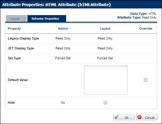
The following table describes properties that are available for HTML attributes.
Property Description Legacy Display Type
The Legacy Display Type cannot be edited. It is always Read Only.
JET Display Type
The JET Display Type cannot be edited. It is always Read Only.
Set Type
The Set Type cannot be edited. It is always a Forced Set.
Default Value
Enter the HTML source in the Layout text area to change the HTML for this layout.
Hide
This attribute will not appear to the user. It can be used in rules.
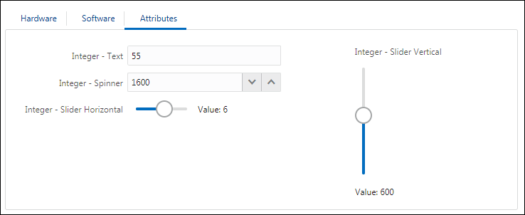
The following images show the different display options available for Integer attributes.
-
Legacy Display Type: Text
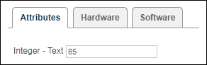
-
JET Display Type: Text, Spinner, Slider Horizontal, and Slider Vertical
The following image shows Behavior Properties for Integer attributes.
- The Admin column lists the default settings that are defined using the Attribute Editor.
- The Layout column allows administrators to define property settings for this layout.
-
When Override is selected, the Layout setting will override the default setting for only this layout.
The following table describes properties that are available for Integer attributes.
Property Description Legacy Display Type
Text is the only available option for Legacy UIs.
JET Display Type
The following display options are available for JET UIs:
- Text
- Spinner
- Slider Horizontal
- Slider Vertical
Set Type
- None: The user can input any value without encountering an error message.
-
Set: A recommendation rule can change the value entered by the user unless the attribute is locked by the user.
- Forced Set: A recommendation rule will change the value of the attributes regardless of what the user enters and if the attribute is locked or not.
Default Value
Enter a default value for the attribute.
Auto Lock
When Auto Lock is on, user selections made to an attribute after a Recommendation rule “Set” the attribute to a different value will be retained if the Recommendation Rule is fired again (such as upon an Update).
Auto Lock Example- Recommendation rule 1 runs and sets Attribute X to A. The user then sets Attribute X to B. The user then clicks Update, and Attribute X retains its value of B. The recommendation message defined in Recommendation rule 1 for option A will appear.
- Auto Lock is on by default for all Recommendation rules that have a set type of “Set.” The Admin can turn Auto Lock off within an attribute by selecting “Set” for the set type and by not selecting Auto Lock. If this were done to Attribute X, the user would experience the following:
- Recommendation rule 1 runs and sets Attribute X to A. The user then sets Attribute X to B. The user then clicks Update, and Recommendation rule 1 runs and sets Attribute X to A.
Required
This will require the user to enter a value before proceeding to a commerce transaction.
Auto Update
This will by updated by the system without the user invoking an action.
Hide
This attribute will not appear to the user. It can be used in rules.
View Legacy user-side examples
-
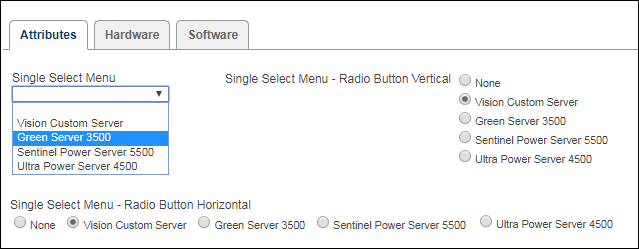
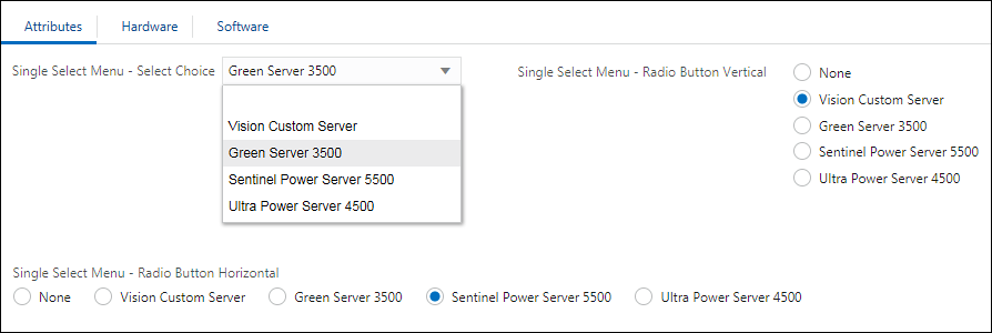
Single Select Menus: Single Select Menu, Radio Button Horizontal, and Radio Button Vertical
The following image shows the Legacy Display Types for Single Select Menus.
-
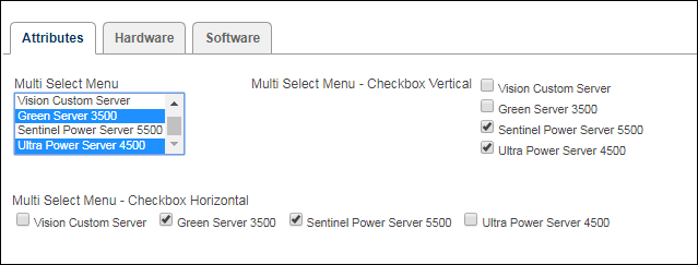
Multi Select Menus: Multi Select Menu, Checkbox Horizontal, and Checkbox Vertical
The following image shows the Legacy Display Types for Multi Select Menus.
-
Single Select Menus: Select Choice, Radio Button Horizontal, and Radio Button Vertical
The following image shows the JET Display Types for Single Select Menus.
-
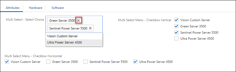
Multi Select Menus: Select Choice, Checkbox Horizontal, and Checkbox Vertical
The following image shows the JET Display Types for Multi Select Menus. When a user selects items from the Select Choice menu the options are removed from the drop-down list. The user can click on the "x" on the right side of the selected items to deselect an item. After an item is deselected it is added back into the drop-down list.
View Image Menu user-side examples
In Oracle CPQ, you can display images next to an attribute, as well as show menu values as images instead of text. This allows users to choose a menu value by clicking on the image. Image Menus are available for both array and non-array type single-select menus, multi-select menus, and single select pick lists.
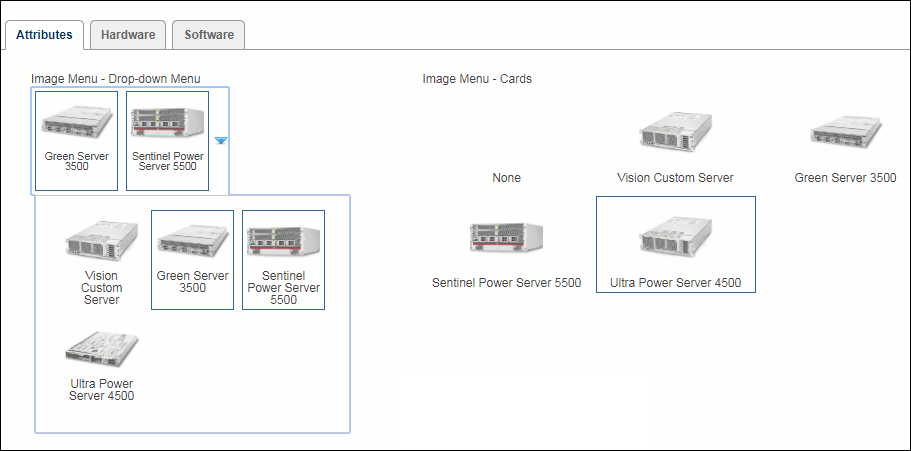
Legacy Display Type Drop-down Menu and Grid options are available when Image Menus are enabled for Single Select Menus, Multi Select Menus, or Single Select Pick Lists.
-
Drop-down Menu - Images are displayed compactly in a menu box that is only visible when selecting. This is typically used when Users need to see a visualization while making their selection, but otherwise it is preferred to keep this attribute compact.
- Grid - All images are displayed in a grid format on the layout. This is typically used when Users need to see a visualization while making their selection and to see that selection even after making their choice.
The following image shows the Legacy Display Type Image Menus. The Drop-down Menu is a Multi Select Menu and the user can select multiple items from the drop-down. The Grid is a Single Select Menu and only one item can be selected.
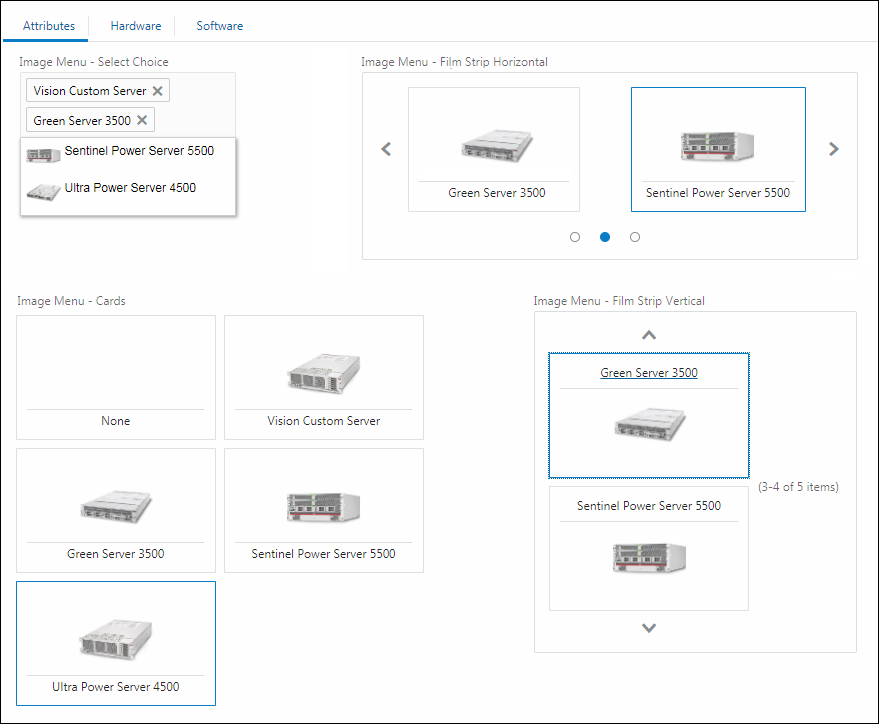
JET Display Type Select Choice, Cards, Film Strip Horizontal, and Film Strip Vertical options are available when Image Menus are enabled for Single Select Menus, Multi Select Menus, or Single Select Pick Lists.
- Select Choice - Allows for display of images in the list of options. Once selected, only the display name of the selected option is shown in the attribute field.
- Cards - Allows for display of all or most images at all times. Once selected, the card visually indicates that it is selected.
- Film Strips Horizontal and Film Strip Vertical - The Film Strip expands in size to show as many images as space allows, making it ideal for mobile users. Film Strip can be set in the Attribute definitions to show horizontally or vertically.
The following image shows the JET Display Types for Image Menus. When a user selects items from the Select Choice menu the options are removed from the drop-down list. The user can click on the "x" on the right side of the selected items to deselect an item. After an item is deselected it is added back into the drop-down list. Also note that the images for the Select Choice menu are not displayed for selected items, they are only displayed in the drop-down list.
The following image shows Behavior Properties for Menu attributes.
- The Admin column lists the default settings that are defined using the Attribute Editor.
- The Layout column allows administrators to define property settings for this layout.
-
When Override is selected, the Layout setting will override the default setting for only this layout.
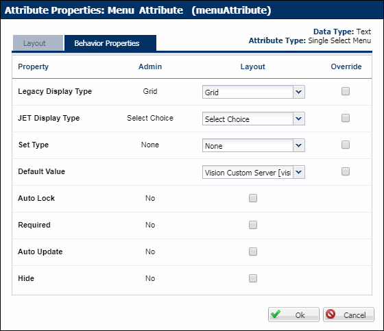
The following table describes properties that are available for Menu attributes.
Property Description Legacy Display Type
The following display options are available for Legacy UIs.
- Drop-down Menu
- Grid
JET Display Type
The following display options are available for JET UIs:
- Select Choice
- Film Strip Horizontal
- Film Strip Vertical
- Cards
Set Type
- None: The user can input any value without encountering an error message.
-
Set: A recommendation rule can change the value entered by the user unless the attribute is locked by the user.
- Forced Set: A recommendation rule will change the value of the attributes regardless of what the user enters and if the attribute is locked or not.
Default Value
Enter a default menu option for the attribute.
Auto Lock
When Auto Lock is on, user selections made to an attribute after a Recommendation rule “Set” the attribute to a different value will be retained if the Recommendation Rule is fired again (such as upon an Update).
Auto Lock Example- Recommendation rule 1 runs and sets Attribute X to A. The user then sets Attribute X to B. The user then clicks Update, and Attribute X retains its value of B. The recommendation message defined in Recommendation rule 1 for option A will appear.
- Auto Lock is on by default for all Recommendation rules that have a set type of “Set.” The Admin can turn Auto Lock off within an attribute by selecting “Set” for the set type and by not selecting Auto Lock. If this were done to Attribute X, the user would experience the following:
- Recommendation rule 1 runs and sets Attribute X to A. The user then sets Attribute X to B. The user then clicks Update, and Recommendation rule 1 runs and sets Attribute X to A.
Required
This will require the user to enter a value before proceeding to a commerce transaction.
Auto Update
This will by updated by the system without the user invoking an action.
Hide
This attribute will not appear to the user. It can be used in rules.
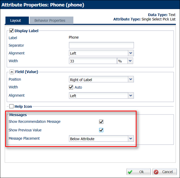
Apply Message Properties to Single Select Pick Lists in Configuration
In CPQ, the Attribute Property s dialog for Single Select Pick Lists contains message properties. Administrators can use these properties to specify how to display the messages that display when the Recommendation Rule's Set Type is set to "None" or "Set".
The following properties are available:
- Show Recommendation Message: When the Set Type is "None" and administrators select this option, the recommended value for the action attribute displays as a message to the user. When the Set Type is "Set," the setting of a recommended value is prevented by locking the attribute. The recommended values' message will display in Configuration.
- Show Previous Value: By selecting this option, the previous message displayed for the recommended value will display.
- Message Placement: Specify the location in which to place the recommendation message in Configuration (i.e. Below Attribute, Right of Value, Bottom of Group, Bottom of Page, or Top of Page.
Complete the following steps:
- Navigate to the Admin Home page.
-
Under Products, click Catalog Definition.
The Supported Products page opens with Product Families displaying by default in the Navigation menu.
-
Click List.
The Supported Product Families page opens.
- Locate the product family to which you want to apply message settings.
- From the Navigation menu, select Configuration Flows.
-
Click List.
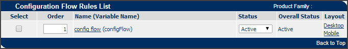
The Configuration Flow: Rules List page opens.
-
In the Layout column, click Desktop.
The Layout Editor opens with gear icons next to the Single Select Pick List attributes.
-
Click the gear icon next to a Single Select Pick List attribute.
The Attribute Properties dialog opens.
- Select the message properties to apply to the Single Select Pick List attribute in Configuration.
- Click OK.
Note: Single Select Pick Lists by default have the Show Recommendation Message selected and the Message Placement option set to Below Attribute. These are the defaults for any attribute added to the layout. If users add a Single Select Pick List to a Recommendation Rule as an action, the messages display by default.
Display Types, Set Types, and other behavior property settings cannot be modified for Single Select Pick List attributes.
The help icon allows the user to observe rich text help that is defined on that specific attribute’s administration page. If a FullAccess user has not defined help text for an attribute, the end user will observe no result when they attempt to access the help icon. -
Attribute Properties can be accessed from multiple locations on the Configuration page. You can do so by clicking All Attributes in the Administration Action Bar or you can click one of the List icons at the grid or column level.
In the Attribute Properties modal window, there are three tabs available to make changes to attributes: Core Elements, Supporting Elements and Behavior Properties. The purpose of this section is to allow you to make mass changes to attributes within the entire Configuration layout, a grid or a column.
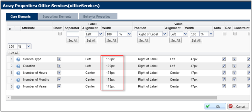
Within the Core Elements tab, you can make changes to the display of the Attribute Label, Value or Message. You can also select whether individual attributes are auto-locked and if they should display the recommendation message, constraint message and the previous value.
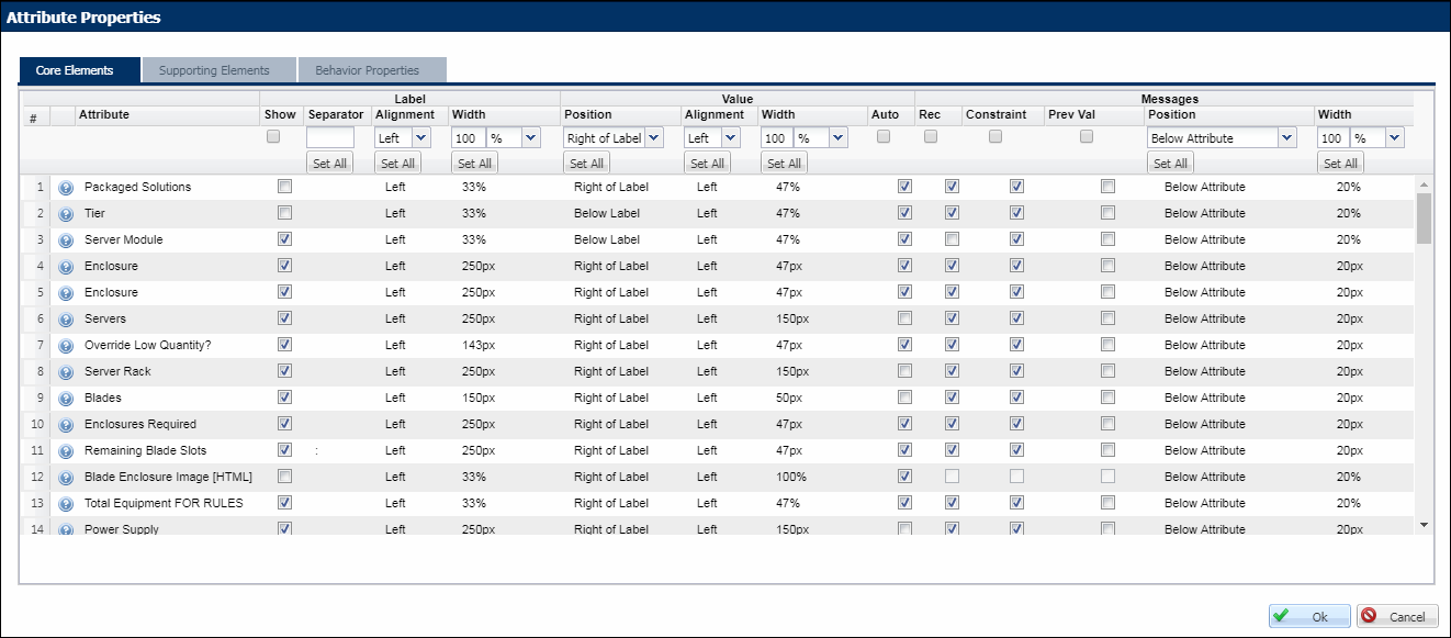
In the image above, you see the name of each attribute names. Corresponding to each attribute, you may elect to show or hide that attribute’s label on the user interface. In this administration interface, you may affect the displays of many attributes at once. You can adjust settings, attribute by attribute or, if you wish to set a given display element en mass, input the appropriate display element in the top-most input row. If a Set All button is provided, clicking it will apply the setting you entered to all attributes listed below.
Example: If you wish to set the label width to 100% for all attributes in the list, clicking Set All in that column will apply “100%” to all attributes listed below . It works in a similar manner for Value and Message display settings.
Within the Supporting Elements tab, you can make changes to display of the Help Icon, the position and width of Price (Attribute Value Pricing), the position of the Menu Image and whether or not to show or hide locks and calculators.
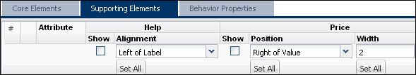
The JET layout does not support the "Right of Value" option for attribute help icons. If the "Right of Value" option is selected, the help icon will appear to the left of the attribute for JET Configuration layouts.
On this tab, you can manage the different display settings of the attributes. You can also override the display type, set type and default value properties that were defined when you created the attribute. This is also where you can determine, for each attribute, if they should be set to auto update, required or hidden.
Drag & Drop Elements between Desktop Configuration Layout Editor Tabs
Admins can drag & drop Elements between Desktop Configuration Layout Editor tabs.
-
Navigate from: Admin > Product Families > Configuration Flows- List.
-
Click the Desktop Configuration Layout Editor link.
- Select the Element from the current Tab that you wish to move to another Tab.
- Drag the Element and hover over the desired Tab. This allows the Tab to open and the Element to be dropped onto the Layout.
- Drop the Element onto the Layout of the desired Tab.
-
If desired, click the Mobile link on the Configuration Flow Rules List page or Mobile Layout on the Configuration Layout Editor to edit the Mobile version of the Configuration Layout Editor.
Previously, when admins desired to move an Element, they were required to remove the Element from the previous tab and re-add it to the desired tab.
Desktop and Mobile Layouts are considered separate Flows. If a change is made to one Flow, it will not automatically be updated in the other Flow.
You must make changes in both the Desktop and the Mobile Layout
For more information on the Desktop Layout, see Configuration Layout Editor.
Notes on Arrays within Layouts
Widths can be specified for labels, value fields and messages for array sets. Additionally, widths can be specified as auto-size.
- Horizontal and Tabbed Array – widths specified in percentage
- Label width defines the width of the label column.
- Value width defines the width of the attribute field.
- Vertical Array – widths specified in percentage
- Label width does not apply.
- Value width defines the width of the attribute fields.
- Pixel Widths – for all array set layouts
- The attribute label and the attribute values widths are the widths specified in pixels.
- If the attribute value width is wider than the column width, then a scroll bar is displayed.
- The FullAccess user can choose to display array messages in different ways - Messages can be displayed in five ways for each attribute – Below Attribute, Right of Value, Bottom of Group, Bottom of Page and Top of Page.
- Additionally, it is now possible to set percentage or pixel widths for array messages.
- Message display, look and feel have been greatly enhanced.
- Array indices can be removed from any specified position without losing the values specified in other positions.
- Array icons have been improved. Existing alternate Stylesheets must be edited to point to these new icons.
- Selecting a constrained value hides pricing, recommended items and invocation buttons automatically. Additionally, these elements reappear via AJAX when the constraint is removed.
- Groups can be collapsed by default.
- The FullAccess user can specify one stylesheet and an alternate stylesheet for each layout.
- Help, images and group descriptions are rendered inline instead of as a pop-up.
Troubleshooting
Pre-12 standard Configuration layouts was composed of tab layouts and group layout. On upgrade, these layouts will be automatically converted to the latest Configuration layout functionality.
Converting legacy tab layouts and group layouts
The column width of the container grid is calculated based on how many tab columns were present in the legacy layout. For example, a legacy two column layout is converted to a parent grid with two columns; each with a width of 50%. Similarly, a legacy one column layout is converted to a parent grid with one column of width 100%.
Legacy group layouts are converted to grid within the parent column. Each grid has as many columns as the old group. For example, a 3-column group will be converted to a 3 column grid. The number of attributes in the column determines the number of rows in the grid.
Column widths for grids are calculated by adding the legacy label and value widths. If the new grid column width is less than 100, then it is not scaled.
- Attribute label and value widths are now calculated by scaling proportionately to the new grid column.
-
Attribute label and value widths within the new column add up to 100 %.
For example, consider a legacy one-column group where the label and width values are 20% and 40% respectively. This legacy group will be converted as follows:
- New grid with one column. The column width is 60% (20 + 40 – sum of old label and value layouts).
- Each attribute is in its own row. Therefore, this grid has as many rows as the number of attributes in the column.
- The new label and value widths for attributes are proportionately calculated as 33% and 67% respectively using the formula: (legacy width value/new column width) * 100.
-
Attribute label and value widths add up to 100% in the converted layout.
If the width of groups was more than 100 % in the old layout, the new layout normalizes it to 100%.
- If a legacy group’s columns were all defined in pixel or percentage, they are transferred in pixel or percentage widths.
- For legacy groups that mixed percentage and pixel widths, pixel is first converted to percentage [1280 pixel = 100%]
- For legacy groups that mixed pixel and *, the widths are first converted to percentage. Similarly, for groups that mixed * and percentage, all widths are first converted to percentage
- Asterisk conversion uses the formula: (100 - (sum of all percentage values)) / (number of asterisks)
Each attribute is migrated in its own row in the new grid. It is strongly advised that you test the end user pages after upgrade to ensure that the page displays properly. If not, changing the widths of the columns should fix most positioning and width related issues.
Common layout issues after upgrade
The new layout will cut off fields if there is not enough space to display them within the column. You must update column widths after upgrade to display fields properly.
- Missing Stylesheets - Layout now supports only one stylesheet and an alternate stylesheet. For legacy layouts with multiple stylesheets, only the style sheet from the first tab will be associated with the layout. It should be noted that all legacy stylesheets are available in the Stylesheet section. The FullAccess user is advised to download those stylesheets and then combine them into one alternate stylesheet. Additionally, tab class names can be used as tab identifiers in this combined alternate stylesheet.
- Existing custom browser-specific styles may not work correctly anymore due to the DOCTYPE change – These custom styling are most likely no longer needed.
- HTML attributes not rendering properly because of the updated Configuration stylesheet – Explicitly set styles for HTML attributes in the CSS.
All tabs using advanced templates are now in iframes where old html, old CSS, and old JavaScript are still in use. However:
- Any JavaScript in header/footer that accesses attributes in tabs that use advanced templates will no longer work (but it is possible to modify it to look for the attribute within the iframe)
- Any JavaScript inside an HTML attribute within a tab using advanced templates that looks for attributes in other tabs will no longer work (but it is possible to modify it to look for attributes in the parent document)
JavaScript customization does not work:
- Any previous custom JavaScript that relies on DOM relationships (for example, .parent(), .children()) or on specific tag names will no longer work as expected.
- JavaScript might break if it does not wait for DOM ready events.
See the following table for an example:
Old JavaScript (will break on upgrade)
<script>
if (document.configurationForm && _BM_USER_LOGIN != "Creed Bratton"  && _BM_USER_LOGIN != "Michael Scott" && _BM_USER_LOGIN!= "Dwight Schrute") {
elements = document.getElementsByName("create_quote");
elements[0].parentNode.parentNode.parentNode.parentNode.parentNode.parentNode. style.display = "none";
elements[1].parentNode.parentNode.parentNode.parentNode.parentNode.parentNode. style.display = "none";
}
if (document.configurationForm){
elements = document.getElementsByName("start_over");
elements[0].parentNode.parentNode.parentNode.parentNode.parentNode.parentNode. style.display = "none";
elements[1].parentNode.parentNode.parentNode.parentNode.parentNode.parentNode. style.display = "none";
}
</script>
Sample Replacement JavaScript
<script>
if (document.configurationForm) {
$('.button-start-over').hide();
$('.button-invoke-create').toggle(_BM_USER_LOGIN == "Creed Bratton" || _BM_USER_LOGIN == "Michael Scott" || _BM_USER_LOGIN == "Dwight Schrute");
}
</script>
Notes
- Column widths add up to be 100 %.
- Most styling should be done using the regular stylesheet UI. The alternate stylesheet can be used for additional CSS customization. Update existing alternate Stylesheets to use the latest array icons. Define CSS classes for tabs and groups to aid in advanced styling.
Notes:
-
The JET layout does not support the "Right of Value" option for attribute help icons. If the "Right of Value" option is selected, the help icon will appear to the left of the attribute for JET Configuration layouts.
- Widths specified for layout elements and attributes are respected. The FullAccess user must ensure that enough space is available within a column to display attributes properly.
- All attributes are migrated in their own row to maintain legacy behavior of preserving white space on hiding attributes. It is recommended that the FullAccess user move attributes to a single cell if collapsed space behavior is desired. A single cell is considered the same column and same row on the layout.


